
Leaderboard

.thumb.png.3d66a1eeb7ecf5404151f8a77ea7cbfd.png)
Popular Content
Showing content with the highest reputation on 08/11/21 in all areas
-
I think te biggest problem is it's a 100% flat look next to elements that aren't flat. See the example of the WNT logo. The text has subtle gradients that give it depth while the black pearl doesn't. It looks better on the GMA look where everything is flat.3 points
-
Oh, the logo wiki has gotten out of control, in regards to station logos. Some buffoons have poorly recreated KABC and KGO's current logos, too, and they clearly have no clue what they're doing. https://logos.fandom.com/wiki/KABC-TV#2013.E2.80.93present https://logos.fandom.com/wiki/KGO-TV#2013.E2.80.93present https://logos.fandom.com/wiki/KGO-TV#1996.E2.80.9320032 points
-
Am I one of the select few that actually likes the new ABC logo? Well, at least the ring-bordered version for regular programming (in contrast to the dark blue version for news programming; it does not fit the World News Tonight graphics at all). Even though I think the glossy 2007 Start Here was the best from my perspective.2 points
-
I'm missing this already.2 points
-
I'm sorry, but I do Not like the new logo. It is atrocious. I agree with iron lion, the previous logo was Way better. This ewww logo is a step backwards, IMO.2 points
-
The fact that a group package is coming has already been established. There's supposedly been pushback in terms of the logo proportions, but everyone will be adopting the new logo. That's non-negotiable.1 point
-
They get shredded in ratings anyway though by WKYT and WLEX.1 point
-
1 point
-
My bet is that CTM will have the windows covered, similar to how it was used for Election Day. In addition, I remember reading somewhere that they will still use a desk that allows them to face each other at the new studio.1 point
-
Mamma-Mia, that’s a spicy meat-a-ball! From their FB page. I don’t mind the new logo but that color combo is rough
 1 point
 -
Former WKYT anchor Miranda Combs is leaving her government communications job to return to TV news as the assistant ND of newsroom start-up WDKY in Lexington.1 point
-
It looks like a re-creation of the mock-up made by the new logo designers that was included on Page 1 of this thread. I am told that the local station group was not involved with this project and that any mock up local logos included in the design documents leaked are not official new logos.1 point
-
Someone on Wikipedia tried uploading what they said was a new 'universal ABC7 logo' for NY/CHI/LA/SF' to the said articles, but it was removed as they didn't source where it was coming from (doesn't help when you say 'own work' in the rationale' and it literally looks like it was pasted on over the KABC logo in MS Paint).1 point
-
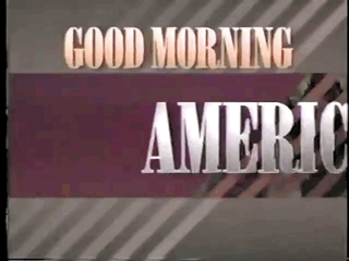
Good Morning America and World News Tonight now use the new logo in their opening graphics and on the studio and anchor desk screens. For WNT, it looks odd and low budget alongside the graphics already in place. For GMA, it sort of fits in since their graphics already had a flat theme to them.
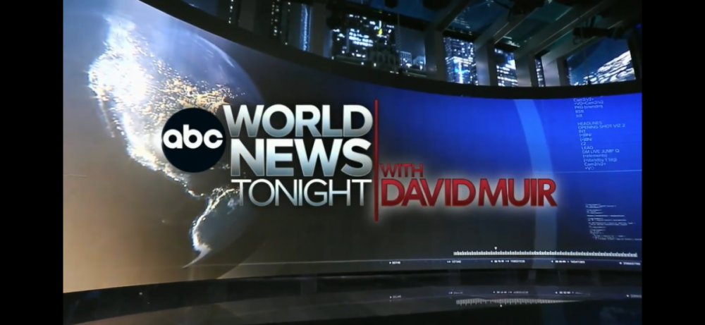

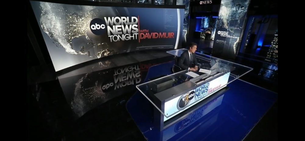 1 point
 -
Matt Standridge is rejoining KFSM as its new Chief Meteorologist. He comes from WKYC, where he was for about a year.1 point
-
ABC started using the new logo as their on-screen bug during The View today.1 point
-
Such a shame to see Dan Harris leaving. He was at ABC News for a long time. I remember the days when he was ABC World News's weekend anchor. Best of luck at 10 percent.1 point
-
Weekend GMA anchor Dan Harris announced his departure from the network this morning. Last day is 2 months from now. One wonders if this is a natural spot for Phil Lipof to assume?1 point
-
I liked the current logo, it’s a shame they’re getting rid of it. The gradients flowed nicely and it wasn’t irritatingly flashy. The smaller letters in the new one make it look cramped and uninviting. If they wanted to make it plain for digital, I would have preferred the original 1962 one. The reason why flat design is everywhere is because young people, like myself, prefer it. Since companies are desperate to appeal to us, they feel the need to make their branding and graphics as flat as possible. I never understood the need for news to rely on gaudy 3D effects and lens flares. The story should be front and center, the graphics should only supplement it. When I watch or read the news, I want to be informed, not distracted by unnecessary clutter. Sports are for entertainment, so they make the graphics entertaining to watch. News is meant to inform about serious topics, so I prefer flatter and subdued graphics. I’m not saying it’s bad for news graphics to be creative, but it shouldn’t take away from the main subject.1 point
-
Former KTRK ABC 13 reporter Stuart Stanley died last weekend at the age of 56: mikemcguff.com: Stuart Stanley has died0 points


This leaderboard is set to Chicago/GMT-05:00