
Leaderboard


Popular Content
Showing content with the highest reputation on 03/23/23 in Posts
-
I disagree. It has been well-known for some time that this entire process was going to be a collaborative one in which the legacy (whatever that may be) of each station would be taken into account with some flexibility when it came to graphics, logos, etc... That said, this is exactly what we're seeing. Has this process/rollout been executed perfectly???? No... which is why certain things have been (and likely will continue to be) fixed/tweaked. I don't think the intent has ever been to make the look/sound of each and every CBS O&O be the same. That would be very unfortunate.6 points
-
It happens everywhere, we just learn of it more often when it happens in television because a reporter or anchor that viewers see daily is suddenly removed from a program. In some cases, it’s also a credit to the network and its corporate parent that they take allegations seriously these days and will now act on things swiftly and publicly unlike other industries where behavior like this is still swept under the rug.6 points
-
I’m sorry, but that pee-stained Spirit Airlines vibe looks awful. They should have been forced to use the same colors like everyone else.5 points
-
According to this video, they still used the Enforcer cut as a close:3 points
-
I have LOVED the new look until they've changed the box on the left from black to now gold. I had no issues with it... Or why can't they use the gold for the mornings blue in the afternoon and black at 10 and 11? And this... This has got to change... The severe weather crawl.
 2 points
 -
That runs entirely contrary to the core point of the restructuring, to merge CBS News into the O&Os. Plus WCBS-TV and CBS News have been tied at the hip since the days of Jim Freaking Jensen. The easiest explanation here is that WCBS management utterly and royally botched the rebrand. There is no excuse to keep any references to CBS 2 if the station outside of newscasts rebranded to “CBS New York” anyway. For the network flagship, this is just downright embarrassing. Wouldn’t be surprised if CBS gave KDKA the option to change the color palette to see if it could even be possible (and potentially incentivizing the graphics package as customizable to affiliates). And that’s pretty much it. In a few months, “KDKA-TV News” will be retired in favor of “CBS News Pittsburgh” (which is what it already is referred to in a visual sense).2 points
-
I assume WCBS kept their branding to differentiate themselves from CBS News given they are both based in NYC and to prevent viewer confusion. In KDKA's case, the call letters/branding coupled with the gold/black color scheme is synonymous with the station that it made sense for it to remain.2 points
-
2 points
-
2 points
-
And whoever created the city's flag and seal...who got them from William Pitt's standard. that's where the colors came from in the first place.2 points
-
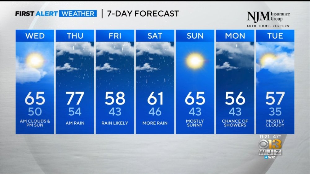
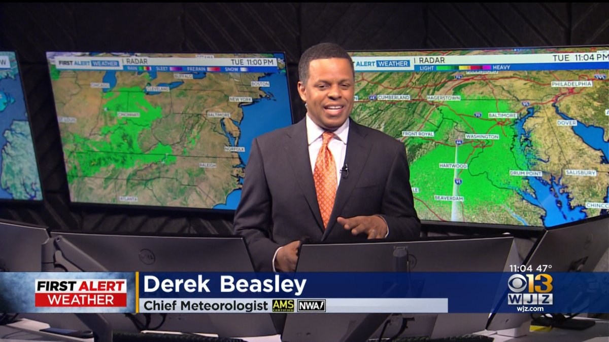
WJZ just got its new Weather Center with updated graphics. It even has the CBS logo jingle when the final forecast is played. Not long now until the changeover to the new branding. Thanks @Georgie56


 2 points
 -
Which why KD didn't go with the streaming branding for their OTA broadcasts like their fellow station since the Westinghouse days, KYW, did.1 point
-
“From CBS News New York, this is CBS 2 News at 9” … god I felt sorry for Brian Lee having to read that sludge. And they didn’t rebrand away from “CBS 2 News” but the station is now “CBS New York”!?! How does THAT happen?? If I’m Wendy McMahon, I’m getting all the execs at WCBS-TV together and telling them, “You’re the flagship of the network. ACT like you’re the flagship!!” That file likely didn’t get cleared out of the master control automation in time. Not an uncommon occurrence after a rebrand.1 point
-
Mary Yoon at KTLA? please! She has ZERO personality. She’d be a better fit with the FAA or an airline meteorologist.1 point
-
I keep revisiting this post, because I can’t get over just how well they transformed this new set. It works so much better arranged this way. Good on them for figuring things out!1 point
-
What is it about network news that so many of these personal scandals occur? Perhaps these workplace scandals happen in all industries but network scandals are magnified because they're on television? Whatever it is, this must make aspiring journalists be cautious of entering the profession.1 point
-
And just as I say that, TWC is not running the streaming show tonight. I admire their...inconsistency?1 point
-
So, both WCBS and KDKA were able to keep their existing newscast branding. The odd part is that O&Os that opted to keep their news brand didn’t have separate logos created for the OTA newscasts that reflect their branding (similar to KCBS/KCAL), while the version using the “standardized” wordmark was saved for the local CBS News streaming channels. If the OTA newscast logos were formatted to reflect the newscast title, the “CBS News [city name]” wordmark would probably need to be placed in the box, using the stacked version of the CBS News logo and the city/region name in a smaller point size aligned properly with it. (Granted, that formatting might not translate entirely well in the L3 bug.)1 point
-
KDKA updated the “CBS News Pittsburgh” box, the time/temp/ticker boxes around 6:30pm to the gold color used this morning. Not sure if it was a technical goof or if people complained about the ticker being too dark.1 point
-
As for whiz next to join the collective: we see you KYW in Philadelphia. We see you watching your sister stations in Pittsburgh and NYC. Come join the CBS collective lol. Resistance is futile!!!1 point
-
CBS News NY is using new lower thirds and mic flags.
.thumb.png.ad48fe006ff3e0764a6bf9b20c04e8b3.png) 1 point
1 point -
I guess they’ve walked back the “CBS New York” brand, at least for now. Even the newscasts are still called “CBS2 News.” If I had to guess why, perhaps it’s because there are a lot of OTA viewers in NYC? That’s the only reason it would make sense to me.1 point
-
I think the way they implented the colors with the last package was not good. But with this one, it's a little more tolerable. That's not to say it's better. It's just a little easier on the eyes to watch. Now after seeing the gold box this morning, I don't think it looks good at all.1 point
-
Unless anything unflattering comes out, sounds like ABC is just fulfilling Marciano's contract with them, which means they'd probably not renew it. They literally found a replacement for him on GMA Weekend. The writing is on the wall.1 point
-
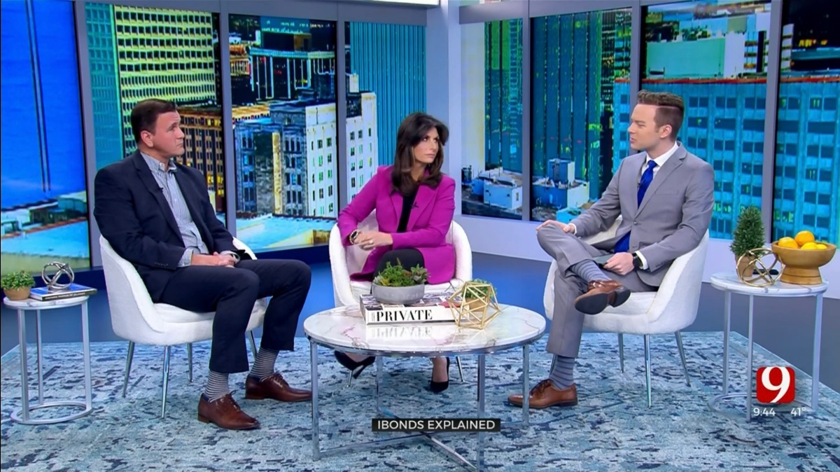
Wonder if this was the original plan and the anchors in the corner was temporary until they got lighting or something Great looking interview area, and the main anchor area has nice depth and warmth from the wood accents. They also add a sense of height with the columns extending beyond the frame of the shot. Nice job framing the area above the anchors with the lit headers though I'd love to see the '9 Oklahoma's Own' up there rather on the anchor desk1 point
-
That looks way better and makes sense!1 point
-
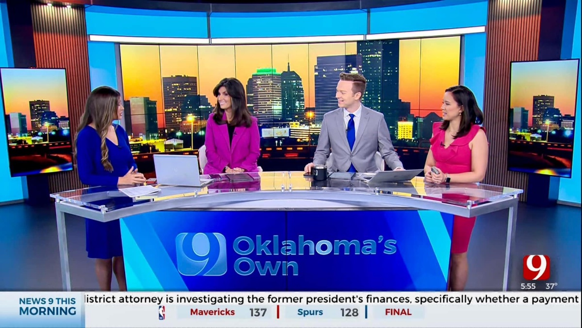
KWTV did some re arranging moving the anchor desk to the interview set making it the permanent location and moving the interview area to where the anchor desk was.

 1 point
 -
[Cough cough] It's happening.1 point
-
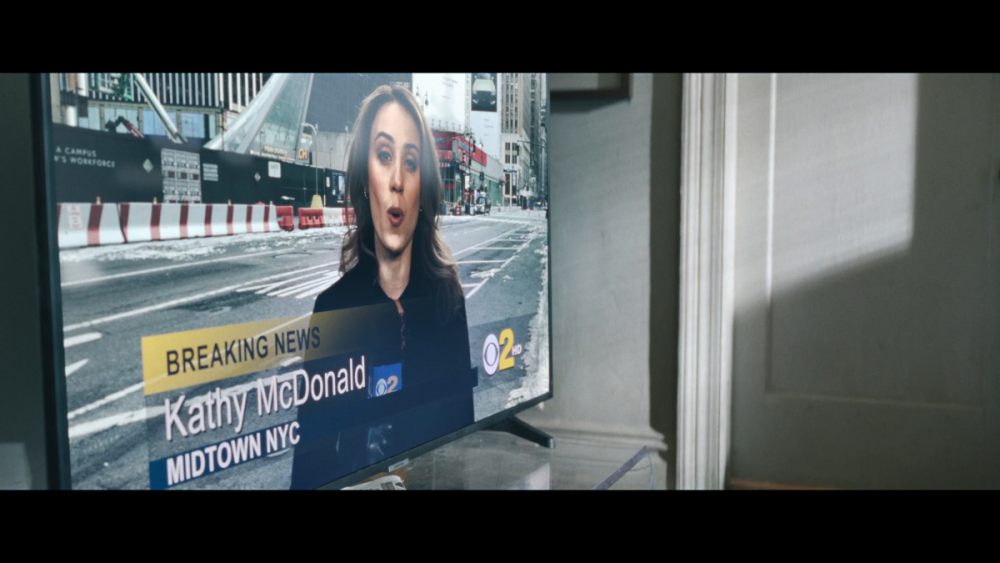
The first episdoe of the new Showtime series "Let the Right One In" uses a simulated newscast from WCBS.
 1 point
 -
Take that up with Fans of the Stillers, Pirates and Penguins, all the same black and gold...0 points


.png.681d61b25d753eff092ec18d9f1f1f97.png)


.thumb.png.3d66a1eeb7ecf5404151f8a77ea7cbfd.png)


This leaderboard is set to Chicago/GMT-05:00