
Leaderboard

Popular Content
Showing content with the highest reputation on 06/22/23 in all areas
-
Y'all don't have to worry about a switch in Atlanta. WANF will stay as a CBS affiliate. Gray has renewed its CBS deal in all of its 54 markets.5 points
-
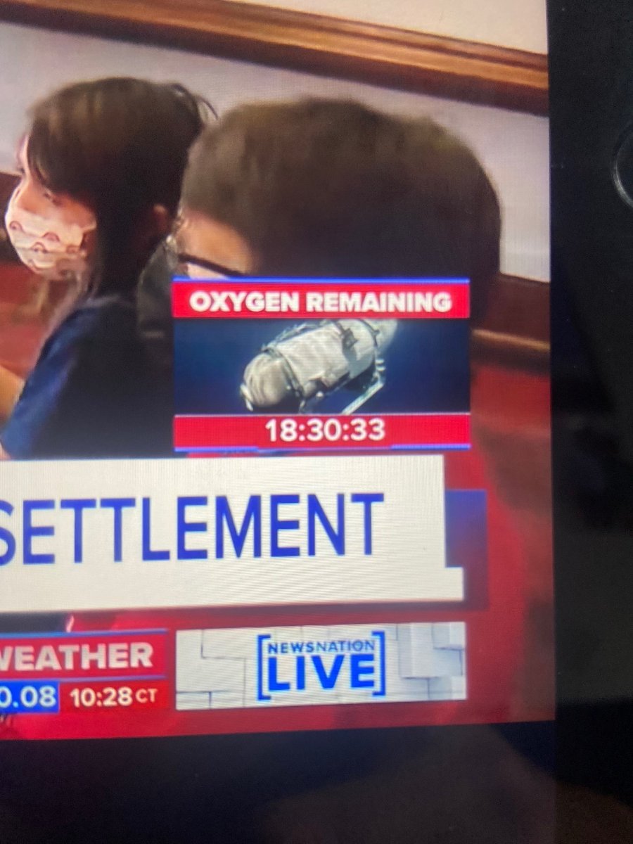
Actually, it’s that logic that’s killing TV news… Anyway, here’s an article from Deadline on this: https://deadline.com/2023/06/missing-sub-news-nation-oxygen-remaining-countdown-clock-1235422766/ I think the most interesting takeaway here is that there are people out there who watch News Nation.4 points
-
If this is “giving the people what they want,” then show me the evidence of high ratings at this farce of a network to prove that this stuff even works. If you think this is the “stuff we need” when the media is facing a record low trust deficit, then with all due respect, you may want to rethink your priorities. Scripps actually did the smart thing and distributed their network on multiple platforms so that, get this, more people could at least watch the damn thing. Scripps is also far more credible, and unlike NewsNation, they aren’t a bunch of cynical attention-seeking desperados that would make Jeff Zucker blush.4 points
-
Update: The L3 replaces the right half of the Eyemark on the far right with an uppercase G.

 3 points
 -
I suppose this confirms what a lot of people suspect; Nexstar’s management team is filled to the brim with f***ing idiots. Hey Susan, maybe if you and your company had nipped this problem in the bud months ago and listened to your employees, maybe you wouldn’t have dealt with a leak and a PR nightmare. Susan Tulley needs to go touch grass.3 points
-
It's tacky and gross. Incredible to think how both Nexstar and Scripps both basically executed the same plan launching news networks, but with such starkly different products.3 points
-
Keep that guy away, especially with how Zuck ruins everything he touches. NBC, CNN, etc.2 points
-
Just as I expected. The best move for CBS would be to sell WUPA.2 points
-
Those are generic WSI icons as well. Here they are being used on a WTOC weather map from 2019. It's extremely rare for a broadcast graphics package to have entirely custom weather graphics. Most stations just go with whatever defaults are available on the system (WSI Max, Baron Lynx, Accuweather) they have for stuff like high/low icons, hurricanes, etc. I used to have the "menu" of icons WSI licensed out (to prevent multiple stations in the same market from using the same icons, there were 4-5 default packs that get exclusively licensed in each market) but I don't think I have it anymore.2 points
-
For literal decades. Even after the hard reset new look a year ago, Chicago's weather graphics have always been rather evolutionary. Hell, there are differences in how WLS, WPVI and WTVD have implemented the weather package. Not every station is going to have the exact same everything.
.thumb.png.eb944b82cca7816abc7456e601d6cbd8.png) 2 points
2 points -
there is so much wrong here… I can’t even.2 points
-
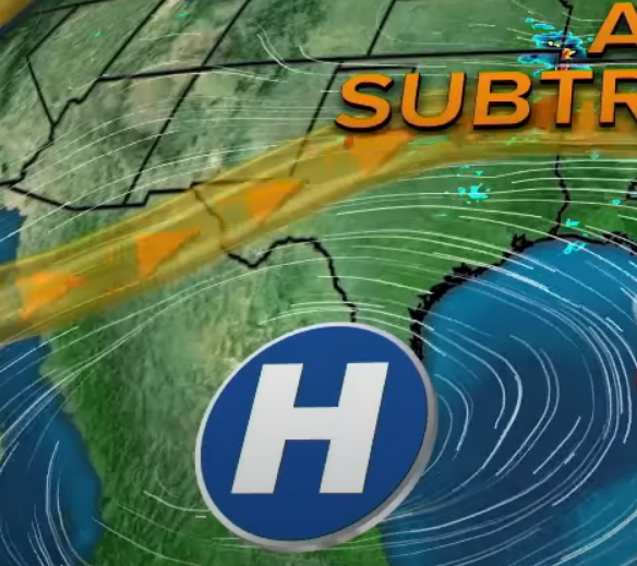
Firstly, blue for high pressure and red for low pressure is the NOAA standard marking. Also, I'm fairly certain those are both just generic graphics that came with the systems... That KTRK one was designed in the weather office if it isn't a generic one. No broadcast designer would have made that. For what it's worth, WLS is using generic WSI high/low pressure system icons...
 2 points
 -
I think some of those game shows are on Britbox.2 points
-
They have different commercial break structures for one, along with an entirely different structure to their unions and they're royalties overall, so unless it's packed into an ad-friendly format like Benny Hill and Monty Python were, it's usually passed on. There's also 'oh no scary accents!' syndrome that makes them a hard sell (though all those Discovery reality shows with bad mic work needing to be subtitled/lots of mumbling are much worse). But the other thing is a lot of folks have long figured out VPNs to watch direct from overseas without the obnoxious sell-throughs many syndicated shows have now (theme weeks and 'special offers'), and UK-specific streaming services now exist in the US, so that's where their focus went long ago, along with public television. It's also why BBC America is just an American rerun farm now, because AMC's budget cuts have killed their acquisition budget.2 points
-
Let’s hope that doesn’t happen. But the more intresting part of that article is: “One possible deal recently floated in media circles involves a merger between NBCUniversal parent Comcast and Paramount. The two companies reportedly had been in talks in 2021. If that merger happens sooner or later, (the newly acquired company under the ownership of) Comcast would likely be forced to get rid of the CBS network due to antitrust violations. Warner Bros Discovery, in turn, might then swoop in and combine CNN with CBS News, seeking to reap efficiencies between the two networks under its umbrella, some insiders have speculated.” That would honestly make a lot of sense and be a huge benefit for CBS which just can’t seems to stand up straight and address the problems at CNN.1 point
-
Mark has been in his position less than 6 years and I doubt he is angling for weekend evenings nor do I think WLS wants to add yet another new person to the weekend morning team after adding both Chatman and Martinez. It's possible he's happy where he is. If he gets the evening slot, great... but if not, I seriously doubt he would up and leave his hometown and the top news station in the market.1 point
-
Once again, you type this with such confidence when you in fact have no idea what you’re talking about when it comes to why the colors are the way they are. I’m sure you made this up in your head to justify why they are what they are but it’s just wrong.1 point
-
Daystar's YouTube thumbnails are all high quality design work, it wouldn't surprise me if they did that all in-house and WWJ just went with it. The logo is probably official, because someone had the common sense to refuse to slap anything with the word "News" on this show. Don't get your hopes up that they'll start rolling it out elsewhere... I'd wager this was done specifically to distance this from their news product, regardless of what time it airs.1 point
-
That promo is impressive for a televangelist show. Usually, promos for televangelists are rudimentary with the most basic of promotions. Whoever is working at Daystar’s promo department needs a raise ASAP if they were able to do the CBS look in-house.1 point
-
I wonder if there is room to declutter the opens a bit. I’ve been watching WLS since the new package debuted. As a whole, it’s great and I’m excited to see it implemented at other stations, but there is A LOT happening in those opens that distracts the eye from the actual newscast name and brand.1 point
-
Looks like a paid program (which would make sense considering the time) decided to make their own logo, IMO. EDIT: Considering the show appears to be a Daystar (Christian broadcaster) program, highly unlikely this is official from WWJ. In fact, I’m a little surprised at the liberal use of the Eyemark.1 point
-
We don't need anymore ABC O&O line-ups. KTRK isn't using their talent resources particularly well. We get it.1 point
-
I know we have talked about this before for previous years, but why hasn’t the BBC, ITV, and Channel 4 tired to sell some of their shows to the US syndicate market? I’ll say it, I will watch Countdown, Pointless, and Tipping Point before I watch another newscast.1 point
-
Would it be this? That's looks fine to me, because the logo is still unique and instantly recognizable, just 2D instead of 3D. On the other hand, the sometimes used sans-serif logo for KTRK's 13 Eyewitness News looks way too generic and lacks any kind of sophistication or class. When you think of Texas, you don't think of a something that's soft and whimsical-looking. So, I think it's much more suitable for California than Channel 13.
 1 point
 -
Pat Robertson, the founder of CBN has passed away at age 93. https://apnews.com/article/pat-robertson-dead-christian-broadcasting-700-club-91299d0953c014ca6860fe545cac793e Take this as you will, just so everyone sees this as they see fit, may he RIH.1 point
-
Okay. Here's the paperwork. It includes a pre-closing LMA (which is now in effect as of June 1).1 point
-
Zucker wants to buy CNN back. https://nypost.com/2023/06/22/cnn-may-be-put-up-for-sale-jeff-zucker-wants-to-buy-sources/ And my reaction....
 0 points
 -
Tully spoke to the WOOD-TV staff. https://thedesk.net/2023/06/susan-tully-nexstar-wood-tv-lgbt-memo/0 points
-
Actually no, this is some 90s news stuff that we need. News channels need to find ways to bring drama and excitement without being about politics all the time. This is old school. This is on par with a camera following OJ in the Bronco. People secretly hope for death and destruction, that's why they watch. You can say it's immoral, but humanity at it's core is immoral, this is just giving the people what they want.0 points
-
Anyone find it a little bit unsettling that News Nation is counting down to the people on the missing submersible’s potential death if they’re even still alive??
 0 points
 -
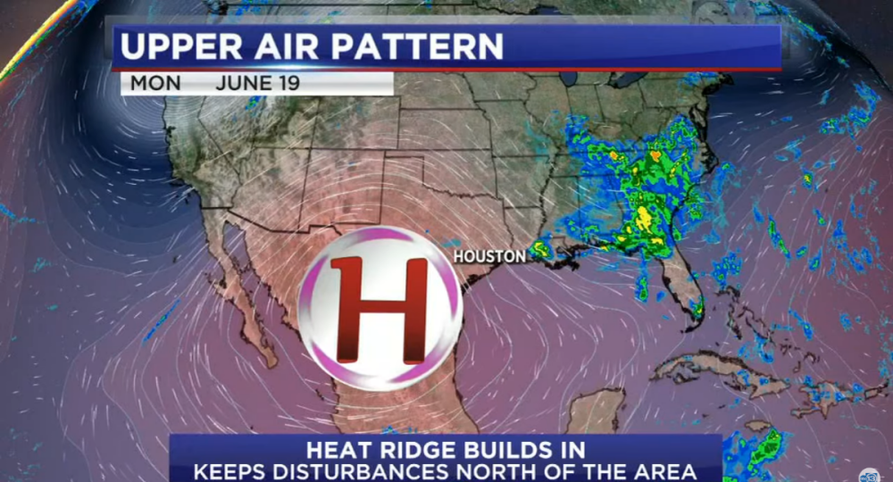
They are much better at designing websites and magazines than news graphics. I guess that's why they tried to make some graphics look like web pages with tabs/arrows, tiles that swipe the screen like you would on some apps, and ellipses marks on banners that look like a more options icon. I was watching part of GMA this morning and noticed their weather graphics, which look a lot like WLS', aren't optimized for hot weather and triple digits. They tired to show three one hundred degree days in a row, and it looked like 101100101 instead of 101 100 101. Even the weather lady said it "looks like a serial number." The ridge of high pressure was your basic white and blue and didn't show the clockwise spin around the H either. That high pressure, which has sinking air, is the reason for the hot weather and KTRK's way of depicting it much better with a red high, which does have the clockwise arrows that spin around on the H's circle and red color gradiant all over the map. Both of those elements makes it look hot and color of the High tells you why it's hot. Whereas a blue high looks cool, and with no arrows, you don't even teach viewers which way high pressure spins let alone convey that it's the reason for the heat.
 0 points


.thumb.png.3d66a1eeb7ecf5404151f8a77ea7cbfd.png)
.png.006d0bb4950941ffaf62c9a823697dad.png)


This leaderboard is set to Chicago/GMT-05:00