
Leaderboard


.thumb.png.3d66a1eeb7ecf5404151f8a77ea7cbfd.png)
Popular Content
Showing content with the highest reputation on 07/31/23 in all areas
-
Can we maybe start an "Anything and Everything Wrong with KTRK" thread, move the relevant posts there, and keep this thread just about the changing graphics at ALL the ABC O&O stations, not just KTRK? When kept on topic, I've found the posts and discussions about what we've seen overall at WLS and in weather on some of the others very interesting.8 points
-
5 points
-
This actually looks really nice. Kinda reminds me of the GMA look but not as cheap/sloppy. I thought they just relaunched their look but I checked The Other Site and the last redesign was May 2021… so I guess it’s been a few years.3 points
-
I know Doris Burke is polarizing, but I like her enough. But listening to Doc Rivers 3 hours a night, up to 3 or 4 nights a week, during the postseason? Goodness.2 points
-
They seem to change their graphics very often. I guess they're really going all-in on the end-to-end lower-thirds.2 points
-
New graphics this morning.2 points
-
And the new graphics are reminding me of the 2013 graphics.1 point
-
It's a base graphics package that both stations' meteorologists have customized for their needs. If you don't like the way it looks on KTRK, well, that's the way their meteorologists have decided to use it. It's essentially a LEGO set. They were sent a box of parts, and this is how they've assembled them. There's nothing more that can be said about this.1 point
-
With all due respect, you sure use a ton of words to say the same damn things, over and over.1 point
-
https://6abc.com/6abc-hall-of-fame-lisa-thomas-laury-dave-roberts-walter-liss/13559168/ WPVI now has its own Hall of Fame at the station.1 point
-
I've said it before, but Jeff Zucker should never be entrusted with anything, ever again. The fact he's trying to have the article retracted is proof he's the Svengali behind the Orange one and all of his illusions and distortions of the truth....1 point
-
Yes they did. After the repack forced them off of 50, they went back to "4".1 point
-
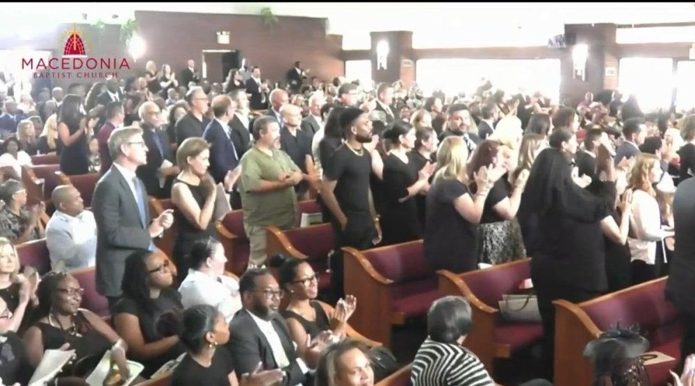
I want to compliment CBS 2 on a great tribute to a great woman. They really did a classy job honoring Elise Finch with the service that went from around 10:34 until 2pm. Dave Carlin spoke, as did Maurice DuBois. They had a video of everyone’s memories of her, too. She is going to be missed dearly, but CBS 2 has been classy the entire time since announcing her passing. I’m sure there were more in the church but I spotted Dana and Dick sitting together, which was nice to see her colleagues honoring her. Rest easy, Elise. Thank you for a great 16 years at the station. You will be forever missed!
 1 point
 -
I happen to disagree; I still think that overall, the new graphics look great. These things are subjective, so while I somewhat disagree with you, I’ll try to see where you’re coming from. There are even people out there who like the latest WRIC graphics, and if that isn’t proof that appearance is subjective, I don’t know what is. I understand the criticism of it being cluttered if we’re strictly talking about the use of 3D in the intros and transitions. These elements would’ve looked better 5 years ago, and they still look ok today imo, but I can see how those transitions may not age well as years go by. Still, I’d argue that these elements still look better than anything coming out of most of the major station owning groups out there. You could easily make the same criticism of the new Gray graphics, but the consensus around here seems to be that those look pretty good. When it comes to the ticker and L3s, which is what people see most of the time, I don’t see any issues there. Those look more than fine; they’re clean, easy to read, and they’re simple enough. Who gives a damn if there’s a slight gradient? The ABC L3s are far less cluttered than anything coming from the non-O&Os. That even includes Tegna, which recently updated their L3s to take up a third of the screen for some reason. IMO, the new L3s are a massive improvement over what most of the O&Os have at the moment (looking at WABC, especially).1 point
-
Can we get back to talking about the current ABC logo and the new O&O graphics package please? I swear we get carried away by the smallest things in these threads. All I can say about the new O&O package now that we've seen the full package on WLS is... I don't really like the look of the graphics. It's too cluttered for a (somewhat) simple package. Very few packages have successfully shown the 3D look with simple gradients (both the current CBS O&O look and NBC O&O look). The only thing I can give the look credit for is the time, temperature, and current weather conditions ticker in the opens.1 point
-
New Petition. Weigel wants to move that new signal closer to the big city. They're keeping the UHF 31 allotment in Wisconsin. But want to move the Community of License east from Wittenberg to Shawano. That's about 38 miles away NW of Green Bay.1 point
-
WRAL is the dominant #1 in the Triangle, WTVD is a strong #2. As for Houston, KPRC, KTRK and I think the Univision station are the major players.1 point
-
When the font is that small, lower case letters tend to be harder to read...1 point
-
I’m thinking Gayle’s CNN thing is gonna work like how Anderson Cooper does 60 Minutes.1 point
-
ESPN's new NBA A-team: Mike Breen, Doris Burke and Doc Rivers.0 points
b.thumb.png.b658c90e4e56cb08f2e8ba3195bb9da9.png)


This leaderboard is set to Chicago/GMT-05:00