
Leaderboard


Popular Content
Showing content with the highest reputation on 01/14/24 in all areas
-
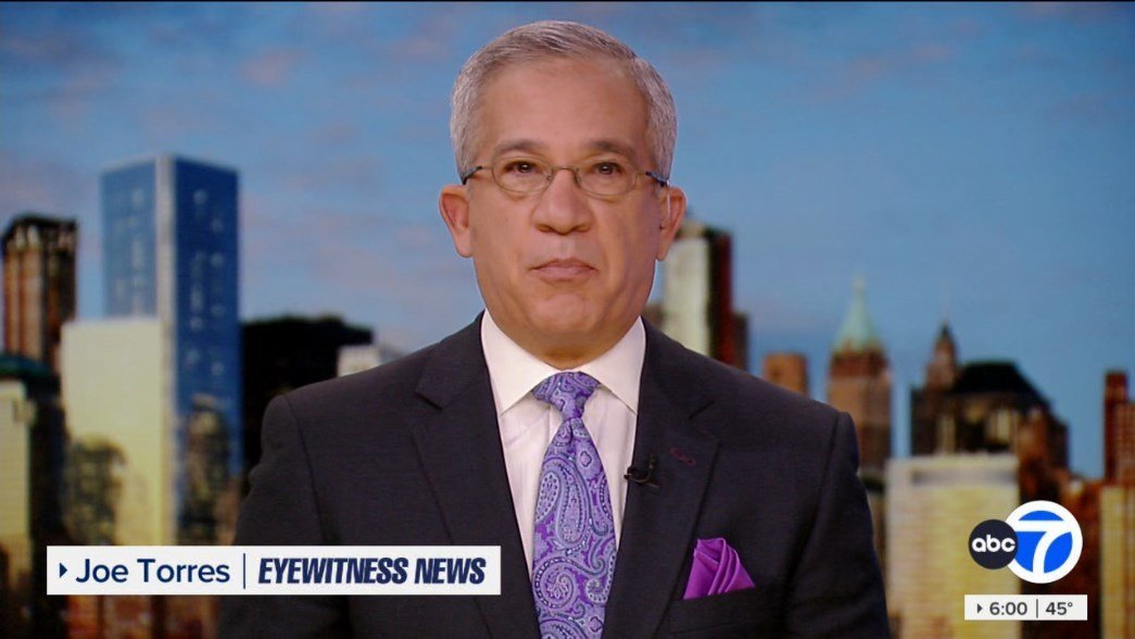
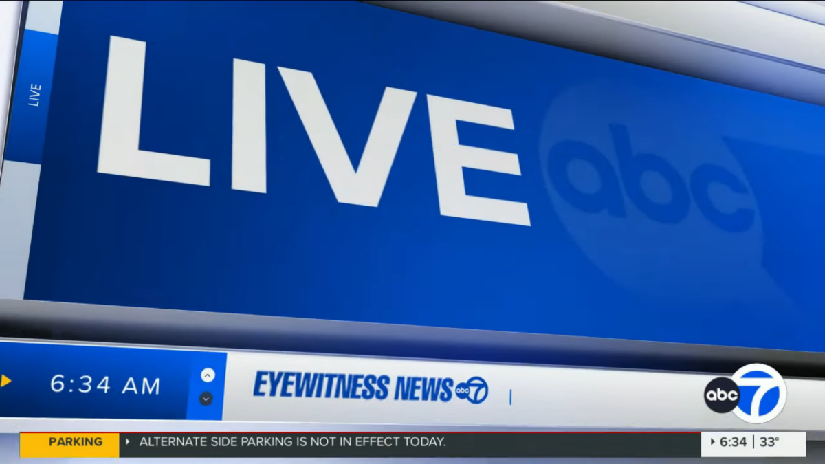
Finally the #1 station can start looking like a number one station. Though I prefer the KGO/KABC look, this is far better than anything WABC has had in the last 15 years.
 4 points
 -
Yeah on this id rather see GMA update their gfx away from the heavy blue and yellow look.3 points
-
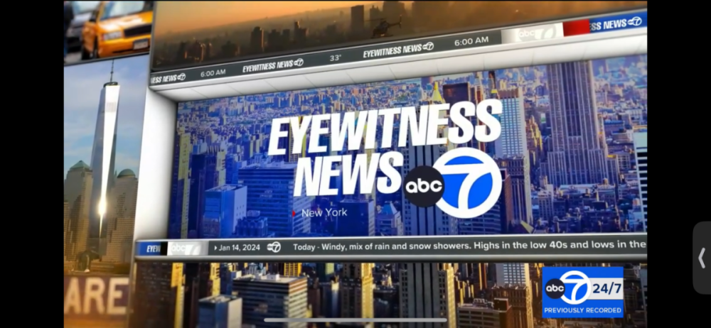
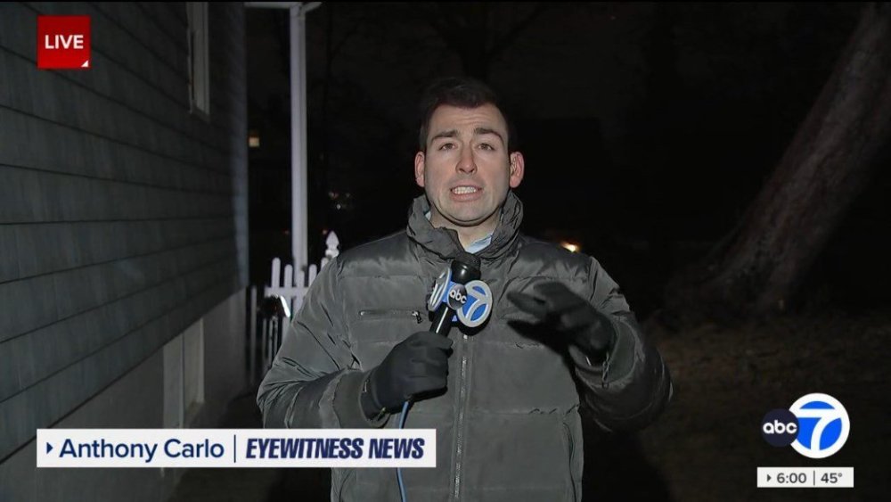
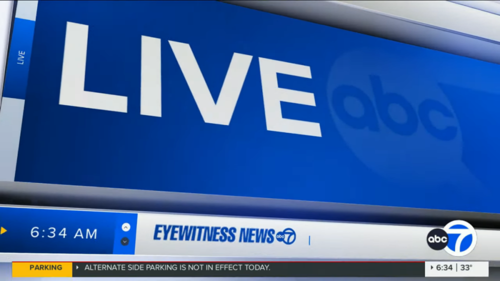
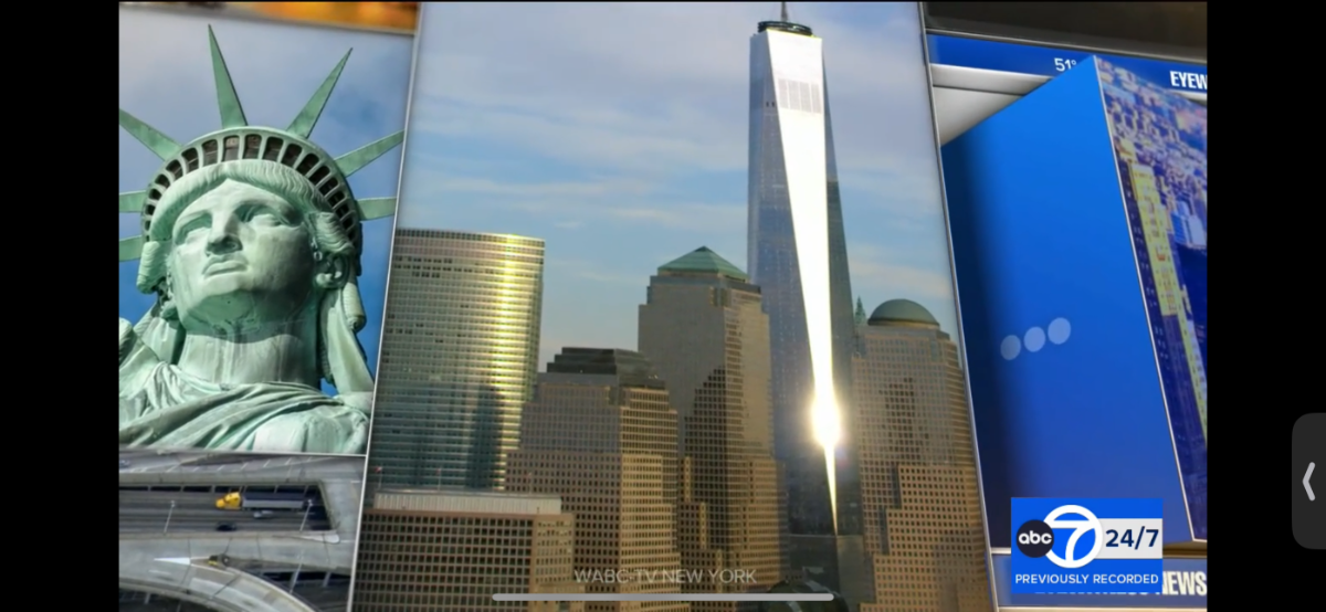
Agreed! The ABC7 LA and Bay Area’s current looks aren’t too bad either and happy that my flagship station here in NY can look and feel like the #1 station at last! I got some dayside captures of the new graphics! RPReplay_Final1705237193.mov


 3 points
 -
Oh my God this is soooooooooooooooooooooooooooooooooooo much better than that crap they had3 points
-
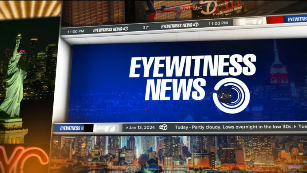
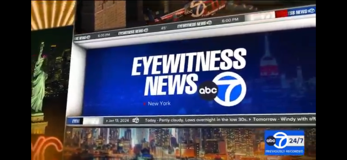
Loving ABC7 New York’s new graphics….AT LAST! Feeling sad about CVD’s voice though, I know he’s up there in age and all but I know it’s not the same and they may replace him with someone else, what a long run since at least the 90s! Here’s my own captures!


 3 points
 -
It's WABC's turn


 3 points
 -
Here's the full newscast (except for sports): https://abc7ny.com/14320962/ Nice to hear that they didn't change their music.2 points
-
We haven't seen a new petition in a while, but we have one. This time its a joint petition. Remember a couple of years back Gray's KCBD in Lubbock wanted to get off VHF 11 for UHF 36? Now, Gray wants to try a different approach. A three-station frequency swap. KCBD (11 > 35) KJTV (35 > 23) KLCW (23 > 11) In the petition, it states that KJTV's current tube transmitter is failing. And replacement parts are not available. Gray has already bought new equipment for KCBD and will use that for RF 35, instead of RF 36. KJTV would use the transmitter currently used by KLCW on RF 23. And KLCW would move to KCBD's current VHF transmitter on RF 11. Gray evaluated moving KLCW to RF 36, but it stated that buying equipment for both stations would be "financially infeasible in this smaller market".2 points
-
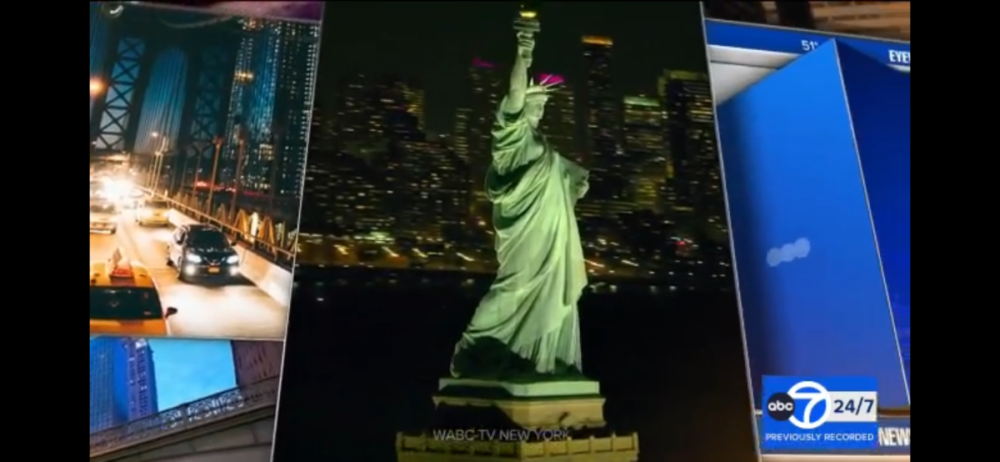
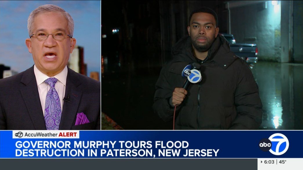
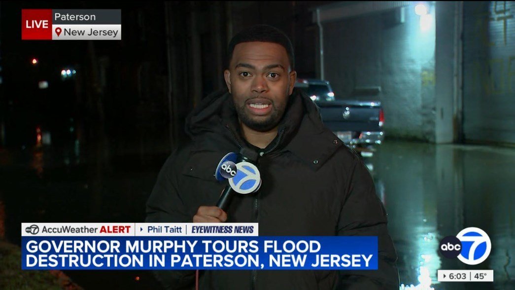
Have they also updated the skyline backgrop? It seems like it occupies the entire frame now rather the borders of the monitor being visible. The skyline image also seems higher quality. SB: Even though journalistic quality is what matters most, when a newscast's presentation (including it's on air appearance) is just as good, it makes me want to tune in more. Good presentation aids substance.1 point
-
It's the same theme as before, just using a cut of it. They were using only that specific cut in some of the previous intros anyway.1 point
-
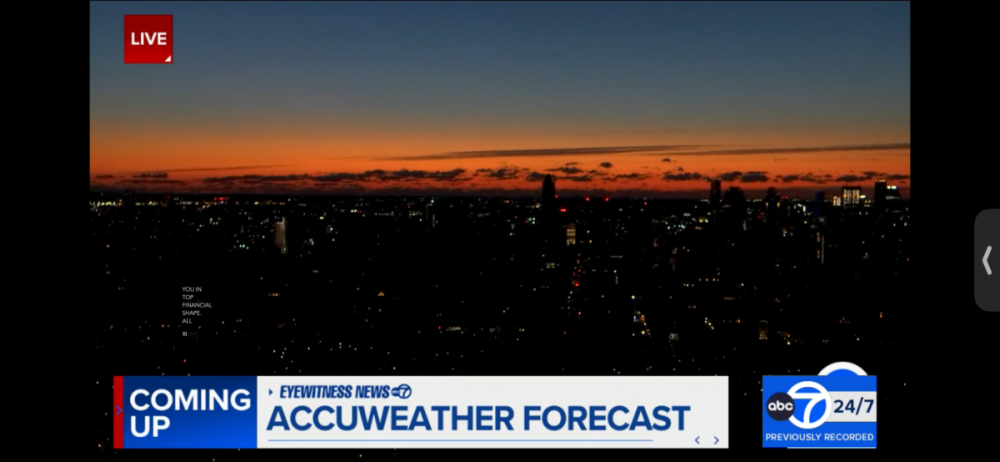
I don't really understand why the lower-third graphics (including the time/temp box and the ticker/flipper line) "expand" when there's a split screen/double box graphic being used. When I first saw it last night, I thought maybe it was just that the background was designed to "continue" the other graphics, but there is a motion to the graphics when they expand for the split screen and then shrink again when the video is taken full. And then I'm sure this has been noted on the overall O&O thread in Graphics, but it's just interested to me the way they incorporate the time in certain full screen transitions, and the time, temperature and forecast in the open. It feels like someone realized they had the ability to program the new graphics this way but it feels like unnecessary clutter. But as I said before, this is a massive improvement for ABC 7. I believe Fox 5 now has the oldest graphics package in NY.
 1 point
 -
Yep the cityscape backdrops on set have been updated too.1 point
-
The newsticker feels off to me Probably because of the difference in color
 1 point
 -
Lots of motion, perhaps too much, but overall it feels fresh and slick. A definite upgrade, though the lower-thirds will still feel familiar to longtime viewers who may be resistant to change. Fonts seem to be unnecessarily large but this is ABC 7 so that shouldn't be a surprise.1 point
-
Opening looks great and they made the music work perfectly. This package will be a massive step up from their old look which I always assumed was in house.1 point
-
New graphics on air as of 6pm tonight. Did not get to see the open1 point
-
The Tegna-DirecTV dispute is over. https://www.nexttv.com/news/tegna-and-directv-end-blackout-with-new-multiyear-distribution-deal Just in time for the NFL playoffs (including WKYC airing the Browns' playoff game today).1 point
-
If one of them had to move to weekend evenings, I’d go with Toni. Michelle’s been on weekend mornings for what feels like forever. I’m surprised they ended up hiring a new weekend anchor instead of sticking with Michelle and Toni though.1 point
-
Or at least moving Michelle or Toni to weekend evenings to be with Joe.1 point
-
I'm surprised they're not keeping Toni Yates with Michelle. I thought they were a great pair. Yes I've been wondering this as well. Hasn't been on since Nov 28th.1 point
-
She'd be my pick!1 point
-
WGN, Chicago; 9 p.m., 1982:1 point
-
The major issue I have with the editorial is it focuses too much on all these Big Four issues, when the major problem are these subfarm broadcasters like H2/Edge/DTV America, along with Coastal and WRNN that should be operating stations in the local interest, but instead have bought out stations to turn into subchannel farms of absolute low-effort IPTV crap run by the same kinds of people who have made the Internet an advertising hellscape. Or with Coastal and Sinclair, have completely garbage newscasts recorded during studio downtime that are viewer-repellant. Edge Spectrum has been tolling out CP's for nearly 6-8 years with no intention of actually broadcasting, while H2 has wound down networks for filler crap like Timeless TV and Vision Latina and absolutely refused to be competitive. Even Tegna, Scripps and Sinclair are complicit with this, as outside Ion the rest of their channels are reality glurge only there for advertising slots, and instead of multiple networks like Twist dying because there's nobody watching, they're being replaced with more things nobody is watching. There should be a local broadcaster running these stations, and the religious broadcasters should be serving their community. They aren't, and the FCC is at least trying something. I understand the justification being the Main Studio Rule repeal, but there should be some kind of local programming on these stations, and not just 'I called some NPO to drone 20 minutes about their stuff, we're good' malicious compliance. There are YouTubers in those communities that could probably fulfill those guidelines better in themselves. Just stop consolidating and racing to the bottom, broadcasters. You see what happened to radio; don't try to even venture near that result.1 point
-
Maybe I'm too used to the old graphics but I'm not keen on this. I preferred the graphics cutting away with the city skyline at different times of the day. Not keen on the more upbeat music either.0 points
-
I hate this package. The way the theme music has been chopped up and abrubtly cut off on some or quickly turned off. It doesnt even feel like COX anymore. They were always still the best at news opens and the correct timings and flow of the opens with the music and graphics. There were never rushed and they always had proper opens. Not these rushed anchor introduced 2 second opens most stations use today. These are just awful. IMO complete downgrade.0 points


b.thumb.png.b658c90e4e56cb08f2e8ba3195bb9da9.png)


This leaderboard is set to Chicago/GMT-05:00