
Leaderboard


Popular Content
Showing content with the highest reputation on 01/15/24 in Posts
-
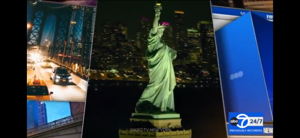
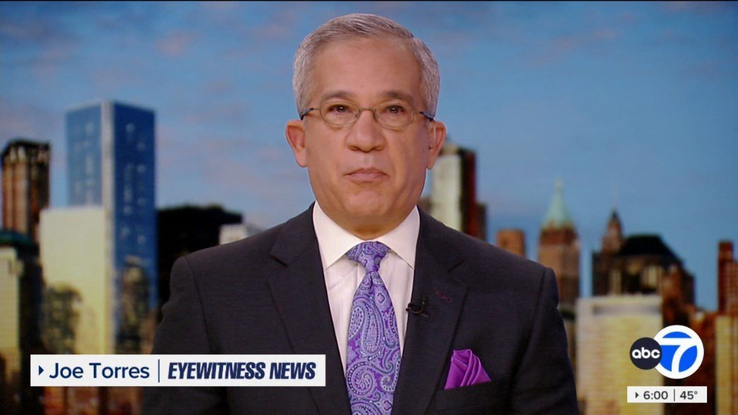
Yes, the skyline backdrops have been updated.3 points
-
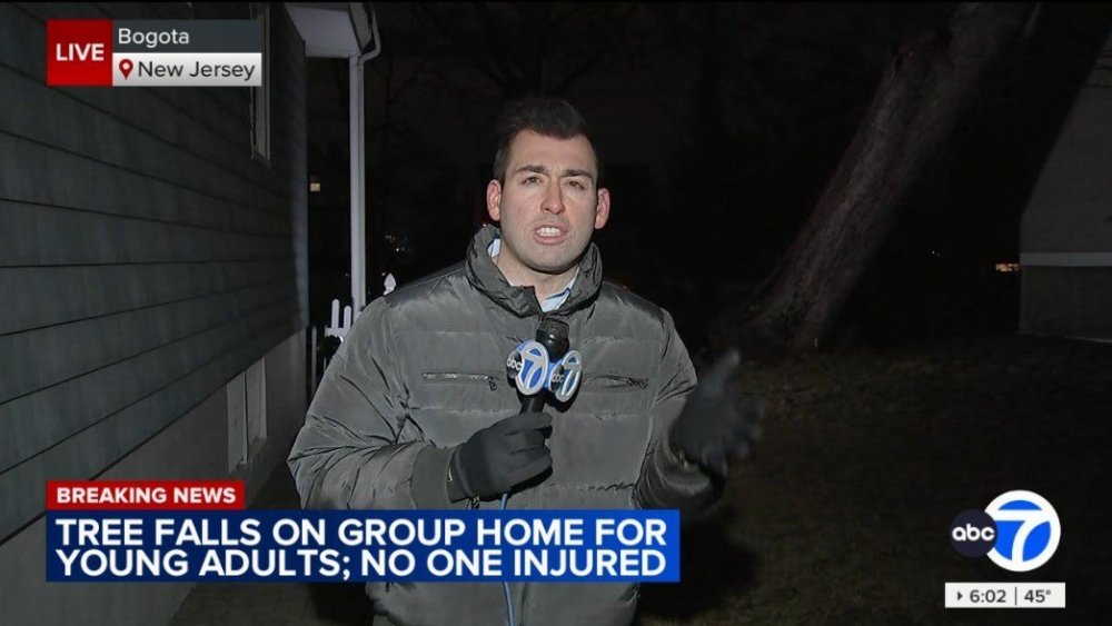
Sade is back on air today, filling in for Liz right now on the 4pm news. Lee gave her a quick welcome back at the top of the show as she tossed to him for a report on the upcoming storm.2 points
-
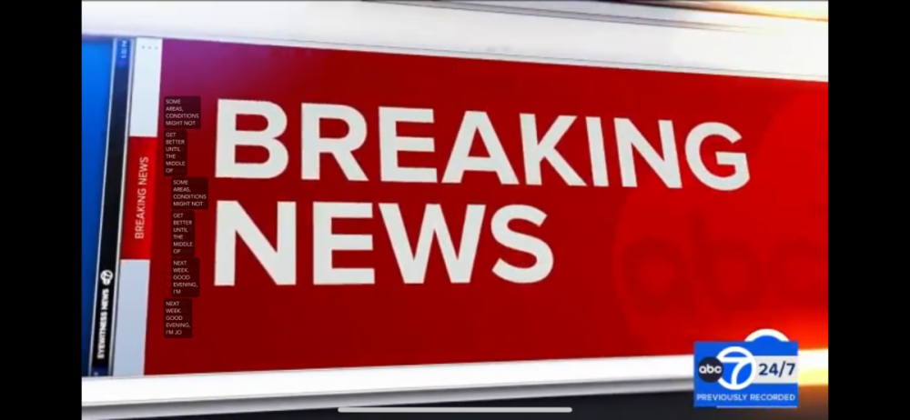
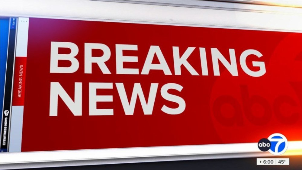
So they got rid of: the Twitter/X handle for each anchor/reporter. web and social media info at the close of the newscast.2 points
-
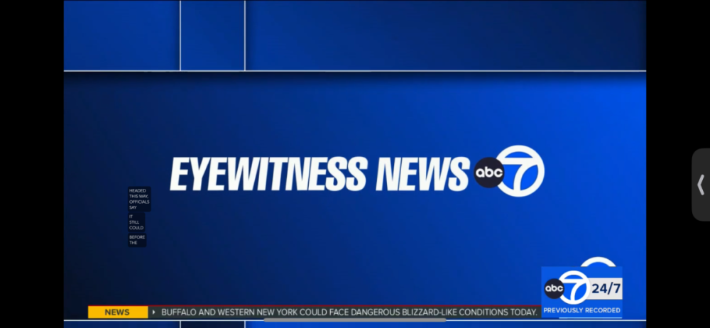
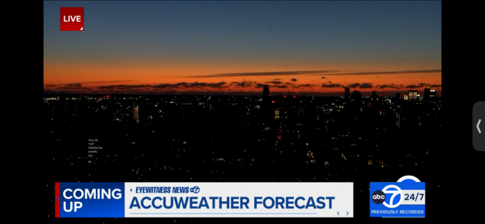
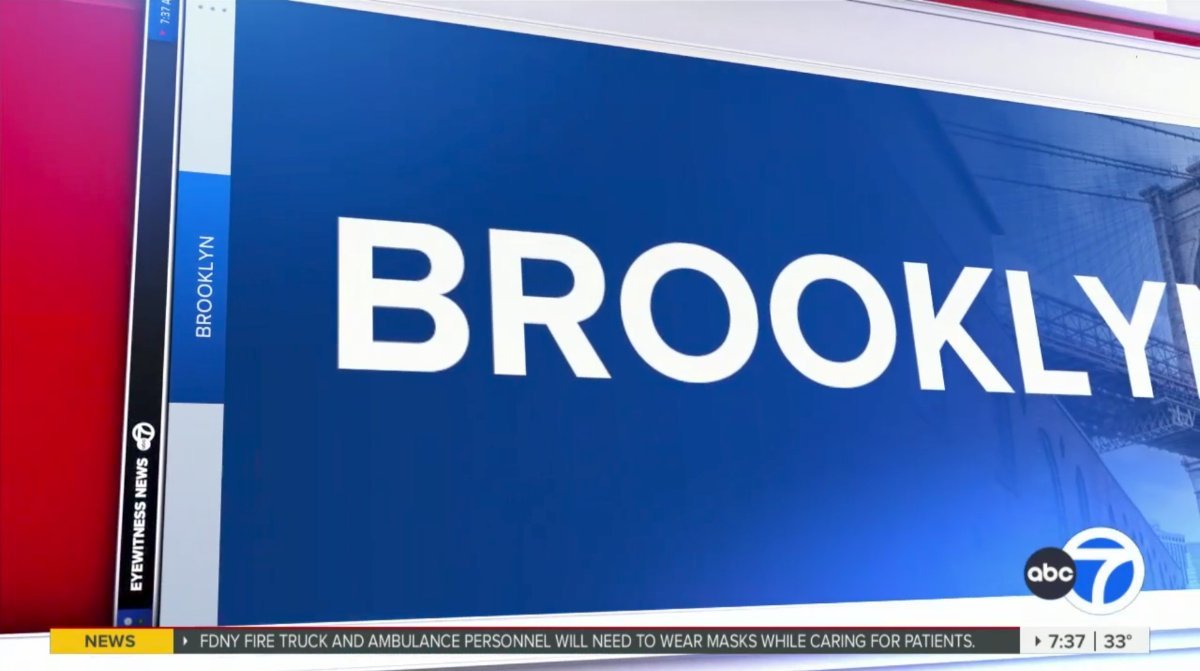
Have they also updated the skyline backgrop? It seems like it occupies the entire frame now rather the borders of the monitor being visible. The skyline image also seems higher quality. SB: Even though journalistic quality is what matters most, when a newscast's presentation (including it's on air appearance) is just as good, it makes me want to tune in more. Good presentation aids substance.2 points
-
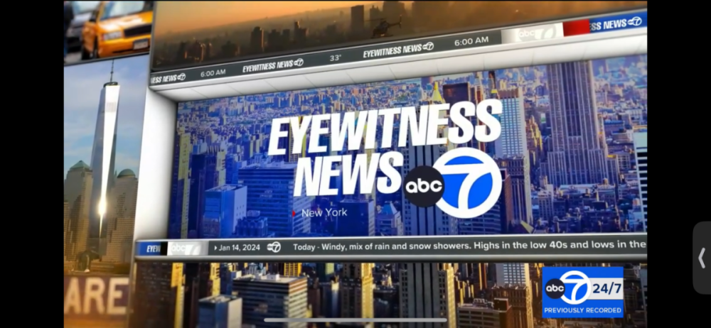
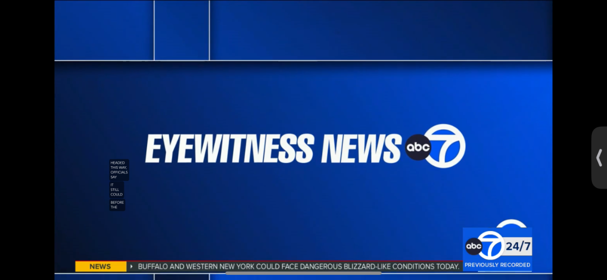
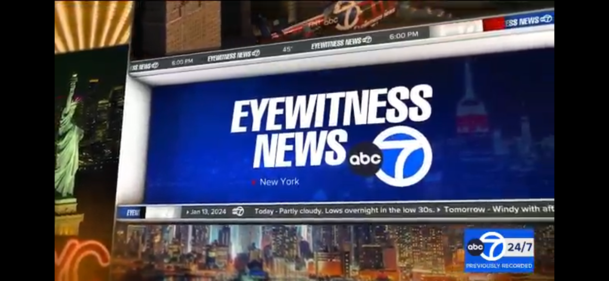
Overall, this is a great package and super refreshing for WABC. What a fantastic improvement from the downgraded package they launched in 2016 and it's finally put to bed today after nearly 8 years. So it's really exciting to see this new look for them! They still kept the Eyewitness News Signature music package though (It dates back to September 1999) Kept it simple with the music. Same cuts they've been using since 1999. The intro's bumper has a bit of an altered sound for the opening teases. The open music sequence is much better than WLS. Let's see how the West Coast will follow suit. Overall I think WABC is a contender and I think they take the crown for the best overall O&O Graphics. The set looks gorgeous as well. The change in the backdrop is refreshing. Makes the set look new again! Anyway, this upgrade will be sufficient till they move to their new locations in Hudson Square Downtown in 2025.2 points
-
Oh my God this is soooooooooooooooooooooooooooooooooooo much better than that crap they had2 points
-
The FCC has issued a $150,000 fine against WPIX owner Mission Broadcasting over the station's carriage dispute with Comcast, which filed a complaint against Mission concerning its de facto control by Nexstar and its involvement in carriage deals involving Mission shortly before the dispute was resolved in December 2022.1 point
-
The lighter shade of Sky Blue KABC uses kind of didn’t age well. KGO’s was more neutral with the Royal Blue look. music wise, I wonder if KGO will revert back to the original opening theme pre 2020 pandemic or still stick with the “breaking news” theme which became the main theme during the pandemic.1 point
-
Unless the program guide on FiOS is wrong, they're dropping the 4-4:30am segment of Today in New York and will start at 4:30 like everyone else (except WPIX). It shows up for Monday (probably an error), but is showing Early Today after that.1 point
-
Yep the cityscape backdrops on set have been updated too.1 point
-
It’s all good. WWJ seems to be making some changes behind the scenes and are hiring more people. One of the anchors who just left (Jeff Skversky) said the station’s numbers were lot better than what was expected. The info I got definitely backs that up. They are definitely looking for a new sports anchor.1 point
-
Yeah on this id rather see GMA update their gfx away from the heavy blue and yellow look.1 point
-
Agreed! The ABC7 LA and Bay Area’s current looks aren’t too bad either and happy that my flagship station here in NY can look and feel like the #1 station at last! I got some dayside captures of the new graphics! RPReplay_Final1705237193.mov


 1 point
 -
Finally the #1 station can start looking like a number one station. Though I prefer the KGO/KABC look, this is far better than anything WABC has had in the last 15 years.
 1 point
 -
Loving ABC7 New York’s new graphics….AT LAST! Feeling sad about CVD’s voice though, I know he’s up there in age and all but I know it’s not the same and they may replace him with someone else, what a long run since at least the 90s! Here’s my own captures!


 1 point
 -
It's WABC's turn


 1 point


This leaderboard is set to Chicago/GMT-05:00