
Leaderboard


Popular Content
Showing content with the highest reputation on 12/03/19 in all areas
-
Hey guys, we don’t need you to constantly rehash complaints with the package as a whole. However if it’s a station specific one feel free and feel free to post how they evolve locally.4 points
-
I do like the music.3 points
-
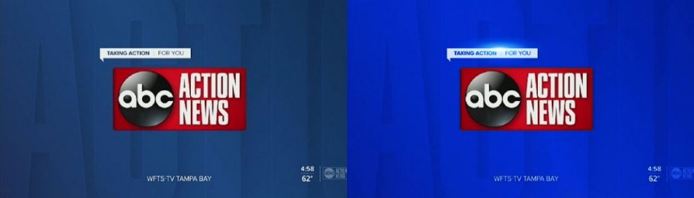
Now that we've seen it on a bigger-market station (WFTS), I can safely say it's still meh. The ideas are there and I do like the still designs. However, the animations are STILL pretty lame, especially for the market size.3 points
-
No way that's going to last long term. Moving the show to DC was clearly all about Norah.2 points
-
Not related to the graphics at all... but I just have to laugh at the idea of temps in the 50s and 60s requiring "boots and heavier coats," not to mention space heaters "to stay warm." Sorry for the slight tangent.2 points
-
I predict that a replacement will be named just prior to November 2020 sweeps.2 points
-
In this 1982 clip, Al Primo, the inventor of the Eyewitness News format, talks to CNN about his consulting work and the makeover of WBZ. This is an old YouTube upload, but if you haven't seen it, it's worth watching: For an in-depth interview with Primo focusing on his WABC work, see Ron Powers' The Newscasters: The News Business as Show Business (1977).2 points
-
Amen to that!2 points
-
Aesthetically, it's the nicest set they've had since...well, the last Washington set. I wish it didn't give such a CNN / FOX O&O feel, but that's sort of to be expected with the new EP coming from the Situation Room. I hope they find good use for those floor panels. Visually, it's the most polished look since the Couric era. They really could have put their money where their mouth is and led with politics tonight if that's the whole reason to set up shop there. A little disappointed it was weather instead.2 points
-
Everyone here is complaining about how awful this looks, but I bet if this had debuted in Europe it'd be hailed as revolutionary.2 points
-
KABC's full screens are everything Scripps' look is trying (and failing) to be.
 1 point
 -
I see Scripps is standardizing their ABC stations to have their morning news named "Good Morning (insert city/market here)." Except that they can't do that in Phoenix because KTVK's morning show has been "Good Morning Arizona" for 25 years.1 point
-
Some of the stations are going to look awful with that design. They might want to redesign the logos for the Montana stations, for example.1 point
-
It's actually more of a compliment than a compliant. WFTS' music choices do help mask how deliberate the graphics are, so kudos for that.1 point
-
Roseanne posted that Marissa is doing PR and was there with a guest who was on GDC.1 point
-
I’ve been told that the EP will likely be in DC but most of the crew will be back in NY.1 point
-
The full-screens desperately need more variety of text weights, particularly for the title.1 point
-
I just threw this together to see what a brighter/deeper blue would do. Looks better to my eyes. Plus a one lens-flair for kicks.
 1 point
 -
I think it maybe wouldn't look so bad had they not picked such a dull shade of blue. Something a little brighter would probably make it look less pedestrian.1 point
-
I wonder if the new CBSEN is using a control room in Washington, DC, or if they are sending everything back to one of the control rooms in New York.1 point
-
I like the package. But my big dislike is the line above the L3. But still. Simple. Modern. Minimalistic. But I still think Blue is not the only color of this. — Matt1 point
-
WJAC celebrates its 35th in 1984:1 point
-
Well, whenever this mess hits Cleveland, at least it will look better than the garbage WKYC is putting out. They desperately need a Tegna-vention.....1 point
-
Which is why I think that the bug needs to have a background that matches the L3, instead of no background at all...1 point
-
The studio looks nice. The graphics are a nice update from the super plain look that debuted a few months ago, though it still feels a bit on the cartoonish side to me. Strange that the old lower-third banners appeared sometimes, including for the top story. (That has to be a mistake, right?) I still hate the show's logo taking up a bar on the bottom of the screen. They had this for Jeff Glor but then switched to a box on the left. But why is this necessary at all? Neither ABC nor NBC has anything like this in the evening. The opening theme still feels lost to me. Sounds almost like a weak close, not an open. But overall, an upgrade from a visual perspective. Let's see if they can take advantage of being in D.C., put on a solid broadcast, and earn the trust of new viewers. I'm interested to see if the special report graphics are updated. I imagine we'll see that on Wednesday.1 point
-
Here's the open.1 point
-
They should get rid of the white bar at the bottom of the screen. Or make it blue. Kinda distracting. Thought the close was kind of weird with the camera moving upward into the rafters (?) or whatever above the studio.1 point
-
Part of the problem here is that Scripps doesn't want to do any of the things mentioned but yet they want to force stations to use a package that is just... ok. It's not great but it's just ok. I think Scripps can still do better since remember this is DMA #112 that we're discussing about here, it can still improve if that's truly what Scripps wants to do.1 point
-
Adding more things to this. I’m getting ready to work at an CBS O&O KTVT 11 Dallas/ Fort Worth. They are preparing for these new graphics and from what I’m hearing a possible new set.1 point
-
Scripps' hub was stronger when it was just the original stations. They've spread themselves too thin with all the acquisitions, and it shows. I'm sure one reason they chose to go with a basic design was the long render times they had with the Renderon package. It would take them hours to render one 5 second animation. That might work when you have 12 stations, but when you have 60 of them, that doesn't scale well. If they were sticking with the Renderon package, it might literally take weeks of nonstop rendering to do all the station-specific graphics (opens, weather opens, etc) for the 8 Tribune stations they just picked up. This package was designed to scale quickly. It wouldn't surprise me if a lot of this package (such as the interstitial graphics) is built in Viz (and/or Chyron because apparently that's sticking around now) and deploying it only involves swapping out a few layers in After Effects for opens. These opens would take a few minutes to render on a low-end PC. That's really another reason 3D is falling out of favor. It's tens of thousands of dollars of additional expenses when you factor in the need for expensive software licenses and render clusters, for what? Some shiny graphics that have fallen out of favor?1 point
-
Dude, this is in-house. As I know, and maybe we all should, Scripps has a weak internal design hub. They built this themselves and spent very little money on it. I'm not surprised that it's so basic because the concept is basic. As Scott Jones posted, Scripps is hit or miss with employment. I would imagine that large components of that are with regard to station and infrastructure investment and brand development. Scripps is way too focused on acquisition and aligning infrastructure at this time then anything else.1 point
-
You really haven’t been able to say much of anything besides bash things... I just did everything when looking at this carefully including stand on my head and I still can’t figure out what sort of irony you could possibly mean... As to the graphic.. I kind of like that shade of blue. Design wise it’s about what one would expect. Notice that doesn’t have the text message tab on top of the graphic.. it’s just a box and it looks good that way.1 point
-
You shouldn't have to take the station off the air (or get knocked off the air) with a little proper planning. Don't Try This At Home or Without proper Adult Supervision. Pretty simple actually... Your video,audio and data links all (presumably) have active back-up paths and circuits, that are used for maintenance or emergencies.. They are extra channels or spare "pipelines". On the big day, all you do is switch to the back-up circuits while you shut down the "main feeds" and establish and test the new signals. Once you are happy with the new signals...you just switch back from the back-up line to the main lines. ...and since you did a secret "test of the test" a few hours or days before...you are certain all will be fine once it's all "official". Practice Safe Engineering for a Green Planet.1 point
-
Was watching KMGH to get my opinion since they don't have the new graphics yet., to be honest it's both good and bad. On one hand the new graphics are more tolerable and less flashy. I have never been a fan of sensationalist imagery and the outgoing graphics had for years contributed to my opinion of Denver7 news as a sensory assault, and it is for the best that those graphics go away. On the other other hand the new graphics come off looking cold and I don't think they will succeed in turning heads. It feels like Scripps wants it's stations to approach audiences with a softer yet more serious look that for one thing will not change opinions of the stations that really try their best, and at the same time do nothing for stations that are not performing good. Ultimately, I don't think it's the graphics but the newscasts themselves that have to be convincing.1 point
-
the graphics in action I don't like the "comment box" at all in the open It's placement is random. I also don't like the use of the comment box during the newscast either. A simple white rectangle would have been fine. I also don't like the font they are using overall this package is a good starting point. hopefully they can make some improvements before it's wider rollout1 point
-
We don't EVER talk about that travesty.1 point
-
I'll take blue and flat any day. That is a fantastic package. Drop the text crawl-like thing over the L3s, and it's perfect. I don't care if it looks Tegna-like or whatever, I'm just happy the last package will finally bite the dust.1 point
-
That voiceover is annoying. “LET’S GET YOUR DAY STARTED!”0 points


.thumb.png.20cbae3777de7f140153442a1bb805e7.png)


b.thumb.png.b658c90e4e56cb08f2e8ba3195bb9da9.png)


This leaderboard is set to Chicago/GMT-05:00