
Leaderboard


b.thumb.png.b658c90e4e56cb08f2e8ba3195bb9da9.png)
Popular Content
Showing content with the highest reputation on 06/01/23 in all areas
-
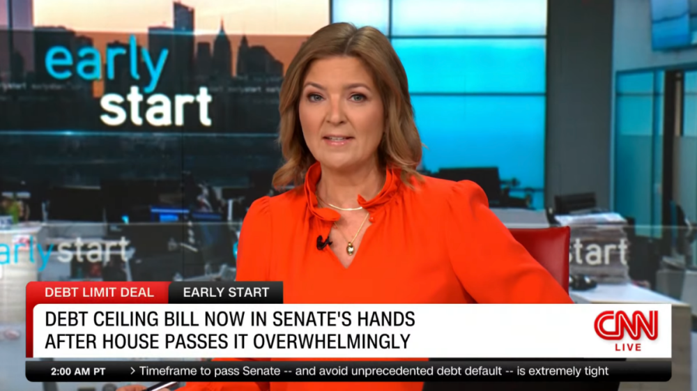
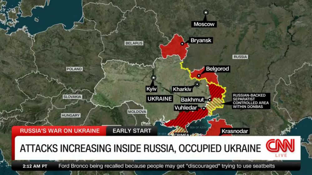
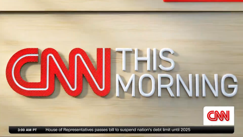
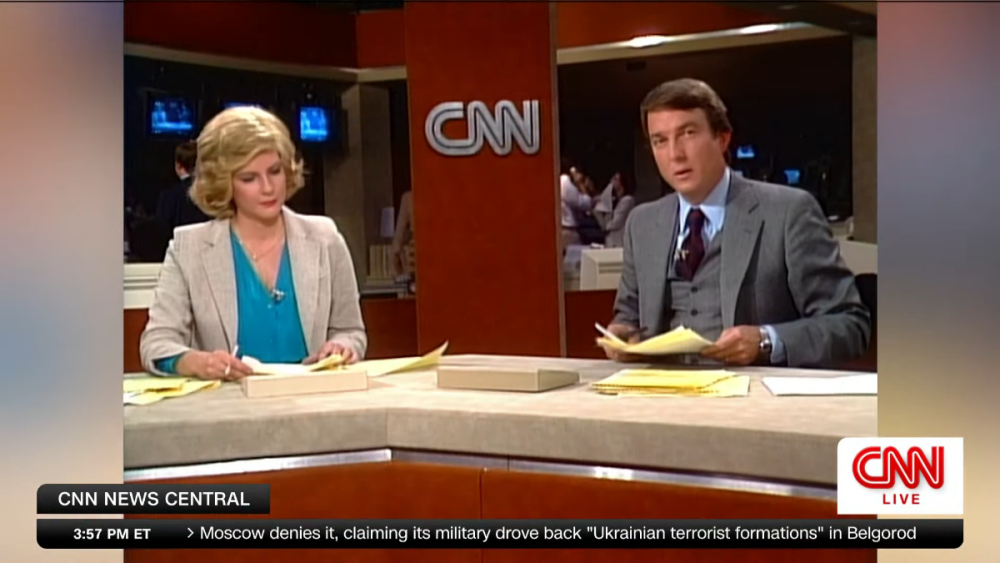
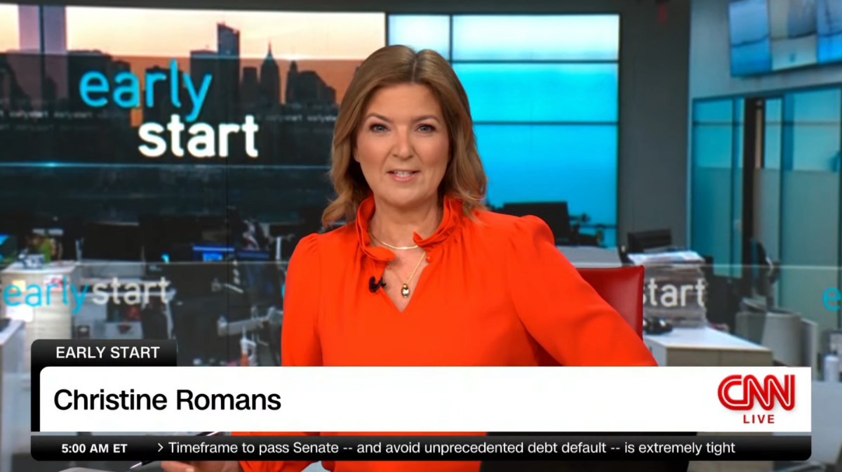
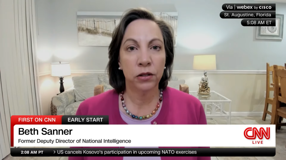
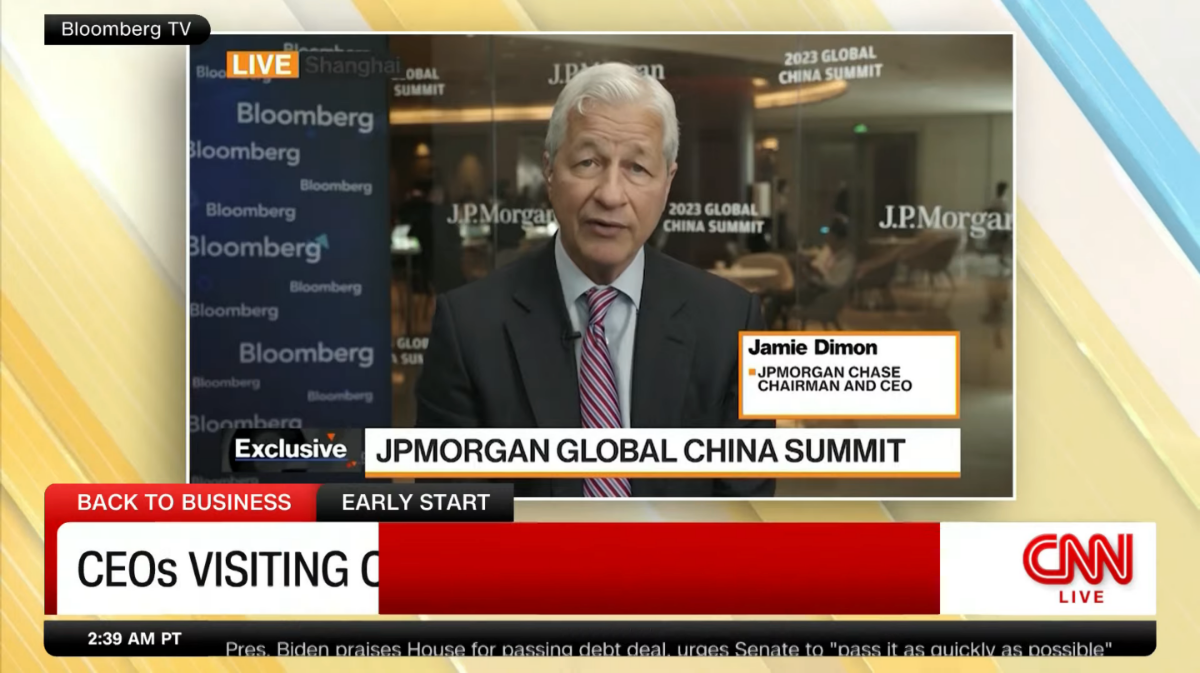
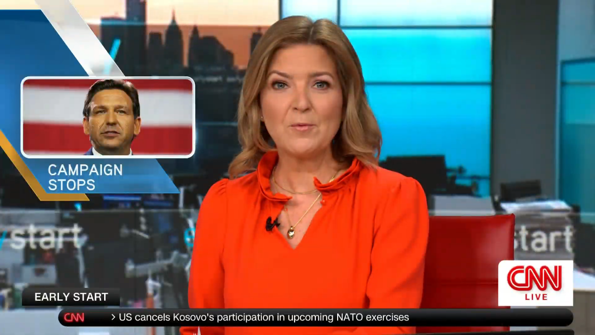
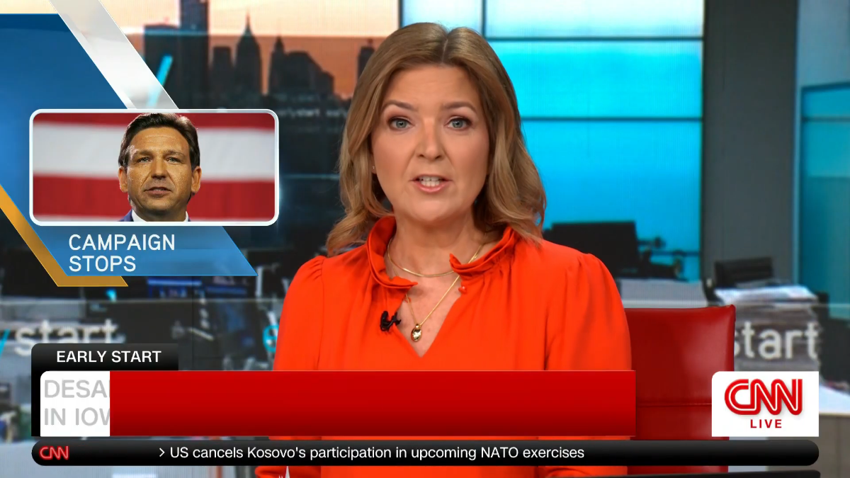
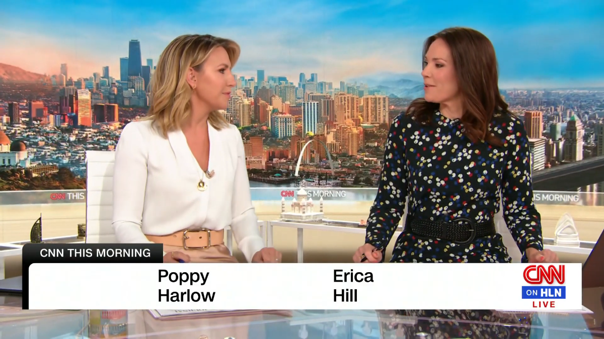
Looks like CNN is debuting their updated graphics (lower thirds) this morning. Pretty underwhelming in my opinion. Not really liking the rounded/bubble corner look or the gradients. Seems cartoonish. The time has been moved to the left side of the ticker and show name to a tab above the L3. There is a red wipe used to animate them on or between changes. I do like the name supers. So far all names have been full size and not shared with a headline.

 7 points
 -
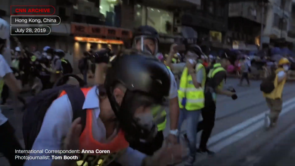
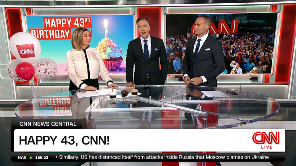
A few more extra nerdy observations... They seem to rarely use it but they still have the two-sentence lower-third. I wish they would use it more, otherwise it feels like there is a lot of wasted white space. The space looks extra wasted when the all-caps headline is long. In the old look, the text would stay the same height but squish to fit on the box, sometimes looking pretty ridiculous. Now the text is resized. (Also, the upper graphics look especially bad, in my opinion, when all three "bubbles" are there.) The the flipper first starts up, a CNN logo appears under the main CNN bug, then quickly moves left before being replaced by the time/stocks. The flipper is also fully rounded on both sides. The time seems to be an overlay instead of part of the flipper. The CNN logo slides lower in the bug when the "Live" is not present. This is how the HLN simulcast looked (including no flipper, at least for the few seconds I checked -- not sure if this was how they did it before today): Just like the previous look, the stock ticker includes an up/down arrow in addition to a +/- icon. It's redundant (and you could actually argue that it is inaccurate when the index is down -- it's like a double negative). They have new promo/IDs showcasing the "CNN Archive." Nothing fancy, no special animations , no music, no voiceover. Just a few seconds of raw video of a CNN correspondent at some event, with a "This is CNN" graphic at the end. Reminds me somewhat of the "This Is Who We Are" moments on MSNBC, except those are often recent lighthearted moments from live TV, often involving studio clips. CNN's all seem to be much more serious. In one, I saw Nic Robertson talking to his photographer while waiting to go live in Russia in February 2022 telling her not to get arrested if he does. I think I noticed another one as far back as 2012 or 2013. (The 5-second IDs with various correspondents saying "I'm [name] in [location], and this is CNN" have not gone away.) Also, today is CNN's 43rd birthday. They marked the anniversary and CNN's moving out of CNN Center right before 4 p.m. (Today's new graphics on top of the very first CNN newscast.) Thank you for indulging me.


 3 points
 -
KTRK has always had different pairs anchors for different weeknight broadcasts aside from 6&10pm. Years ago, Erik Barajas and Illona Carson used to anchor Eyewitness News at 4pm, Melanie and Art Rascon anchored Live at 5, Dave Ward and Gina Gaston anchored the 6&10pm. They broke EWN at 6 into two half hours as a stepping stone to push Dave Ward out, which was a huge mistake because Dave built that station to what it was. Brhe Berry left Channel 13 months ago. The station isn't bloated. In fact compared to a few years ago, is grossly understaffed and steaming stretches the station too thin. They don't have an investigative reporter, or a full time sports reporter other than the Eyewitness Sports director, they don't have a morning traffic anchor, Action 13 reporter, or 13's HealthCheck reporter either. They skip the sports segment at 6&10pm all the time now after the station forced Bob Slovak out.2 points
-
Here's a collection of most of the new "This is CNN" promos. I think there might be some CNNI-specific ones that aren't on here. https://www.cnncreativemarketing.com/cnn-uncut/#open-overlay These are fantastic – CNN at its best. With this ad campaign, I can look past the pretty bland and underwhelming update of their chyrons.2 points
-
Yeah, MLB clearly had well-founded contingency plans for this scenario, and it’s impressive that they were able to put something that polished on the air in such a short time. Honestly, even if the Padres find a permanent OTA/cable partner, I could see MLB continuing to produce the games.2 points
-
The dumping of The CW, IMO, may be why KMAX may be holding off on any graphics changes to Good Day for now.2 points
-
There are some people on TVNT's UK counterpart that have been complaining that these new graphics are ugly and that the BBC could make something better. I personally don't mind the new graphics; they're clean and have some depth to them from the gradients.2 points
-
The surrounding animations around the standard MLBN graphics set for the Padres sure seem pretty easy to adapt for any other team. Guessing MLB made a quick and dirty set to have ready and perhaps something a bit more bespoke would be rolled out next season. Maybe with a full-on MLBN revamp that’s needed, IMO.2 points
-
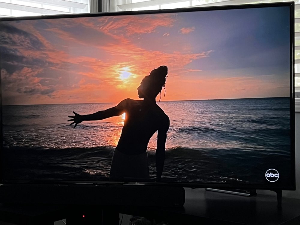
Like tonight's documentary, other series, and most WWoD movies, content that first debuted on Hulu or Disney+ gets the small ABC bug. It's not permanent, at least not for now.2 points
-
I actually noticed it last week when they were airing “Shang-Chi”; I figured it was a one-off but I guess not I think it’s an improvement; the old bug was far too big imo and I found it distracting. People watch TV to see the programs, not to look at the bug.2 points
-
Considering the path the other CBS O&Os have gone, call letters in a box is probably more likely than not. It would easily slot into any CBS News (Local Name) graphics set.2 points
-
Told yall.1 point
-
Now that you point out the comparison, I can see two positives. The ticker looks good, especially because it isn’t just a constant crawl of doom anymore. Also, I appreciate the fact that they’re no longer putting every damn headline in all caps. It still looks really outdated to me, though, and I think they could’ve done a far better job than they did.1 point
-
I believe this is still that typeface, just a thinner, narrower weight. There's some spacing issues to me, especially when you go to the two line identifier, that make things look a little TOO thin. But put it next to the old look, and I'd have to say the new look is cleaner:1 point
-
You could honestly stop right there. The new graphics look about as cheap as David Zaslav himself. I’m not gonna lie; I think the 2011 graphics look far better than this. Granted, I am glad that CNN’s actual content has shifted to the center, but it’s still not all that watchable for me. A new set of graphics (and poorly designed ones, at that) doesn’t change that they’re often just as sensationalist as every other American cable news channel.1 point
-
I'm sure someone's fiancé does.1 point
-
Asking for a friend… doesn’t anybody proofread anything or understand what the edit button does?1 point
-
Ami late to the game on this? Or did the ABC logo bug just get smaller?
 1 point
 -
Well, this is interesting. Tonight they're trying something totally different in the 10pm ET and later hours. Instead of the normal Fox Weather @ Night format with tons of pre-recorded interviews and features, tonight they are doing a full nationwide weather synopsis for the full half hour, hosted by Kelly Costa in Orlando (guess the Orlando studio isn't dead after all). This is reminiscent of the overnight content that TWC used to do back in the 90s and early 00s. No interviews, no features - just a constant in-depth examination of the weather. I really hope they keep this up. Best nighttime format they've tried to date.1 point
-
There’s some clarity but then not really. Why Erica Simon and not one of the 4 anchors you already have in the afternoon block? Melanie, Elissa, Mayra and Briana are all right there and instead you’re bringing in a 5th anchor. I’m not understanding management at KTRK. The weekend evenings slots are the only ones that make sense, everything else from mornings to night are in chaos. Travis is advertised as part of the 10pm team but it’s anyone guess what they’re doing up there these days. Nearly every time I’ve been home to see 13 there’s an anchor / weather person out of place and on another newscast than the one they’re formally assigned.1 point
-
That's just dumb, a graphics package for weather that completely feels out of place considering all of ABC O&O graphics1 point
-
Another year... No change. Just sayin....1 point
-
Personally really liked the WLS graphics of the last several years, really easy to read from couch distance, nice dimension to them. 'Instant classic.' I know others prefer the flat mobile / tablet screen look but it's not my thing. The blurred skyline background is pretty though. Reminds me of the KTVU late 90s look.1 point
-
Who wants an L3 that fits more words in it?!?! Who? That seems to be the big change out of this; more wordy L3s, which this seems to be designed for (they were bad in the old package...and this now looks even worse). I know cable news is trending older and these graphics seem to now be designed as a mobile-first experience, along with being designed to be stripped down for FAST experiences, but the only people that like these graphics are political spokespeople who can have CNN crunch even more inaneness onto the screen. Glad the ticker is gone though; remember they did have a really nice flipper back in 2013, but Zucker had it removed on his day one for the ticker because he was that much of an egomaniac. It has to flash to prevent screen burn-in, which I can predict will be now really obvious for the old package on public TVs that never switch off CNN.0 points
-
Wow these are awful. their idea of re-branding is let's just add rounded corners to the existing graphics and thin the typeface. Based on the CNN plu graphics CNN can do better.0 points
-
"More on that story just as soon as this logo gets out of my way." This makes me wish the main part of the L3 was in white-on-red.0 points
-
I would have eliminated the ticker all together or at the very least use it for breaking news stories only. I don't like the open space above the ticker/time and would rather that everything is connection. The flashing 'live' is unnecessary. They presented the new graphics (or the L3s at least) as something new/unique, but what we got isn't everything special. Overall, the new graphics are okay. I doubt whatever happens (graphics-wise) during breaking news will be revolutionary in any sense whatsoever.0 points
-
First confirmed casualty: the Padres.0 points
-
It's been on billboards for weeks, but the new news logo has made it to promos.0 points
-
I think he was referring to the logo at the end. A pretty generic logo IMO, but that's apparently what they're going for this September. I expect the logos for the other seven stations to look more or less the same.0 points
-
This chart makes me wonder if WABC or WPVI or WTVD will start a 3pm newscast with Rachael Ray ending and vacating the 2pm spot (GH would move to 2pm).0 points
-
WPVI, 6ABC in Philly has updated their weather graphics to the new look.0 points


This leaderboard is set to Chicago/GMT-05:00