ATLNewsExpert
-
Posts
444 -
Joined
-
Last visited
-
Days Won
12
Content Type
Profiles
Forums
Articles
Everything posted by ATLNewsExpert
-
The Ever-Evolving Gray Graphics Situation...Thread
ATLNewsExpert replied to NEOMatrix's topic in Graphics
LOVE the ANS logo!! -
Ideally the best scenario would be to keep him at Evening News and simply give him a new co-anchor, now, who the heck could that be? No clue at this point. Would be nice for it to be a female though. Also, Bret has said on Megan Kelley I believe it was, that he is locked into a multi year contract with FOX and is happy where he is.
-
Just seen the article, looks like this event was the brain child of Bari, not a bad idea though to be honest. With Norah hosting it, makes sense it could have been a test. However the article then goes into mentioning Tony and Cecilia, but those seem more so wishes of the staff than actual potentials. Hypothetically if Norah does return as anchor, which, I wouldn't mind, I wonder what they would do visually, bring back Norah's last package, use the current package or modify it.
-
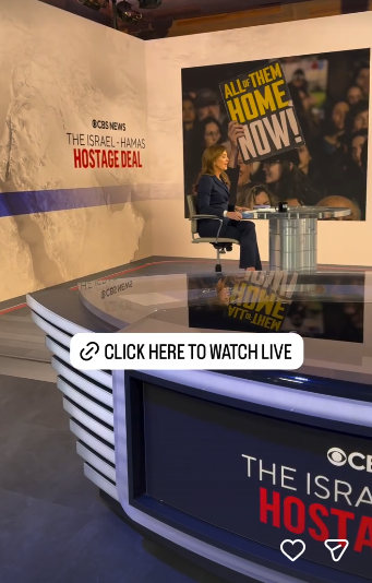
CBS is currently having a live event with two former Secretaries of State, Norah O'Donell hosting, and is using Studio 47. Just screenshot this from Norah's Insta story, but on the floor screen, they are using it to display a map of the Middle East, and the main screen has a triple box with the one protest image and Secretary's Clinton and Rice.
-
And, not to go off topic, but especially local outlet's sorry attempts. "Hey fellow kids! This show is about what's on social media, you like that, right?" Yet a lot of graphics or montages still have Google+....
-
Ok, this helps A LOT. Helps not make it feel so cluttered. With the weekday backgrounds, it makes me a little claustrophobic, too much going on.
-
Actually now that you mention it, the 12 graphics aged well, just maybe some light color adjustments and they're better then the current package.
-
Apologies for the bump, but I did watch a few episodes at first launch. At first, it was alright, had relevant discussions on topics like education and stuff (my school district was actually mentioned, had a former teacher on the show, and a statement) but soon it clearly became another political talking head.
-
I like it, but, I don't know, as of know, I prefer the old 57, prior to CTM leaving, more light aired, didn't feel cluttered. Interesting choice for the desk, it seems a little bulky, yet trying to be thin like the current and old CTM desks. Wonder where they made room for the green room as well, but I'll leave final judgement for Monday of course! Side note, I assume this means moving forward, election coverage will come 47. Considering it's basically a sound stage, CBS has an opportunity to basically be like South Korean stations and their election coverage, it's quite possible and I recommend anyone to do some research!
-
This exact video was already posted on this page.
-
Small world! Madeline Montgomery, who they snatched from WANF, interviewed her former co-worker from WANF, Samantha Louie, who is a contestant on Survivor this season.
-
Boris and Brianna are based in D.C! Matter of fact, if I remember correctly, most producing went back to Atlanta I believe, by order of Mark Thompson when CNN This Morning (as the main morning show) was cancelled.
-
This actually looks so much better, the lighting, wide shoots, etc! Any reason why they were in Atlanta?
-
I've already seen it, I'll post the video later, but it's a completely different set!
-
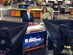
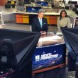
Could be wrong but the bottom image looks like they just took the headshots and put them together.
-
Watched the first newscast of CBS News Atlanta, not much to say, a newscast is a newscast is a newscast! For launch, they only had one reporter, Brian Unger, out in the field, at the CDC headquarters, though the shot was a bit fuzzy/blurry behind the reporter, is that a normal CBS thing? They also had a local feel-good story about skating, re-aired the CBS Mornings segment, sports, and a segment with anchor Jobina Fortson-Evans out in the city asking folks to fill in the blank "Atlanta is _______." Every other story and headline were read by Jobina, using the floor as a map of the Metro Atlanta area. On a personal note, when doing my High School newscast, filming time would only allow for one reporter, two if we were lucky, and every other story was read by our anchors. This newscast is what that felt like, on a larger scale. Interestingly, they are using a QR code for people to suggest story's and leave feedback, but only displayed it twice, super fast. Personally, I would've left it up the entire time in the L3, especially for these first few weeks, and causally mention it every once in a while, so there would be more time for people to scan it. On a staff note, they also have snatched Alexa Liacko from WAGA, and Madeline Montgomery from WANF, and WXIA veteran Sam Crenshaw remains for Sports, which he did for the station during it's CW69 News at 10/Atlanta NOW days, for some reason using his WXIA headshot, lol.
-
In France, an update on the 20h saga! Léa Salamé has been named the new anchor of 20h, and with her arrival, updated set, and updated graphics! In an interesting move, the headlines now come before the intro, obviously the norm here in the States, but it is usually the opposite in France. The new intro is an actual graphical intro, not involving the set, a departure for France 2, though it takes inspiration from the last intro's use of circles, and then exits gracefully to the shape of the desk. I'm also a fan of the graphic behind Salamé during the headlines.
-
Yep, I remember seeing her at TF1! She had a lot of experience, but I am happy to know she has landed somewhere at least for now!
-
Call me a sucker for modern-ism, but I like this, the "From Monday to Friday" ident gives off the vibes of clothing chains like American Eagle's marketing, and the box look of the ident is nice! That is such a shame, I always enjoyed her style, always professional, but never afraid to dig deep into politician's, which ultimately ended up being her downfall. Wished we could have someone like her in the U.S, but if the climate in France couldn't handle her, I doubt here could also.
-
United Kingdom ( Scotland specifically) STV, part of ITV, has debuted new sets for it's operations in Glasgow and Dundee (slight differences but overall the same) and new graphics!! Honestly, this might be the best looking newscast in the UK now, hope ITV proper follows suit, they still have the same graphics from 2013.
-
I know this might not happen, but what if they just made Maurice anchor of Evening News, and keep John as anchor of +?
-
Interesting note, I looked at the new WUPA schedule, it seems they are opting to air CBS Mornings +, but not CBS Evening News +. The noon, six, and 11 slots are filled in with Family Feud for the time being. Family Feud also airs at 7, which was already on the schedule. Tamron Hall is moving from WSB to WUPA, same time, at 3pm. I don't recall if anything has been said on what the newscast slots will be, but 4pm and 5pm are currently slated to be Judge Mathis and People's Court reruns. Jericka Duncan also wished the station luck during the final minutes of tonight's Weekend News.
-
This is kind of disappointing, on what world does Atlanta need an hour and a half of TBBT? Something smarter would have been to make the 6:00 an hour long, and move the weather show to 7:30, and then air an hour of LNL at 8. I personally would not complain if they go the WPLG route and have a ''world news'' newscast, possibly at 7 or 8?
-
According to LinkedIn, Matt Quinn was in charge of this, as well as the new CBS Evening News look, not sure if the latter was ever mentioned.
-
Very glad they did this, I loved the classic theme but the original cut just feels out of place now, so this definitely helps! Didn't realize the national operation got a new set! Looks good!!


.png)