ATLNewsExpert
-
Posts
444 -
Joined
-
Last visited
-
Days Won
12
Content Type
Profiles
Forums
Articles
Everything posted by ATLNewsExpert
-
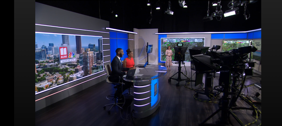
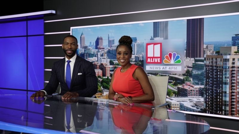
Some better pictures!
-
New set has debuted at 4pm, will get more pictures throughout the newscast.

-
Looks like it, all the intros, for all hours, are using TEGNA blue, the bug is now blue, and red is only being used for Breaking News. Honestly a shame in a market dominated by blue graphics, now WANF will be the only station using red as it's colors.
-
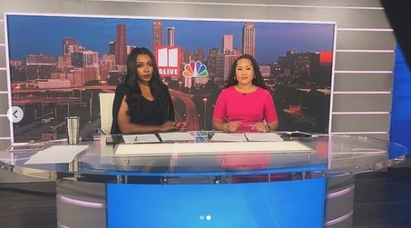
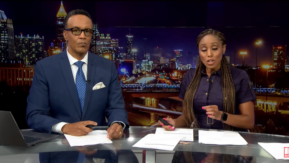
Taken from anchor Aisha Howard's Instagram during the cyber outage,
-
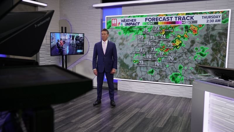
I think what would help is if those monitors in 47 would be on during the newscast, displaying various graphics, creating sort of a control room like look.
-
Not just the CBSEN set but the Washington newsroom looks amazing too, especially when they show the various angles of it! Honestly, now that you say it, CBS does have the best look of the big three as far as the main newscasts' go, having great graphics and a great set, not only that but using that set with many shots. WNT does not even use it's set, simply using that one OTS shot the entire time and the graphics are outdated. NN has alright graphics, not the best but better than WNT but 1A brings it down.

-
Here's a look at the new intro and how WXIA is using the updated TEGNA graphics, interesting cut of C-Clarity being used, I honestly wonder they are getting another cut, or does anyone already know of this cut? Also, from my contacts at the station, the new set will debut tomorrow, not sure when but when the set updates debuted a few years back, they revealed it in the morning.
-
Well beyond time they got a new set and I say this was well worth the wait! It matches Florida and Jacksonville well, it's not super edgy like WJAX or WFOX but it doesn't have to be. It's honestly refreshing in this market! I love the wood and warmness of it and how much it relies on other elements other than video walls and not just the same tired trends like graphics or repeating stuff but using woods, the logo on set, the bricks, the overhead, a different floor patterns. Very unique to see a curved video wall, and honestly, that might be the best part, it's something few newscasts have used here in the states local or national, and for a market like Jacksonville, I'm all for it! Hope WXIA will get something similar.
- 7 replies
-
- 2
-

-
- First Coast News
- Jacksonville
- (and 3 more)
-
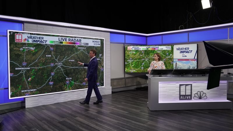
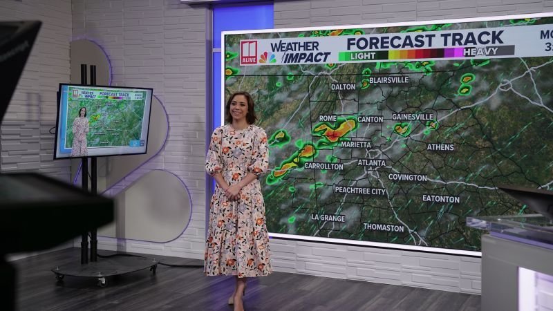
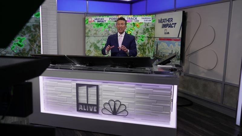
Looks like WXIA is rolling out the updated TEGNA graphics with preparations for the new set, dumping their tweaked version, and now using blue as the main color.
-
Honestly, a little riser in front of the curved wall on the WPLG set would help it like with TVNZ, maybe wood or black with a white border.
-
European done in all the wrong ways! Look at France 2's set, SVT Rapport, Yle Uutiset, TV2 Denmark have use similar ideas, big desks, curved walls, newsroom shots, and repeated colors, and pull it off 10 time better than this!
-
There's just something that I don't like about TV3 being used for GMA, it's just too dark!
-
Looks like one of those news set stock images my middle school used for a green screen, what the heck is that desk?
-
I kind of disagree. I do agree that most TEGNA station's have good sets but for some reason that has not happened with WXIA IMO and here's why, the outgoing set, technically, is over ten years old! The set premiered in 2013 with the USA Today graphics, and honestly, even though most on this forum were not fans of that look, I really liked it. Then in 2018 I think it was, the set was updated and got the TEGNA treatment of woods and bricks, carrying the same structure but swapped out, but on this set in particular, that look has always just looked off to me. (Examples of swaps, the bright lighting was replaced with dark lighting, black floor with wood floor, white column with decent sized glass logo replaced with brick wall with giant metal logo.) Side note: Pre covid, they used lots of shots of the newsroom, for those that don't know, the newsroom and set are in the same large space, and honestly, in hindsight, I really liked those. Then in 2022, the set was updated again, ditching the newsroom view all together. The area that was originally just a faded duratran in 2013 that became a series of panels in 2018 became home base and other pieces of the set were moved around.
-
But for WXIA, they just had an update around two years ago, which makes me think it's a new set. Plus, the Olympics is right around the corner.
-
Just now noticing but WXIA appears to be on a temporary set for the past week.
-
I think that started after Jim Lehrer's retirement, when Woodruff and the late Gwen Ifill succeeded him, not too long after the rebrand from just "The News Hour" to the "PBS NewsHour", still a few years before the 2015 set. I remember during Lehrer's last few years, even if the newscast had two anchors (Woodruff often co-anchored with Lehrer I believe), they would not be sitting at the same desk, one would be in one part of the set, while the other was on the opposite side, separated by a duratran, almost like to give the illusion that they were in seperate places. That started once the new set debuted, with the social's rebranding to "PBS News" as well, even the website. Honestly, it's about time, especially in this digital age, the news operation should not be limited to just an hour, and it honestly makes things confusing in my opinion, imagine if the big three done that. "This is a CBS Evening News with Norah O'Donnell Special Report, I'm Norah O'Donnell in the nation's capital"
-
The set is set? However it is, tonight's presidential debate on CNN, the first in American history to not be sponsored by the Commission on Presidential Debates as well as the first to be held this early is underway and will take place in Atlanta, at Techwood. It will also be carried by other networks, though CNN has put in place strict rules for this simulcast such as for the commercial breaks. Also it's sort of a full circle moment, as for the debate, the network is broadcasting from the garden of Techwood, right outside the building Ted Turner originally built for the network. The set.
-
The Ever-Evolving Gray Graphics Situation...Thread
ATLNewsExpert replied to NEOMatrix's topic in Graphics
You beat me to it! -
I love it! The last set was amazing at the time it debuted, but honestly, it aged quite a bit so it was time for a new one! It's simple, not that complicated, but I love it for that, and the colors and lighting all tie into together nicely. I see some inspiration from parts of the old set, and some from Europe, like the use of the main wall as a set extension (which is beautiful). My eyes at first did not know how to take the new logo but I think since it debuted, it's grown on me. The graphics are pretty stellar as well. I think I seen that this set will also become Washington Week's set as well, I wonder how they'll change it for WW. Their outgoing set was a beautiful set too, probably better than the News Hour set. Overall, I actually rank this as my second favorite of the main four evening newscasts' sets, behind the CBS Evening News set!
-
Hello everyone again, Well, this episode brings a wrap to the outgoing school year! It's been quite a ride, and we're already in next year mode, thinking of ways to improve and grow! Feedback is always welcome! I'll be back to this thread specifically once we return in August with hopefully one great product! Also, I got nowhere else to post it so also below is another concept of mine, this time for WXIA. 11 Alive Intro Concept - Made with Clipchamp.mp4
-
As part of a greater brand overhaul, NRK Norway has debuted new graphics for all of it's news programs, including flagship "Dagsrevyen". Notably, "Dagsrevyen" has more of a global feel with it's graphics, while other shows, such as "Ođđasat", with the same graphics have a more scanadvaian focus, a nice example of how the same identity can be translated between shows.
-
DW News has debuted new graphics, including a new thumbnail design (getting rid of the old serif font), and lower thirds, which seem to be leaning towards a deeper shade of blue then what the network has used in the past. Intro and in studio graphics are the same but those might change too, will watch over the coming days for any other changes.
-
HUGE NEWS TODAY. The two presumptive nominees for President have agreed to debate twice. The first will be on June 27th on CNN. This will be the first debate in American history to be before September as well as the first to not be held by the Commission of Presidential Debates, this will be a network EXCLUSIVE. https://www.cnn.com/2024/05/15/politics/joe-biden-debate/index.html
-
Hello everyone! Been a while since I posted about this but I am here to share our latest episode with you from our school newscast. Before Spring Break, it was our first year anniversary so we celebrated that with a new graphics package which you can see here (which debuted before break) and a new music package that debuted with this episode. All feedback is welcome as always!