ATLNewsExpert
-
Posts
444 -
Joined
-
Last visited
-
Days Won
12
Content Type
Profiles
Forums
Articles
Everything posted by ATLNewsExpert
-
Like this OTS for serve weather!

-
Just now for a "county by county" segment, they used a transition similar to this, so far, same other transitions and intro.
-
Massive downgrade
-
Was just about to say that WSB used this for the "WSB Tonight" open. They went mostly full package for this newscast. Used the completely new L3 teasers too. I actually like what they done for the L3's for "WSB Tonight", the main box is dark blue, with orange being the above box. Hopefully by the end of the week they'll switch to using the whole package for every newscast.
-
Not bad! Like the still Falcons transition WSB used today. Hope that transition animates nicely! Like that infographic here too! IMO from what we've seen this looks like Scripps News meets NewsNation.
-
Could you upload some screenshots or give your thoughts on the package?
-
Did they debut anything else but the lower thirds, OTS, and double box? Any new intro, transitions, etc or are they using a mish mash of this and their "old" package? If they did, have video?
-
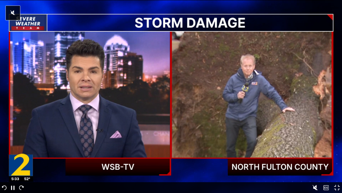
More observations. First here is the two name L3's without the "Action News" below each name. Also is it just me or does the background seem slightly updated, I could have swore the picture on the left did not use to be the highway, and although you can't see it in this picture, some boxes repeat themselves right on the bottom right behind the last row of "Channel 2 - Action News" on the very bottom of the panel.

-
These "diagonal boxes" on the main video monitor are new. Something similar was done on this wall before going on a report but it was with dark blue and yellow, and more flat.

-
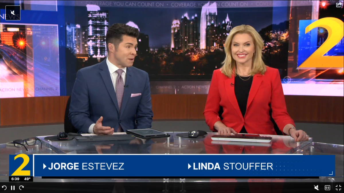
Looks like they listened to you! At the start of the 6pm newscast, Jorge and Linda's names were in the L3 without "Action News" at all! Really like the new info graphics actually, like below, the transitions to them are nice to, the space in white is preceded by a light blue box beside the topic picture. Observations. For the 4pm tease, they did not have the black box, but simply just the headline in the white/gray box, not half in half. The picture I quoted from myself was at 5pm, and they done this again at 6pm with the headline "Mayor controversy", Mayor in the white, Controversy in the black.

-
I think that was with the last package to on occasion. While I'm at it, the pre newscast teaser with lower thirds. Also for the self proclaimed "Cobb Bureau" and other counties so graced by the COX gods for such a branding, they still use those new out of place cards beside the bug, same with the "Serve Weather Team 2" logo.

-
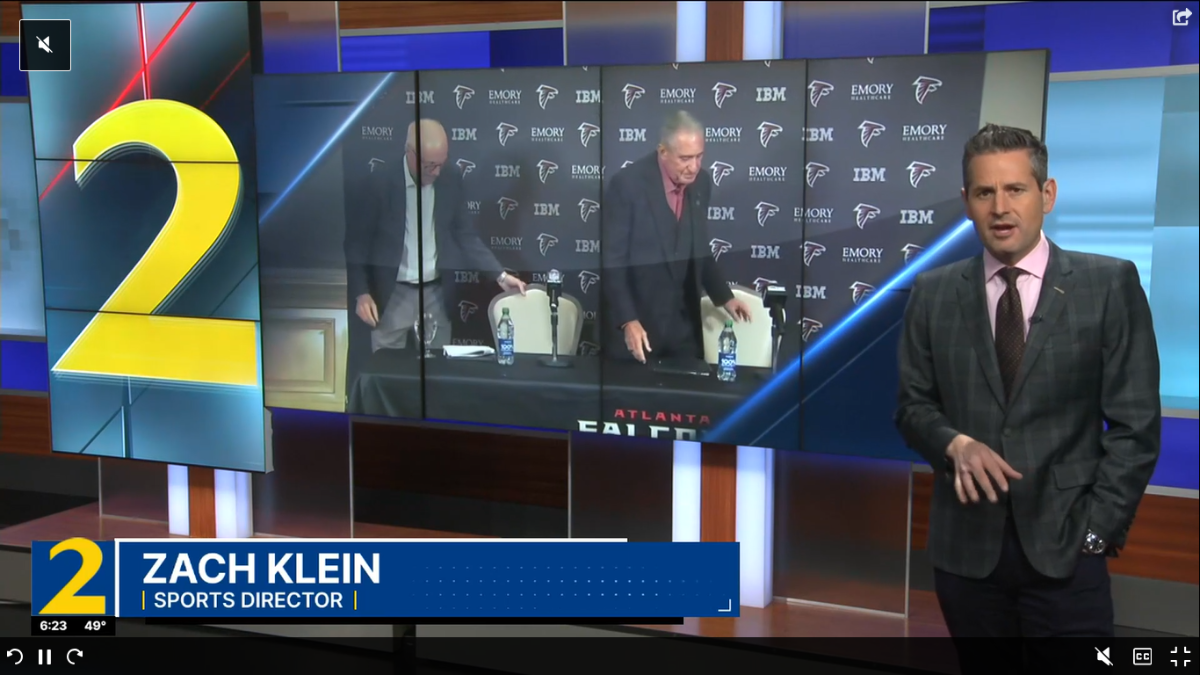
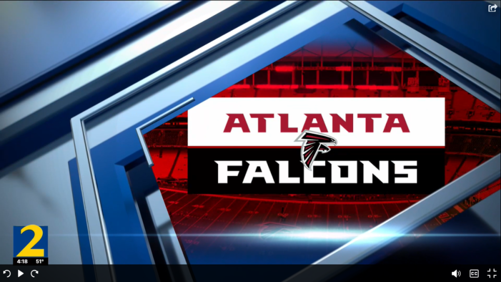
And here is that Falcon's transition. And here is the new OTS shot. And the new teaser graphics without L3's (they only use the L3's before each newscast, like in the last package. Also this is the first time, at least in my memory, that the time and temp bug has been on the left side, as it, every package since the launch of HD, has been on the right.


-
You spoke too soon! Scratch this y'all. No new intro. No new transitions. It's just a lower thirds update. Though there is an update to the teaser lower thirds, though those now make you think you're watching Atlanta News First...... Though funny enough, right before they done a quick live shot of the Falcon's manager's press conference they did have a new Falcon's transition, maybe this is just the first half of the launch and there will be new transitions based off that Falcons transition???? Here is the updated Double Box shot, there is also a new OTS graphic, as well as a new, cleaner version of that weird map graphic that they have used in some form for around 10 years, which is below as well.
-
I was actually on the fence on making that same observation in the original post!
-
Hallelujah! Thought this day would never come! WSB debuted new graphics at noon, ok well maybe not entirely new graphics, more like an update on their last package, which was an update from another package...... Regardless the main thing is things look a little different on air, this new update is very flat, no gradients actually, honestly so far, color me disappointed. Below are some screenshots of how it looks on air so far. Unsure what the new intro looks like, if there is a new one at all, we shall see at 4pm!


-
Apologizes for the month's bump but I wanted to document some observations. News Central, when debuted, was taking advantage of 19Z's massive space and video walls, a technique I really like and feel is a slow way to introduce more European way of presenting a newscast. However, at least over the past month and a half, maybe (likely ) more, I've watched, and ALL THREE HOURS both Morning and Afternoon were the exact same. John, Sara, Kate at a standing desk in the back of studio 19Z and they would be stationed there the entire show, with just four shots (one for each presenter and the background behind them and one to see everyone standing at the desk). For the afternoon, Brianna and Boris are sitting at a desk (I'm not sure which studio) and that's it, with the long video wall behind displaying a repeated image of the logo plastered on fake screens. If I just turned on the afternoon edition and seen the desk shot and didn't see any other shot (used only when there is a guest), I would be thinking that was a temporary set! In addition, all headlines, instead of the way both editions debuted, are now simply the topic image or video and the presenter's voice. I know this will only get "New management is the reason" comments but still, it's almost comical to me how a network can invest so heavily in a new brand, and publicize how much it would be innovative and visually presenting and then within months go back to exactly how "Newsroom". In addition might I add that it's so sad to see the entirety of CNN be summed up with a head in front of a backdrop with the camera just being an inch away from being too close for comfort, it's just so common of a shot for the network, especially primetime and now News Central. How hard would it be to just zoom that camera out a bit, and actually use those million dollar sets then just face+background and zoom out before commercials? And hey if not, with the way the network is wanting to cut costs, why not just forego those sets and they just do what we do for some shots for "Magnet Newsroom", print out a background, anchor stands in front of it, same effect
-
Hello everyone, here with our latest edition of "Magnet Newsroom", our election special for student council. Very excited we got Russ Spencer of WAGA to be our announcer for this coverage. In addition, why is the episode so long? We got an interview with our superintendent this week so glad we could get that out before the holiday season (he has never done a local news outlet interview, even when some particular instances arise in the district) and for our students, a special holiday message from all teachers/staff/admin. Very proud of this product, as it is the last episode we will do of 2023, our first year in existence, kind of brings everything full circle. All feedback is always welcome! Thank you so much? For now, I would say so. Because of all the work that goes into each episode, we can't do them live but regardless that's kind of what we're looking at. In addition, YouTube is the best way (for now) to ensure parents and families are able to see it. One of our major problem's we've encountered is increasing viewership as it's up to teacher's discretion on if they show it in class, and a bunch other factors.
-
Hello everyone, our latest edition of "Magnet Newsroom", we reintroduced the headlines segment, using a new transition and AR which I'm very pleased with and our very first on-sciences report, we hope to do this throughout the rest of the year with various students (preferably freshmen and sophomores) to find some potential successors for our current anchor team.
-
Double post First off, Three Newshub in New Zealand has debuted drastic new graphics (a departure from the flat graphics Newshub has used since becoming Newshub) and set updates, relying heavily on AR. This debuted shortly before the Nov 3rd election, this look being used for election coverage. Now, over in Italy, Rai's flagship newscast TG1, barley a year since debuting their new set and graphics (the first update in 8 years), they just introduced set updates (mainly the floor and lighting), a new intro, revised theme (same as the update last year but removing the bass drop), and slightly updating the rest of the graphics package.
-
Music I can somewhat understand but the graphics, seriously? I much prefer these to that tired 8 year old package!
-
WHO DESIGNED THESE? This is SOOO much better then The Source and NewsNight's graphics, and those are weekday PRIMETIME shows!
-
What's the problem that I sense everyone is having? I had to look back at pictures of the last set and this looks different, even if using the same elements, and looks MILES better, is more professional and modern looking in my opinion and is a nice way to have optimize your space, no matter how big or small.
-
WAGA meteorologist Ryan Beesly is leaving the industry. https://fb.watch/nQeY9258VV/
-
Hello everyone, Magnet Newsroom has launched, first a few things. 1) With the rebrand, we have moved officially into that spare room I mentioned, trying our best to create a decent set in it. In the coming weeks, we are wanting to 3D print our new logo, (The three hexagons in a box, a motif to the new CBS O&O logo designs and our school's official logo) and hang it up on that bare wall you see at the end, it is going to be huge! 2) We recognize two things, that their were MANY pronunciation errors in this edition and the lighting was TERRIBLE. We plan on purchasing some overhead lights to fix that. 3) With the new graphics, we also have a voiceover, Rebeckka Schram of WANF! Please fill free to leave any comments, questions, or suggestions as we continue experimenting around with our product!
-
Sorry to sound uninformed but when is Thompson starting again?