Jump to content

Leaderboard

Popular Content

Showing content with the highest reputation on 12/04/19 in all areas

  1. Not going to lie. I sat here waiting for images to load before I saw your note.
    6 points
  2. WJZ transitioned..... j/k it will be ages before they transition.
    5 points
  3. Calling news music packages "production music" and saying television design "peaked" because we don't like it is exactly the level headed analysis I would expect from TVNT.
    5 points
  4. i’m not going to make ANY friends here, but i’m gonna be the one to say it. well, i’ve already said it on the discord, but still - the package is growing on me. i kinda like it! i wish that it had a bit more motion to it (like the KABC package mentioned earlier) and fonts that have more of a presence but honestly? i see what they’re going for and i can kinda dig it. it definitely won’t be as flexible with existing station branding like the Renderon package is but... sometimes it feels like i’m the only one who wants to give this one a chance it took time for the tegna package to get appreciation for what it was too so...
    5 points
  5. And the Scripps music is pretty slow and it sounds non-descript and like production music. As a news music curator and composer, I'm very underwhelmed. SAM's production cuts have a stronger more sonic sound. This isn't that. Which is somewhat ironic given that ABC is developing a standardized package. This KABC look was developed in-house too.
    2 points
  6. Seems like someone's reading the itinerary on a cruise ship. Very utilitarian. Nothing more.
    2 points
  7. In terms of the old studio, Im all for fully utilizing a resouce but, why does CBS repeatedly use studio 57 for almost everything?
    2 points
  8. KABC's full screens are everything Scripps' look is trying (and failing) to be.
    2 points
  9. Hey guys, we don’t need you to constantly rehash complaints with the package as a whole. However if it’s a station specific one feel free and feel free to post how they evolve locally.
    2 points
  10. Studio just got upgrades to hold them til the network relocates, and new graphics might be coming.
    1 point
  11. There have been many other packages and I'll even throw in Inergy for good measure as one of those solid news music packages. This one, I'm not sure if I like it or not, there needs to be other cuts to it before I can actually give an honest opinion on it. So far Scripps is trying to (and failing) to make their music a carbon copy of the Weather Channel
    1 point
  12. I think everyone here wants the best for the Scripps stations. But if I see something that I know is not going to work (as I do with those gfx), I'm going to express that opinion. What's the point of expressing any opinion if you can't be honest about it? Also, criticizing others' ability to analyze just because they may have a different opinion than you doesn't help anything. I'll just leave it at that.
    1 point
  13. Nexstar graphics, and there a variety because of affiliation and station are 2x better than this. Nexstar graphics packages (and it varies based on station and affiliation) are 2x better than this.
    1 point
  14. Glad I wasn't the only one lol. KDKA uses WSI. They have The Weather Company logo on the backgroud of their weather computers...
    1 point
  15. you'll change your mind once i finish writing my essay about how the stretched helvetica WJZ graphics were the pinnacle of creativity in graphic design for broadcast media and literally everything that came after it is depressing and awful and on par with (gasp!) the WKYC rebrand!!!
    1 point
  16. Before he hit it big in Dallas, John McCaa was the weekend guy in Omaha.
    1 point
  17. What do you mean? The bulk of the team being in NY, or the show being in DC. Every studio CBS Broadcast Center is booked. The only place I think they could use to switch out sets would be using the CBS Sports Studio. They’ve used the studio before for a few of their town halls they did during sweeps. But the news division doesn’t have any other major studio space except for Studio 33 which I imagine is just a chroma key studio for 60 Minutes. Studio 45 which is half Inside Edition’s virtual set and half hard set for Sunday Morning which I don’t think they dare touching (aside from maybe painting and technological upgrades has it changed from the beginning). And Studio 57 is the bulk of their operations. There are also two studios converted into newsrooms - Studio 57 and Studio 47. The rest of the space is booked. 41 - The Mel Robins Show 42 - Last Week Tonight, Full Frontal with Samantha Bee, Desus & Mero 43 - CBS Sports 44 - CBS Sports Network 46 - WCBS/WLNY.
    1 point
  18. The Scripps closing logo has been updated to include the 4-note signature of the new theme.
    1 point
  19. Comparatively, Guardian is a modern success and Signature is a classic success.
    1 point
  20. It's actually more of a compliment than a compliant. WFTS' music choices do help mask how deliberate the graphics are, so kudos for that.
    1 point
  21. I’ve been told that the EP will likely be in DC but most of the crew will be back in NY.
    1 point
  22. They have been hiring for technical roles in DC, and there's always been a control room there, so it's safe to say at least a good chunk of the production is coming from DC.
    1 point
  23. I'm still utterly confused why Scripps would ever sign off on these graphics. If someone at Scripps is reading this, hire me and I'll make you a better gfx pkg using PowerPoint! But seriously, these gfx are beyond awful. If I am watching a newscast, I don't want boring and meh for graphics. I want gfx that get your attention and draw you into the story.
    1 point
  24. I just threw this together to see what a brighter/deeper blue would do. Looks better to my eyes. Plus a one lens-flair for kicks.
    1 point
  25. I think the new studio looks really good. I’m thankfully they are back to using monitor OTS instead of graphics! I always felt the graphic ones were very cheap looking. I’m also glad they are moving around to use different parts of the studio and standing sometimes unlike WNT. I agree the graphics are trending more towards WNT now with the movement and such.
    1 point
  26. I think that was kind of the point, and I am honestly very excited!
    1 point
  27. Aesthetically, it's the nicest set they've had since...well, the last Washington set. I wish it didn't give such a CNN / FOX O&O feel, but that's sort of to be expected with the new EP coming from the Situation Room. I hope they find good use for those floor panels. Visually, it's the most polished look since the Couric era. They really could have put their money where their mouth is and led with politics tonight if that's the whole reason to set up shop there. A little disappointed it was weather instead.
    1 point
  28. So if the suspect was white, they reported the race? In recent years, the media have simply tried to treat people of different races using the same criteria. Unless you are giving out a detailed description of an on-the-run suspect, why does his or her race matter? What some people describe as "PC culture" is, in many cases, just a common-sense move toward equality. I suppose that's why some on the right get so annoyed by it. Again, until a causal link between their religion and their actions is established, their religion doesn't matter. For instance, if a Christian participates in a shooting at an abortion clinic, their religion is irrelevant UNLESS and UNTIL there is evidence that the suspect's religious views played a role in his actions. Sometimes it's best to treat those sites as a running joke. The moment the media outlets start shaping their coverage to get the approval of conservative sites (or any political sites, for that matter) is the moment they lose all credibility.
    1 point
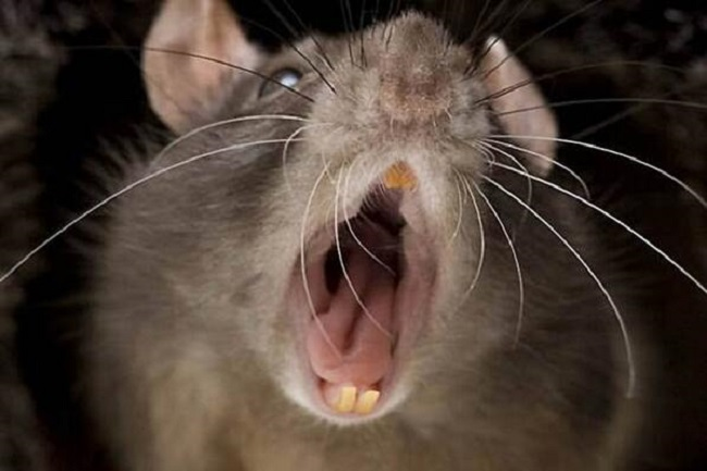
  29. Just wait till the Scripps people meet those huge rats...and I mean the furry ones...NOT the union ones. *No disrespect to union furry's.
    1 point
  30. Well it's official. I now completely dislike this graphics package. If this is what 2D "modern" graphics are supposed to look like, then I guess news graphics have passed their peak in quality. I've said it before, but Scripps deserve better gfx than this. Not only that, they, as a matter of necessity, need better graphics than this.
    -1 points
This leaderboard is set to Chicago/GMT-05:00
×
×
  • Create New...

Important Information

We have placed cookies on your device to help make this website better. You can adjust your cookie settings, otherwise we'll assume you're okay to continue. By using Local News Talk you agree to the Terms of Use and Privacy Policy.