-
Posts
1944 -
Joined
-
Last visited
-
Days Won
98
Content Type
Profiles
Forums
Articles
Everything posted by MediaZone4K
-
Yes! CBS shows appeal to an older audience. I can also see why CBS stations do well in rural smaller areas. Historically the network has run rural comedies like Green Acres and in the 90s *shows* like Murder She Wrote, Diagnosis Murder, Walker Texas Ranger etc. Today they've got an endless portfolio of procedurals. It's definitely a watch with your grandparents kind of channel which must trickle down to the newscasts.
-
My theory for the affiliates is that their struggles stem from the '94 realignments. They lost some stronger affiliates, left to pick up weaker ones. Look at ATL, CBS lost WAGA 5 to Fox, so they had to settle for WGNX 46, a weaker station with a dial number up in the boondocks. For the owned and operated stations I'll say again...CBS O&O newscasts have a very generic, corporate, "Spectrum News" like feel, that isn't always authentic to the markets they're in. Big example, CBS' defunct "Nowcasts". WUPA's version, produced in NYC, felt so out of place in a country/soulful/hip hop city like Atlanta. WCBS' Mary Calvi and Chris Wragge could do one of those nowcasts because they don't add any extra personality to make it feel like you're watching a New York morning show. This in contrast to the loud-brash-Brooklyn Rosanna Scotto on GDNY or the Jamaican Dancehall or Street Soldiers segments covered on WNYW. Even though all o&o station groups duplicate their formats across markets, ABC, NBC, and especially FOX & CW stations are better at adding local touches.
-
Not to turn this into the CBS thread but the issue there is that if their national news brand is not doing well outside of two shows, does that justify duplicating it on the local level? If anything, CBS stations need to be seeking separate identities. I'll save that for it's designated thread. Fox O&Os, like ABC stations, are a prime example of duplicated yet still locally fresh format. WAGA feels authentically Atlanta as WNYW feels uniquely NY with personalities like Rosanna Scotto, and segments covering say Jamaican Dancehall culture... despite both stations being "Fox 5 News" with the same graphics. Again WABC does this well also. Back to WABC, I have to agree. Left to their own volition, Channel 7 has shown us for decades how bad their sets and graphics can get.
-
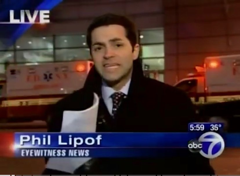
True. I see both sides. I agree with the idea of identifying a similar product via aesthetics through several markets. Not to drift off topic but, comparing the more successful ABC O&Os vs CBS O&OS...I don't mind duplicating a look just with added personal touches like KWY doing green instead of the standard CBS blue and white. I know the argument is a similar look for content sharing but the audience does not care if WCBS takes a KYW green graphic. The issue becomes when stations sound like a bland corporate carbon copy and not locally authentic. Look at WCBS with its pharmacy jingle ringtone open and clean corporate feel which doesn't match the vibe of a gritty intense city like New York. In contrast, even though WABC is one of ABC's many Eyewitness News copies, it still feels locally authentic to NYC with its diverse set of long-tenured reporters and its "flashier" (as some have said) format.
-
Say it louder for CBS to hear.
-
I'm not saying I necessarily disagree with some of the points Rosanna made. But, she (as usual) drifts into editorialization. Sanctuary "Trap" for example is a loaded title. "This is coming to a city near you, unfortunately" which she said, is also another iffy statement. That's fine for Fox News Channel, but very slippery for her already compromised 'neutral image' role on GDNY.
-
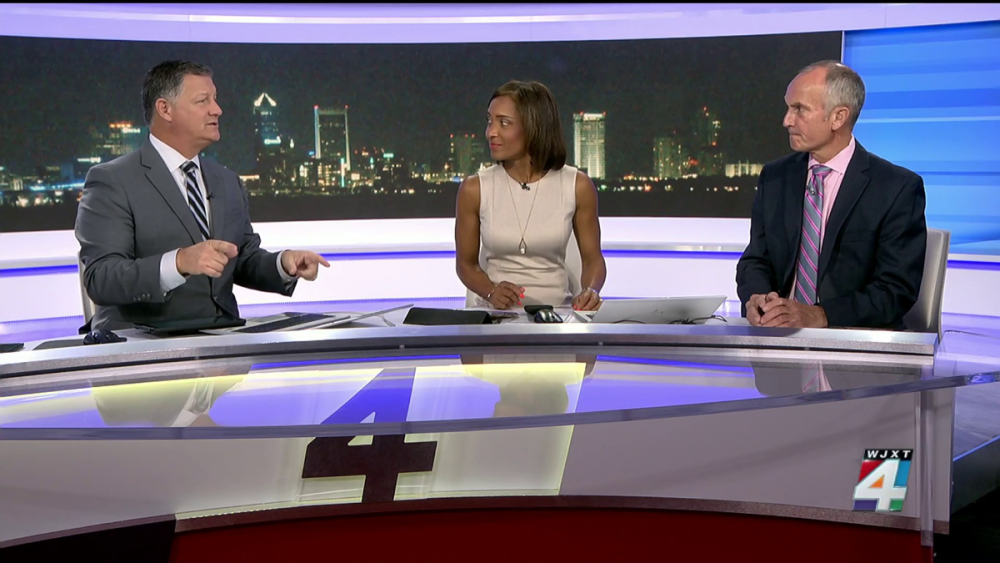
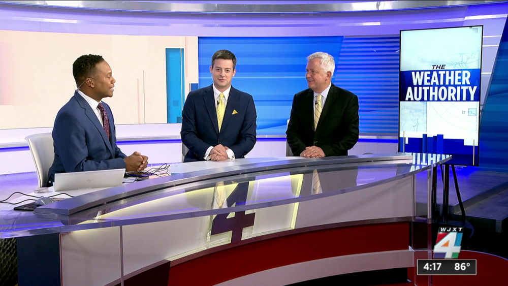
Very underwhelming, especially for Graham which has some good looking stations. They should have taken a page from sister station WJXT whose set looks way better. IMO, stations need to tone down the video walls, quit the furniture minimalism and get some physical set pieces.
-
Interesting catch. Just this morning my local CBS affiliate skipped Face the Nation (for the first time that I've seen) and aired E/I programming instead. The did however air Sinclair's Sunday morning political show "Full Measure".
-
Yep! I wasn't sorry to see Don go, he was one of many annoying cable pundits. I just didn't like the circumstances under which it occurred.
-
Pardon me for me for being facetious, but the video *wall* would look better and more seemless without that red thing (a table?) in the background.
-
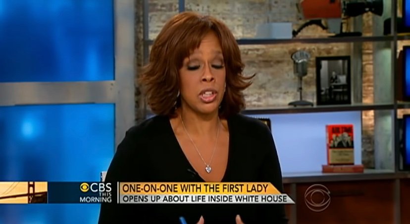
Agreed. The concept is not horrible. The L3's just look too cartoonish, flat, fat, and white. The graphics looked better in the CBS News Mornings shot, maybe because it doesn't have the ticker and the upper subject bar weighing it down. Broadstroke: As time advances television graphics are not.
-
The network keeps making adjustments to this show (and it's predecessor's) graphics that aren't better. The CBS logo needs to be shifted to the right to fill the dead space where the ticker ends. Excluding the ticker, this was probably the only decent L3 CBS This Morning/Mornings has ever had:
-
I think that's what help sets Today and GMA apart and ABC vs NBC as a whole. Today/NBC was the sleek urban show/network and ABC/GMA was the more homely middle America network/show. I would take physical pieces over the proliferation of bare video walls that we have today. that's basically the modern version of the 70s chromakey set trend.
-
Pulling for big names much like Fox 5!
-
Snippet from Today in New York, 2007. WNBC's looked really good aesthetically here, and they had good talent. So, I'm still trying to figure out exactly what caused them to drop in the ratings to the point of cutting newscast at that time? Was it simply because WCBS made improvements and displaced them for second in some timeslots?
-
That column was nice and it worked! Embrace it, maybe even stick a Today Show rainbow at the base, similar to the 80s.
-
It looked better when the camera feed monitor was frameles
-
Yikes large white box L3s. At least the time-temperature bug looks less cramped. Having just discovered the Morgan Murphy group, I will say some of their stations's graphics and sets look better than some stations at larger companies like Sinclair.
-

ABC changing their logo; New graphics coming for ABC owned stations
MediaZone4K replied to Briella's topic in Graphics
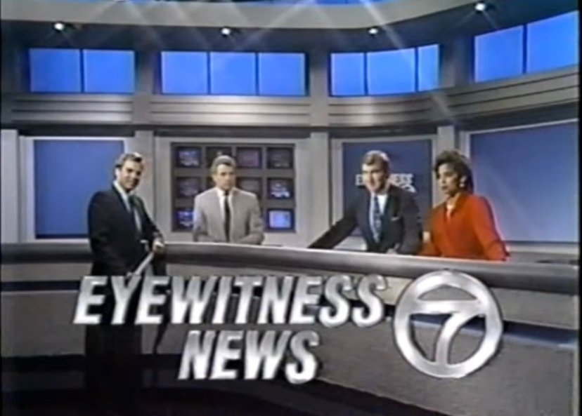
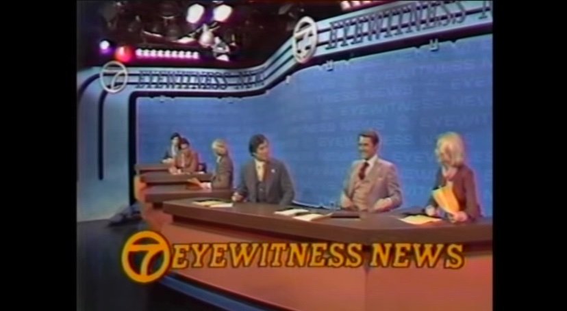
From that era you mentioned, as simplistic and unremarkable as it was, this was probably most their decent set. The early 90s graphics wern't great compared to WNBC but it worked. Arguably the best set this aestetically troubled station had was the steps look from the 70s. -
*14 years this year
-
He was a great sucessor to Kurault! I always used to skip over Sunday Morning but since the day first watched the program I make an effort to catch it every weekend. RIP!
-

ABC changing their logo; New graphics coming for ABC owned stations
MediaZone4K replied to Briella's topic in Graphics
Someone else, perhaps you, also talked about WABC's NY Post look and feel. As for tabloid, I would love to see what Sunbeam would do with NYC station lol. As others have said, their look must be deliberate, because it's hard to believe the #1 station in the country would be that aesthetically clueless. Especially considering sister stations KABC and KGO look so much better in contrast. Jim Gardner not Vance I should say. This was perhaps WABC's last decent graphics package: -

ABC changing their logo; New graphics coming for ABC owned stations
MediaZone4K replied to Briella's topic in Graphics
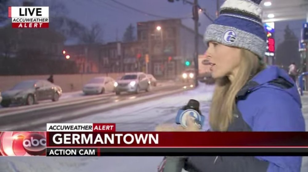
WPVI still holds out, but their current lower thirds are pretty decent. Very Graham like. I almost hope they don't change. PVI's flat graphics look cheap though. These can definately stand the new upgrade. Just like the new Cox package, 3D and flat look awkward when mixed. Reguarding tone which was brought up during the WABC's discussion...Having seen snippets from their evening newscasts, especially when Jim *Gardner was there, 6ABC has a real national evening news like presentation. Very clean and ultra professional news product. -

ABC changing their logo; New graphics coming for ABC owned stations
MediaZone4K replied to Briella's topic in Graphics
People here often say WABC is flashy. I can hear it in their writing historically. But, Compared to stations like WWOR or WSVN I'm having trouble seeing it. Maybe it's because they do as you say have a one-dimensional look. -
At the very least, I like that talent opens still exist. It allows anchors to own their slot rather than being interchangeable. They're also more grand than the boring two second opens we get on stations like WNBC. Overall, the new ABC O&O package isn't the best BUT it's better than anything WABC has had in decades and I'm just greatful for that. I enjoy their use of gradient blue L3 rather than the over proliferated paper white box look.






.png)