
Leaderboard


Popular Content
Showing content with the highest reputation on 01/23/24 in Posts
-
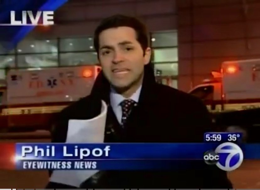
Those game show hosts also came from other fields. They were not sent down from on high to become game show hosts from day 1. Alex Trebek’s own book details how he wound up where he did.3 points
-
That was a coding error in Ross OD. I made stingers (like you saw play out) and I made “open stingers” that sting out after the open seamlessly…the coding was swapped and that’s what occurred. Thank you. This has been a dream project. I was literally given the keys to drive the whole thing without any interference from other management…just “how can we help.” and hat tip to Matt Quinn, Tristan and team for letting me version it out. They all deserve a big hat tip as well. They give us the tools to build masterpieces.2 points
-
KTVN is one of those DMA #100+ stations that just refuses to behave like one. Great look for them. Sounds like they got a new set, too?2 points
-
KWQC finally made the switch to GrayONE, and it's probably the best implementation of the package thus far.2 points
-
Today marks the one year anniversary of the launch of CBS News Detroit.1 point
-
Interestingly, Erin Burnett, who usually anchors from NY, is anchoring election coverage from DC today, and Wolf Blitzer, who usually anchors from DC, is anchoring election coverage from NY today. They did the same swap last week covering Iowa, I believe.1 point
-
In a way, Drew Carey could be considered one. He's hosted TPIR for far longer than his namesake sitcom from the 90s.1 point
-
The reason I went with this cut is it was the cut we used in the 00s for First Alert weather. It has an urgency that I like. I tried other cuts from the updates when putting this together and preferred the cut from Disk 3.1 point
-
Seems out of place for a DMA such as Reno.. I'd easily see this in a top 50 market... But nonetheless looks sharp.. I wonder if WDJT will get this, seeing that they liked the previous O&O look1 point
-
Yeah, I remember how ecstatic we were when this graphics package debuted in 2008. It wasn't their best and there were other stations that had better graphics, but that was also the year when many TV station productions have "gone HD" What an era haha. That was their Giant Octopus package, which was very "Shiny" in that era when we were transitioning from SD 4:3 to HD 16:9. I remember the bugs would always be further centered in the screen to accommodate the 4:3 video feed but now that most people do not have 4:3 the trend seems to be to move the bug further to the right.1 point
-
Based on the headlines, it's end of summer 1993.1 point
-
Mark L. Walberg and Pat Finn were also career game show hosts, as well. I think Jess was right over on the Discord. The breed of “game show host” is extinct.1 point
-
I don’t think so. The role of career game show hosts made more sense when game shows were in greater demand by the networks to fill out the morning and afternoon hours. I don’t think there’s anything wrong with having people who don’t strictly host game shows do just that; to me, comedians are especially great in that role. Keep in mind, it isn’t anything new. Dick Clark was primarily known as an DJ, not as a game show host. Alex Trebek was a CBC DJ before he hosted game shows. Pat Sajak was a local weatherman. The only modern example of a career game show host that I can think of is Jeff Probst.1 point
-
They have been using "Hello News" since the beginning of November, as part of their 75th anniversary year long celebration.1 point
-
They are the first to use Warner Chappell music with the package too.. This was a very well deserved upgrade for KWQC1 point
-
You can still visit if you’re in the area and find yourself in/near Lincoln Center; it’s pretty cool to see it in person. It’s a shame there won’t be one in Hudson Square, but I imagine they have their reasons for that.1 point
-
I like the use of more than two colors, gives it texture. Good thing they didn't go with the all red package!1 point
-
Someone else, perhaps you, also talked about WABC's NY Post look and feel. As for tabloid, I would love to see what Sunbeam would do with NYC station lol. As others have said, their look must be deliberate, because it's hard to believe the #1 station in the country would be that aesthetically clueless. Especially considering sister stations KABC and KGO look so much better in contrast. Jim Gardner not Vance I should say. This was perhaps WABC's last decent graphics package:
 1 point
 -
Studio space might not be an issue. KDNL's old studios at 1215 Cole Street were up for sale last year, as they jumped ship to Brentwood, MO where the Allman Report was being filmed. If Scripps and/or Weigel wants an in town studio that's turn-key, 1215 Cole is it. https://www.loopnet.com/Listing/1215-Cole-St-Saint-Louis-MO/27232037/ If we are "news saturated" that seems to be news to people here. A quick look at any newscast that KMOV has proves a lot of news is being left on the table. KPLR isn't really producing much of anything, other than essentially a rebroadcast of the previous KTVI newscast. It's leaving KSDK and the Post-Dispatch to find rest of the news out there, but they don't have the resources. We need another functioning newsroom. Spectrum News doesn't really have any sort of obvious presence.1 point
-
I think Portland is a market where the FOX branding (at least on newscasts) is something of a liability, so I'd imagine KPTV would either go back to their UPN-era "Oregon's 12" branding or even "KPTV 12" (the branding they had as an indie, pre-UPN.) Then again, I don't know what KPDX will brand as, since right now, they're "FOX 12 Plus".1 point
-
My only issue with the "stripping" of affiliate logos from these stations is that these affiliations lend a form of credibility to them. Bad actors have been lifting and creating fake logos for use on illegitimate "news" sites for the sole purpose of spreading disinformation. Even with FOX affiliates, despite any link to their affiliates and "news" channel. The link between them is minimal and any well-educated person should know that. Being a heritage station and Raycom's idea to use their highly visible longtime neon sign as their main brand is a brilliant branding move. Same with WAVE in Louisville resurrecting their "WAVE" logo from years past.1 point
-
WBRC's news dominance isn't built around their affiliation to FOX. They don't need to emphasis it.1 point
-
Given that Fox has historically had more rigid branding conventions than the other major networks (the only ones to deviate from using network-centric branding including WSVN, KHON, WDRB and KVRR), I think culling network references from Gray’s Fox affiliates would be much harder to implement. ABC has apparently been requiring affiliates to include the “circle” logo into their station logos, making it also unclear whether they can pull network branding.1 point
-
That reminds me of something on WBAY a couple years ago where there was an ad for a home medical provider showing their building and ten seconds later coming out of that break... 'Breaking news from Allouez, where a car has driven into a building'...and they cut to that same home medical building, now with a car halfway through its front window (thankfully nobody hurt there). Gotta love it when the sponsor somehow gets 'lucky' with another mention without the ad department getting involved.1 point
-
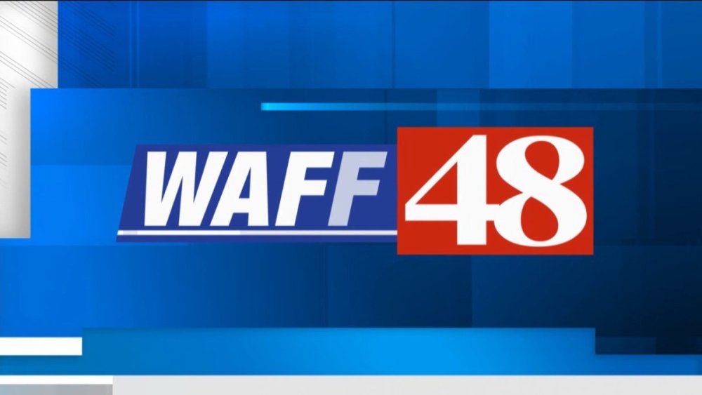
WAFF made the switch at noon today! The website has yet to be updated.
 1 point
 -
This de-affiliation trend of their logos is going to be interesting if it ever reaches the fox affiliates. Especially stations like WALA and WVUE who have branded as "Fox 10 and "Fox 8" for almost a generation. However, this could come in handy in Mobile, especially if they decide to snag NBC away from WPMI after next year and put it on 10.2. It also unifies the branding in markets like Biloxi and Hattiesburg, these are both markets that have dual affiliations but run the same newscast in many time slots. WLOX and WDAM largely refer to themselves by their call letters.1 point
-
This is absolutely awful. First, the fact that they are using red tends to indicate Breaking News, which is exactly what Alert insinuates. This is why First Alert Weather has always struck me as bad branding for weather too. You're going to burn out your audience if all news product is branded as "First Alert" instead prioritizing the content. Ultimately, having clear brand and design language is really needed to inform viewers and boost ratings... This won't do it.1 point
-
The more I read Rich Lieberman, the more I'm convinced that he no longer has any sources. He is the equivalent of an elderly fanfic blogger but for local TV. Lieberman doesn't see the ratings; I do. For the first two weeks of this month, KPIX was virtually tied with KGO for #2 at 6pm. I think their format and anchor changes have had a lot more of an impact than the branding change. I think adding news at 7pm, moving national news to 6:30, and putting Juliette Goodrich on the 6 and 7pm were all good ideas that made KPIX at least somewhat more competitive again. I'm not always sold on their unconventional leads and enterprise story ideas, but I suppose they're at least trying something different. The most underperforming network O&O in that market though for sure is KNTV – literally hashmarks for their 11pm some nights. KTVU's Like It Or Not, a mindless show that costs no money to produce, regularly gets higher ratings at 11:30 than KNTV does for their 11pm news or the Tonight Show.1 point
-
I wouldn't take Rich Lieberman's word for anything. To him, every Bay Area radio and television newsroom is a cesspool of incompetence and failure, backbiting and jealousy, and most news anchors are having illicit affairs. It'd be pretty funny if it weren't so monotonous.1 point
-
Had to Google their outgoing logo... This is an impressive change for a market their size!1 point
-
Looks like KMVT is switching to GrayOne, ‘cause their apparent new logo is now live on their website:1 point
-
Had a blast putting this together. There’s a hidden message or two in here…1 point
-
Wtoc in action. They’ve appeared to have dropped “live local now” and brought back their old slogan “the southeast news leader” in the open1 point
-
I designed this open. We needed something fresh pretty badly so I whipped this up using some aesthetics from GrayOne. Without giving away the details, I can tell you a 3 phase relaunch is in motion. Phase I begins October 31st as we begin our 75th year, Phase II will begin in early January with some more really big changes. Then phase III happens middle of next year. And yes, part of this rebrand is launching GrayONE. So, stay tuned for some really exciting changes!1 point
-
Side note: The skyline they used is a fake.1 point
-
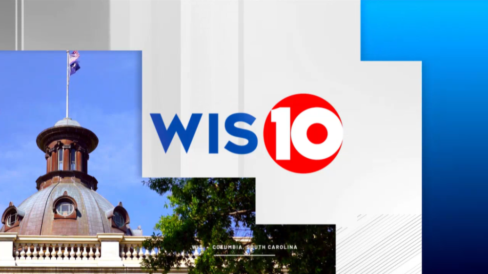
WIS-TV Columbia looks REALLY good. While I like NBC 12 WWBT Richmond, I am kind of disappointed with all the red. I mean, that's something that Cleveland 19 News would do. The blue colors in the background with WIS with the red in their logo looks fantastic.
 1 point
 -
Basically, an homage to their 1978–83 logo:
 1 point
 -
Not to solution it here - but they could have leaned into the “3 as a B” thing and done something like this…
 1 point
 -
I like this a lot... Excited to see this roll out to other prior Meredith stations!1 point
-
When Gray purchased Meredith, they inherited their graphics hub. Matt Quinn was the lead designer. GrayONE is built off the bones of the outgoing Meredith graphics package.1 point
-
And a new studio! Two questions ... Was GrayONE developed from WFSB's prior package? They seem so similar to me (please don't come at me too hard if I'm way off base on their similarities) Why do some stations prefer the meteorologist in front of monitors rather than the chromakey (WFSB is doing this with their new studio)? Maybe it's me, but as a viewer I find the graphics much easier to see and read off the chromakey, and it often feels unnatural when the meteorologist has to turn fully from the camera and face the screen versus turning 90 degrees to look at a monitor.1 point
-
The font is Barlow. It’s free to use. Makes sense why multiple station groups use it, one less thing to pay to license for 100+ stations…1 point
-
A new logo as well. Hint to WCSC: Bring back the old red 5 logo, with that font for "Live" and "WCSC".1 point
-
WGEM has GrayONE.1 point
-
Ditching that news theme is one thing. But replacing it with This Is The Place? Really, Gray?? Really??1 point
-
It's hard to expect much in Market 203.1 point
-
The GrayONE look has launched at WCSC.1 point
-
Trailblazing Los Angeles TV newswoman Ruth Ashton Taylor, a longtime reporter at KNXT (now KCAL News) passed away a few days ago at 101. She also worked alongside Edward R. Murrow and See it now.0 points
-
Not used to seeing studios putting much effort into the floor. Wonder if the next studio will continue with that.0 points
-
What in the world is going on in Alaska ?0 points


.thumb.png.3d66a1eeb7ecf5404151f8a77ea7cbfd.png)


b.thumb.png.b658c90e4e56cb08f2e8ba3195bb9da9.png)
This leaderboard is set to Chicago/GMT-05:00