MidwestTV
-
Posts
2409 -
Joined
-
Last visited
-
Days Won
24
Content Type
Profiles
Forums
Articles
Everything posted by MidwestTV
-
Sinclair Broadcast Group - General Discussion
MidwestTV replied to Smitha A's topic in Corporate Chat
To be fair to Tegna, they've really backed off of the edginess compared to when they first came into existence. -
I had the same thought. The viewer...doesn't care.
-
TEGNA Broadcasting and Digital General Discussion
MidwestTV replied to ABC 7 Denver's topic in Corporate Chat
Not starting a new thread over it, but KUSA has adopted the new open first seen on WXIA.- 3735 replies
-
- 5
-

-
- innovation
- tegna
- (and 1 more)
-
That's pretty solid. I dig it. Nice use of textures, monitors don't feel over the top, and it has some warmth too it.
-
I like it a lot. It's a nice refresh of what they had before.
-
It gives me hardcore sailor vibes with those giant wheels
-
I promise you reporters are in the building more than you think, and they certainly aren't going to a Starbucks to work on their stories.
-
I'm more shocked that $10.5 million came out of WDVM? Or am I misinterpreting and it's $10.5M from all Nexstar NBC affiliates of which WDVM was (not) one?
-
Kind of mentioned before, but now CNBC has an article on Allen Media being tens of millions of dollars late in payments to NBC, ABC, and CBS. https://www.cnbc.com/2024/08/16/byron-allen-draws-abc-cbs-and-nbc-ire-with-late-payments.html
-
It's ultimately just a slogan. Many last place stations will claim they're the "first source" or "most trusted source" or whatever.
-
Big fan of that cut of C-Clarity and hope it's part of a refreshed music package. Also a big fan of that new open. Looks like the TANK has really stepped up its animation game.
-
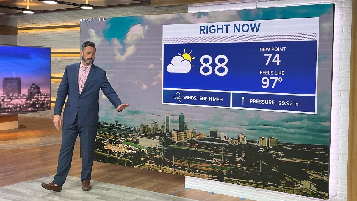
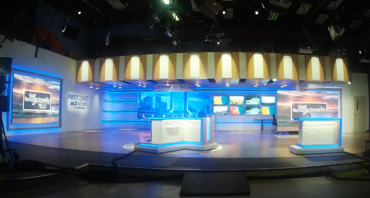
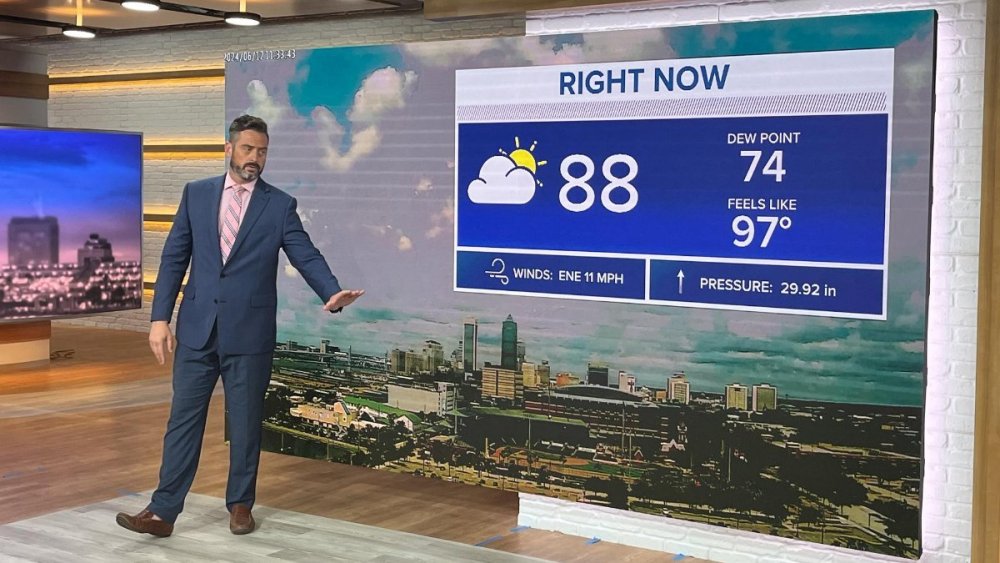
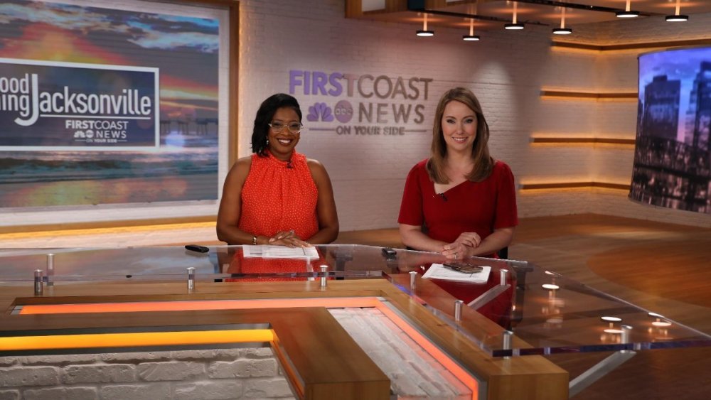
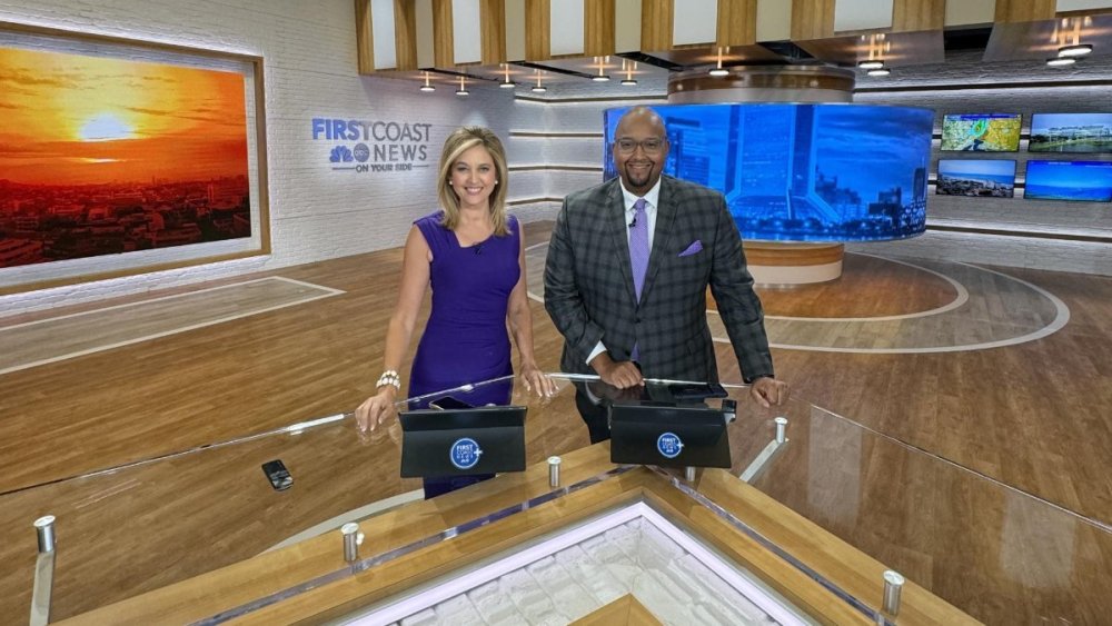
Flew under the radar, but Tegna's First Coast News has debuted a new 1250sqft studio. Their website has a time lapse. https://www.firstcoastnews.com/article/about-us/first-coast-news-unveils-modern-innovative-new-studio-design/77-ca0f6dee-457b-4e0a-b1b1-5eb0ab0d99fb

- 7 replies
-
- 2
-
-
- First Coast News
- Jacksonville
- (and 3 more)
-
That's a bit...dramatic.
-
Megan Conway has been unceremoniously let go at KLKN-TV after nearly a decade at the station. It's actually made news across the state (even in the Omaha newspaper). Nebraska viewers can be very loyal to their favorite news talent.
-
This is part of a larger corporate mandate by Tegna. All Tegna stations (with the exceptions of their largest markets or those they deem as having "legacy branding") are required to start this initiative by mid-July. No exceptions. All weather branding will be [station] Weather Impact. Yes, it's a direct copy of Hearst, Sinclair, Gray, Nexstar...with "alert day" branding for impactful weather events. Why they decided this needed to be done now and so many years after competing companies is bizarre to me, but what consultants say to do is what gets done. That said, every station has their own say in what exactly constitutes a "weather impact alert day."
-
Nexstar is opening the Nexstar Weather Center based in Dallas. Its job is to serve as a "relief hub" for its small/medium markets that have had stubborn openings for weekend meteorologists and allow the any full-time staff to take time off (as in several of these markets meteorologists are working 6-7 days a week). No word on a launch date (presumably later this year). These weather segments would be forecast and produced out of Dallas then sent out to that individual market. Multiple ways to think about this. One could argue if Nexstar has the time and resources to create an entirely new hub to provide relief for its small market meteorologists, it could also use those resources to make those weekend weather/MMJ jobs (which is what the vast majority of them are), more appealing to college grads or sub-3 year professionals. However, it also shows the struggles of small markets to hire anyone out of school since now top-50 markets are more than willing to do that themselves. Would you work in Lubbock, TX out of college, or Norfolk, VA?
-
TEGNA Broadcasting and Digital General Discussion
MidwestTV replied to ABC 7 Denver's topic in Corporate Chat
It'll probably rate better, or at least similar, too. Might even get the benefit of local content before local news.- 3735 replies
-
- 1
-
-
- innovation
- tegna
- (and 1 more)
-
Still not a fan of anchor-read intro VOs, but it doesn't look bad.
-
TEGNA Broadcasting and Digital General Discussion
MidwestTV replied to ABC 7 Denver's topic in Corporate Chat
Thankfully a lot of local games, especially college, run on weekends when programming isn't as big of a deal. Tegna also goes hard with its OTT channels where in-house content runs on repeat (if at all). They'd probably put the games there to encourage people to download their app to their TVs. -
TEGNA Broadcasting and Digital General Discussion
MidwestTV replied to ABC 7 Denver's topic in Corporate Chat
If they were really smart they'd go hard on local college teams as well, especially as realignment is still shaking up the broadcast landscape there. It'd be a great opportunity for some of their markets that are only near pro teams, but have a big variety of local college sports. Des Moines has Iowa, ISU, UNI. Louisville is near three NFL teams, but has local college teams in the Cardinals and Wildcats, and USL/NWSL soccer.- 3735 replies
-
- 2
-
-
- innovation
- tegna
- (and 1 more)
-
Erin Little has sued KCTV/Gray for gender and age discrimination. She hasn't been on air in almost a year. https://news.yahoo.com/meteorologist-erin-little-sues-kctv5-000941077.html
-
The look of them is very out of place, but I don't mind the concept.
-
From my third-hand understanding (from someone who had a conversation with someone who works within Scripps and is likely more informed on the matter than any of us), these changes will vary on a market-by-market basis. That includes small markets. I couldn't imagine Scripps totally doing away with anchors in their largest markets.
-
Changes to Scripps' smaller market stations include eliminating some anchor positions, beefing up heavily on MMJs (including, apparently, giving substantial raises on the order of $20k+), eliminating the chief meteorologist title and placing all meteorologists under the purview of the assistant news director.


.png)