


ns8401
-
Posts
2882 -
Joined
-
Last visited
-
Days Won
20
Content Type
Profiles
Forums
Articles
Posts posted by ns8401
-
-
On 12/19/2019 at 5:10 AM, TheRyan said:
Bingo. I haven't yet seen the WXYZ weather promo being discussed, but that whole gfx package is a mess.
This is the shortened version... a couple bubbles appear and you get the idea... my normal equipment is out of service at the moment so this will have to do.
-
 2
2
-
-
1 hour ago, tvtime07 said:
Not a fan of the bubble. Seriously, in addition to these blue-white minimalist tones, it seems like they are mocking up a "Facebook" graphics theme. All they need are the hearts, thumbs ups and emojis to pop up on the screen.
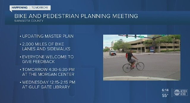
Saw a new weather promo on WXYZ last night... the quotes about “what will the roads be like in the morning?” Etc are using these new bubbles... it looks ridiculous... still no new graphics but that certainly goes with the new theme...
-
15 minutes ago, 24994J said:
It appears that the temporary video wall has been reinstalled on the main ABC News set, positioned closer to the desk, in front of the usual installation. Last time, it was to switch out the monitor array with a seamless curved display. No idea what's up this time, though they've been making some updates to lighting and walls over the last several weeks.

There’s something to be said for a newsroom right behind the anchor instead... I missed a call from the 90’s and they may be trying to get me back though...
-
2
-
-
1 hour ago, KentBrockman said:
Am I the only one who thinks the new Scripps graphics and music may actually fit WPIX rather decently?
No... it fits the style of their newscasts...
-
2
-
-
3 hours ago, Roadgeek Adam said:
There's no reason to keep the same graphics. WABC used it for years until 2016. I'm not suggesting we should keep the same package going for 20 years, but a refresh is always good. Just for perspective:
1968-1975
1975-1978
1979-1983
1983-1986
1987-1994
1995-1998 [in my opinion, the worst]
1999-2003
2004-2008
2009-2015
2016-present
These are the ages of the graphic packages. Right now we're probably on pace to replace them in 2020-2021, but I'd not expect much until the move I'm guessing.
The problem is the minimalist nature of the KABC graphics also lead to limitations like this.
WABC's is 2 lines and while it may be bulkier, it guarantees lines like this fit.
That KABC lower third doesn’t need the arrest and victims condition to both be on it. That’s a station issue not really a graphic issue. Somebody doesn’t know how to work within space limitations.
-
1
-
-
From the nice touch department... WXYZ has started using the traditional “Good evening I’m”... across all of its newscasts when there isn’t breaking news leading off... its been almost 10 years since they used this style of open consistently. They’ve started doubling down on hard news so this may be connected to that.
-
3
-
-
5 hours ago, TheRyan said:
Yeah KXXV's bolder font choice (along with the faded logo in the background) does make a significant difference. I still think this graphics pkg is awful, but at least it's an improvement...I'll give it that.
Kudos to KXXV for making better choices with the font and background. Probably did the best they could.
As for the fading in the background... they’ve all had that effect for this package... it’s definitely a YMMV situation... the 25 logo looks better than the lousy WFTS logo faded in the background. A circle 5 or 7 will look pretty good faded in the background.
I would add that some logo redesigns or new versions are forthcoming for everybody given the new bugs at the very least. For example I already know WXYZ is ditching the fat silver circle 7 logo they’ve been using since they got the Renderon package during the newscasts if not entirely in favor of a more traditional thin logo. I wouldn’t necessarily think anybody will debut some other new logo that isn’t just a reimagining of what they have already.
1 hour ago, ABC 7 Denver said:Any way a station can cut a $50K - $85K in contract fees, they will. This is what has happened a several stations. They are dropping our VOs. TEGNA has pushed it and so has Scripps, here, it seems. For example, KUSA no longer has an imaging voice.
So what are they doing for promos and station imaging?
-
2
-
 1
1
-
-
18 minutes ago, TheRyan said:
I notice a small difference between the cuts used on WFTS and WTXL. Although, that four-note signature seems to be uniform across the cuts I've heard (with the exception of the breaking news cut). But the thing that is starting to drive me crazy with WFTS' music cuts is that "clamoring" percussion that is heard as the opening starts, before the 4-note signature--as can be heard in this open:
I’m gonna take the opposite side of that... the part before the signature sounds like news music... the signature sounds like it belongs on a lifestyle magazine show... I actually am appreciating the fast paced cut of Inergy more and more... I’m very underwhelmed with the music... that particular cut will absolutely not work in Detroit... it’s like a square peg in a round hole for the style of newscast they do here...
-
1
-
-
1 hour ago, oknewsguy said:
There have been many other packages and I'll even throw in Inergy for good measure as one of those solid news music packages.
This one, I'm not sure if I like it or not, there needs to be other cuts to it before I can actually give an honest opinion on it.
So far Scripps is trying to (and failing) to make their music a carbon copy of the Weather Channel
Have we even heard any more than that one excruciatingly slow cut?
-
1
-
-
1 hour ago, newspulse said:
you'll change your mind once i finish writing my essay about how the stretched helvetica WJZ graphics were the pinnacle of creativity in graphic design for broadcast media and literally everything that came after it is depressing and awful and on par with (gasp!) the WKYC rebrand!!!I’m praying this is sarcasm...
-
2 hours ago, TVIntheDesert said:
I see Scripps is standardizing their ABC stations to have their morning news named "Good Morning (insert city/market here)." Except that they can't do that in Phoenix because KTVK's morning show has been "Good Morning Arizona" for 25 years.
I wonder if they will rebrand WXYZ’s? They’ve used the same name since the O&O days... I rather doubt it though they are using the GMA-esque logo with the swoosh under it...
Did they fix the bug without a background? In the weather shots it’s in a black box. Was that just for weather?
-
1 hour ago, KCActionNews said:
Just got these screen caps sent. Looks like Tampa was next on the list. My opinion hasn’t changed so no need for me to rehash. I’ll just leave these here for your enjoyment. Lol
Their logo ghosted in the background like that looks like hell...
-
11 minutes ago, Weeters said:
Easier said than done. There's also a hefty price tag attached to a Renderon package, something that Scripps might not be up for paying these days. I don't doubt one reason they went in-house is because of the cost of an outside designer.
Renderon is still around. They mostly have been doing foreign work lately. VDO is long gone.
I wonder if some of the larger creative services departments could handle taking a skeleton of the new package and modifying it for their own purposes? If the graphics hub is overwhelmed it might help balance things...
-
1
-
-
1 hour ago, DirtyHarry said:
Like I said, the media not mentioning party affiliation if a Democrat is involved is a running joke on conservative sites. Here's a sample from Instapundit:
(Glenn Reynolds links stories like these frequently, but the search terms I used only picked up a sample.)
1. Not once in a ten-paragraph report did the AP find the space to mention Dukes’ party affiliation — D-Austin.
2. There was no mention of party affiliation in any of the first 9 news articles.”
3. CBS Doesn’t Mention Jesse Jackson Jr. is a Democrat in Story About His Sentencing. It’s in the Style Guide: Party affiliation of disgraced pols is only relevant if they’re Republican.
4. OCCUPY CLEVELAND PARTICIPANT PLEADS GUILTY TO BOMBING PLOT. AP leaves mention of his affiliation to the last paragraph of the story. I’m sure they’d do the same if the Tea Party were involved. . . .
5. IT’S TIME TO PLAY NAME THAT PARTY! This story in the New York Times about the sentencing of New York State Senator Carl Kruger for corruption omits any mention of his party affiliation. And, sure enough, it turns out he’s a Democrat. Thanks to reader Thaddeus Perry for pointing this out.
6. UPDATE: About a gazillion readers wonder why Rep. Ackerman’s party affiliation isn’t mentioned. Yeah, go figure.
7. They don’t mention his party affiliation anywhere, but it turns out he’s a Democrat. A.P. should try using Google next time . . . .
8. But that’s not all. Read the whole thing. And try to guess her (unmentioned) political affiliation . . . .
9. It mentions that Young is, indeed, a GOP lawmaker.
10.“The LA Times never mentions Mr. Shelley’s party affiliation. Is it safe to assume he is a Democrat?” Yes, it is.
It could also be that party affiliations are germane to Republicans because they tend to abuse their offices more. Democrats get more sex scandals and other out of office criminal stuff... party affiliation doesn’t amount to a hill of beans regarding who’s wife you are boning. It does matter if you gave sweetheart deals to 5 of your best buddies in exchange for campaign contributions. This bias against conservatives canard is all in your head.
Katie Hill just resigned for a sex scandal and her Democratic affiliation was the first thing or nearly the first thing mentioned. Next thing will be that they only mentioned her party to save face for not mentioning it all those other times. If Conservatives feel like making things work better then they can come to the table and have a voice. Constantly whining and playing the victim and wanting nothing to happen and reading the same junk over and over about how bad they have it is really getting old. Being dragged into oblivion because 40% of the country is a supposedly persecuted conservative isn’t very much fun and as their lives continue to deteriorate for lack of investment or progress I hope they’ll use their last pennies on a mirror when they ask why it’s this way.
-
3
-
1
-
.png) 2
2
-
-
3 hours ago, ABC 7 Denver said:
Lmao! There's some irony here that I literally can't say anything about!
You really haven’t been able to say much of anything besides bash things... I just did everything when looking at this carefully including stand on my head and I still can’t figure out what sort of irony you could possibly mean...
As to the graphic.. I kind of like that shade of blue. Design wise it’s about what one would expect. Notice that doesn’t have the text message tab on top of the graphic.. it’s just a box and it looks good that way.
-
4
-
1
-
-
5 minutes ago, TheRyan said:
So it's becoming increasingly likely that this will be a mass rollout to Scripps stations, especially because they wouldn't issue a style guide unless they had plans beyond WTXL for this package. Of course, we'll have to see what happens to certain stations...namely the former Journal stations like KGUN.
It's going to be interesting to see if stations like KSBY adopts the WTXL gfx package. Honestly, I think KSBY looks and sounds much better with they have right now. KSBY has used "Tower" for many years, and I'm not convinced that the new "Scripps 2.0" music pkg is going to work well at all on that station. The graphics on KSBY are far better than what WTXL just adopted.
But like I've said before, as far as music goes, I'll need to hear more cuts before knowing whether the music pkg is going to work or not.
I think it’s a definite that some version of these will be rolled out everywhere else. Each station will apply them slightly differently of course so your mileage may vary as far as the end result goes. Even now with the current graphics there is a definite difference in how the current package has been applied, some stations don’t have or use all the graphics, some have custom graphics for certain things etc.
I can’t see any reason why that would change drastically.
-
1
-
-
21 minutes ago, ABC 7 Denver said:
I've seen the style guides. They are either blue or red (for breaking news).
So the same color scheme they have now...
-
1
-
-
6 hours ago, oknewsguy said:
Some judges are leaniant on the recorded notetaking other judges not so much and the Benton County Judge apparently has an issue with that.
The question is what the law says in that particular jurisdiction. Is audio recording treated the same way as video recording and neither is permitted? Or did the judge just go rogue and decide that he has special rules? They reference other stations and in those states or jurisdictions there may not be bans on audio and video recordings. I kind of wonder how the judge figured out she was recording.
If it’s the latter explanation I would imagine your odds of appealing and overturning are better. That sounds quite extreme though. If on the other hand he told her to knock it off and she kept going then she’d get what was coming to her though.
In this case it appears both audio and video are not permitted. I think this is one of those things that depends on the state. Here in Michigan for example both are just fine and we get the whole show. At the federal level neither is allowed if I’m not mistaken and that single handedly keeps sketch artists employed.
-
2
-
-
9 hours ago, TheRyan said:
Based on this promo, Local 10 has reporters in Venezuela and Haiti, as well.
On a side note, it seems like they are using the phrase "Local 10 News is everywhere". If I recall from earlier in the decade, WTVJ heavily promoted themselves by saying "Team (or NBC) 6 is everywhere". Not sure if that slogan is just for this promo, though.
Cuba I get, are there sizable Haitian and Venezuelan populations in Miami?
-
9 minutes ago, Webovision said:
this pkg is a big disappointment... it has all the makings of something done in-house... at least tegna went outside the hub to get a designer...
doubt there will be a warm reception to these from many stations management teams... to go from flashy renderon graphics (which most of the old jbg stations have used since 2004) to... this...
this might be the second coming of the burnt orange scripps pack... i give it a few years before it gets replaced...
hopefully the rumors of the "alternate package" are true...
Anything but burnt orange... even those white letters for 5 seconds over video 70’s style...
An alternate package would be an intriguing idea...
-
11 minutes ago, Webovision said:
i can assure you... everyday health was 100% done in-house and pre-dates scripps ownership of the station... and long before tmj started working with the graphics hub (that did not happen until right before tmj debut the current gfx)...
if my memory serves me correctly... that lower third was thrown together in an afternoon...
any resemblance to a scripps graphic is purely coincidental...
https://www.youtube.com/watch?v=Zo5iF85FGv8
not the same...
At this rate graphics will be like cars... are they really all that different looking we’ll be asking soon... thanks for pointing out the differences, 6 years after I made that video my memory is a tad foggy...
16 minutes ago, qunewsguy said:Not to turn it into one of those threads but KNXV has uploaded a billboard with the new look. It seems like the only animation on the entire thing is the logo outline fading in in the background. It's just... weird.
That is kinda odd... they must be close to ready to go with it...
-
2
-
-
19 minutes ago, Weeters said:
These have been around for a few years (Here they are in March 2015) and are not related to the new Scripps graphics.
It’s the original refresh of the L3’s for promos previewing an upcoming newscast... at least that’s what WXYZ used them for but those have been gone for a couple years now. It’s a little odd to see them as actual L3’s during a show. Took me a minute to place where I had seen those...
-
53 minutes ago, ABC 7 Denver said:
You have no idea what I've seen and heard. Thank you for your presumptive diatribe.
Then enlighten the rest of the class. “Oh my god! It’s terrible, god help their souls” really doesn’t tell anybody a thing. So no I don’t know what you’ve seen and heard, you never said anything but some vague whining which I responded to by trying to politely tell you to chill.
Now I can’t speak for a 2nd rate station like KMGH but it’s a basic fact that the third rate stations are going to do a far worse job applying the graphics than the 2nd rate ones and the 1st rate better than the 2nd. Or are you really gonna have everybody believe that they literally have 1 cut of music, 1 L3, 1 OTS, 1 Weather graphic, 1 open and 1 full screen graphic and that’s the whole thing? You usually come in here trashing whatever they come up with next... I want to see how a larger station actually applies them first and each will apply them differently by the way. Relax.
-
5
-
1
-
-
2 hours ago, oknewsguy said:
I doubt if KXXV will be the next station to receive the package. Quite frankly, this package needs some work before it can be rolled out to other Scripps stations around the country.
Also @Weeters mentioned on Discord about the ex-Journal stations perhaps resisting on the new graphics package could Scripps tailor the new look for the ex-Journal stations? I think it'll be very interesting to see how Scripps does with this package.
With the current graphics package they have been VERY flexible and giving on individualized graphics, transitional elements and localized weather backgrounds. I doubt that would stop with a new package. It seems more like a company policy.
I just think that station in Tallahassee isn’t very good and that really hurt the implementation and influenced, perhaps unfairly, our perceptions of the implementation of the new look. That’s the real problem here me thinks.
-
1
-
Scripps - General Discussion
in Corporate Chat
Posted
Isn’t WCPO supposed to be a major station?
Happened to run into this video and I don’t have words to describe how bad this live shot went...
https://www.wcpo.com/news/local-news/hamilton-county/cincinnati/riverside/pd-train-derailment-closes-river-road
Im not sure if I should feel sorry for the reporter or what... but what she’s saying is unintelligible...