-
Posts
1078 -
Joined
-
Last visited
-
Days Won
19
Content Type
Profiles
Forums
Articles
Everything posted by MichiganNewsGraphicsJunkie
-
Didn't realize she was pregnant!
-

NBC Remodeling, Dividing Studio 3B?
MichiganNewsGraphicsJunkie replied to Weeters's topic in Sets & Studios
Wrong forum... Go here -

The Ever-Evolving Gray Graphics Situation...Thread
MichiganNewsGraphicsJunkie replied to NEOMatrix's topic in Graphics
I'm disappointed with WVUE... This would've been a great opportunity to implement the Saints colors... -
I don't care for it.. KPNX is kind of a bad example.. They've been known to go "offroad" with the packages....
-

The Ever-Evolving Gray Graphics Situation...Thread
MichiganNewsGraphicsJunkie replied to NEOMatrix's topic in Graphics
I'm not mad with the use of Trust.. I actually would like them to use it for some more future GrayOne implements -
FTVLive is reporting the Freeze and Frazier are both essentially leaving at the end of their contracts...
-

The Ever-Evolving Gray Graphics Situation...Thread
MichiganNewsGraphicsJunkie replied to NEOMatrix's topic in Graphics
Ex-Meredith WNEM has finally switched to GrayOne today @ 4:00pm. Also they switched from CBS Enforcer to 615/WC's Truth -
These are freaking FANTASTIC!!
-
I think Karen Carter got the shaft.. She was there before any of the current meteorologist if I remember correctly... Whenever I watched the weather updates, it was always Karen Carter and then Kylee when she came... Unless it was truly her choice...
-

Hearst Stations Facebook Pages
MichiganNewsGraphicsJunkie replied to MichiganNewsGraphicsJunkie's topic in Social Media
So weird.. I wonder why mine isn't... -
When the tornado outbreak was happening this past weekend, I was expecting to find plenty of coverage from Hearst stations KETV and KOCO. But my news feed was rather scarce. After doing some digging, I found that all of the Hearst stations actual Facebook pages are no longer available. You can still see a smattering of reporters/mets/etc with station branded accounts. Twitter and Insta seem to be fine. When I go to the bottom of the websites and click on Social & Apps, then choose the Facebook link, I get the image below...
-

Question regarding the term 'sister stations'
MichiganNewsGraphicsJunkie replied to J.W. Rodriguez's topic in General TV
Sister stations are stations that are owned by the same company as them. For example WOOD-TV in Grand Rapids is the sister station to WLNS in Lansing -- both are owned by Nexstar. WNBC in NYC is sister to KNBC in LA -- both are owned by NBCUniversal... etc etc etc -

WDIV New Studio
MichiganNewsGraphicsJunkie replied to MichiganNewsGraphicsJunkie's topic in Sets & Studios
Fixed... Clumsy hands -
WDIV debuted a new studio on 4/20 @ 6pm (weird day/time).. I kinda liked the previous set better..
-
What's with the Hearst-like rip off diagrid L3's for their 11pm bumpers??
-
I've lost all respect for Scripps at this point.. They just really want to screw everyone: employees, viewers, etc...
-
What a great improvement for WZVN!
-

What Happened with TVNewsTalk?
MichiganNewsGraphicsJunkie replied to Weeters's topic in Site News and Announcements
Thank you for your hard work in getting this site back up and running.. I agree the red is a nice touch -
Makes sense, since ABC 10 is a bare bones station that does literally nothing news wise....WJMN would do much better for ABC
-

The Ever-Evolving Gray Graphics Situation...Thread
MichiganNewsGraphicsJunkie replied to NEOMatrix's topic in Graphics
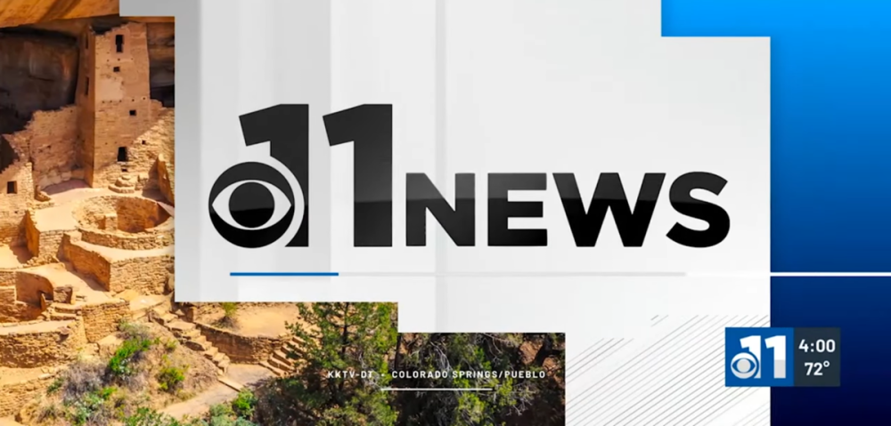
KKTV made the switch back on 4/4.. Interestingly enough, the CBS eye has not been removed... for now.... -
Nexstar has sold WJMN to Sullivan's Landing LLC, headed by former Quincy Media head Ralph Oakley, will be run by Morgan Murphy Media... sale is now pending per regulatory matters
-
I do like the cleaner look of the logo... Some of these boxed and multi-colored logos just don't work anymore.. especially with certain graphics packages....
-

The Ever-Evolving Gray Graphics Situation...Thread
MichiganNewsGraphicsJunkie replied to NEOMatrix's topic in Graphics
I don't only because the animated weather part is waaaayyy too busy... plus they have only a 30% chance of rain/storms and show the entire day as rain.. Can be very misleading if you can't see the teeny tiny weather icon above...


