-
Posts
2209 -
Joined
-
Last visited
-
Days Won
109
Content Type
Profiles
Forums
Articles
Everything posted by MediaZone4K
-

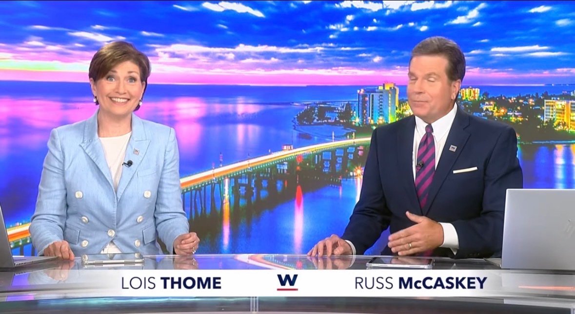
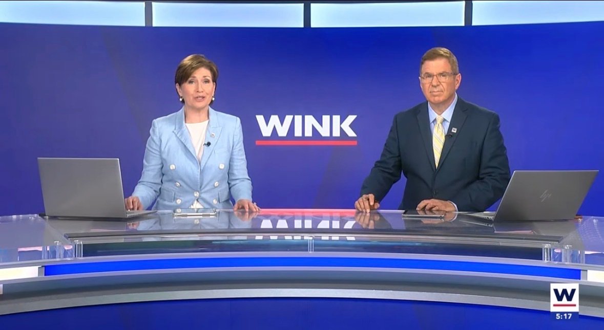
WINK-TV/Fort Myers Broadcasting Company new facilities
MediaZone4K replied to LocalNewsNerd7000's topic in Sets & Studios
I miss the window pane split monitor look of the old set Looks like they're using some soft white glow effect by the anchor desk. loving the look of the pink skyline versus a solid blue background.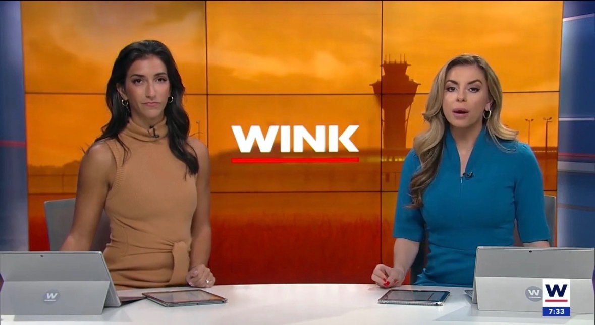
-
Well, I like that it still lives on somewhere. They can keep it for the Weekend Evening News or CBS Morning News. Perhaps they can resurrect the beautiful 2006 theme for Face the Nation so all three iconic CBS themes can live again. Good. Get rid of Bari. Serves them right. They canceled the best evening show (quality wise) for this mess. If and when they eighty-six Tony, who next? They don't have anybody (young) with the name recognition or gravitas.
-
WINK-TV/Fort Myers Broadcasting Company new facilities
MediaZone4K replied to LocalNewsNerd7000's topic in Sets & Studios
WINK New set -
Speaking of Bari & them, Nikki Glaser called out CBS News' new editorial direction at the Golden Globes---on CBS!
-
Eeh IMO Scott is a solid journalist but he was a little bit stiff as host of the CBS evening news. He fits better on 60 Minutes. These old graphics look better. The new themes and set are upgrades though. The Guardian reviews Tony's first week. At the very least, Tony could not have gotten a more active news-week to launch his broadcast. In all fairness, all three network evening newscasts are shells of their former selves. David Muir's program is certainly not the best, it's just the most popular of a shaky bunch. Nightly News feels like a lesser copy of Muir and CBS is an unstable revolving door hopelessly trying to find its rhythm. If CBS was insistent on revamping the format, I wish they would've just kept Maurice as a solo anchor.
-
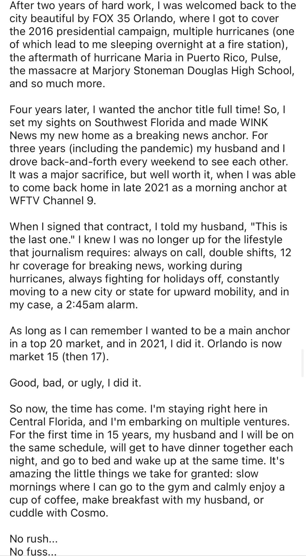
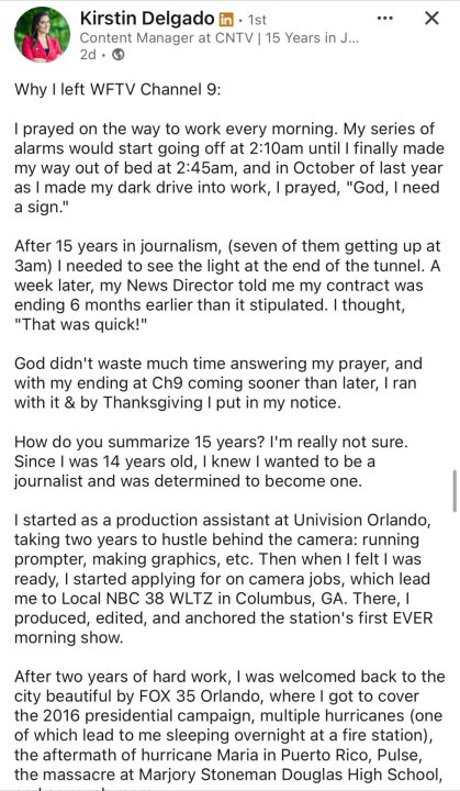
WFTV morning anchor Kristin Delgao outlined her reasons for leaving the news industry on Linkedin. Like so many in news, that dreaded 2 AM alarm was a major factor.

-
Good thing Lonnie kept his job at WCBS
-
Were they cheaper than Dana and Michelle, otherwise why lay off the original hosts?
-
It's nice that all three evening newscasts have their classic themes again, especially since ABC News brought back the (updated) 70s theme. Now if only ABC News could bring back their special report theme from the early 2000s. FULL BROADCAST (cleaned up West Coast version) Montage (with mistakes)
-
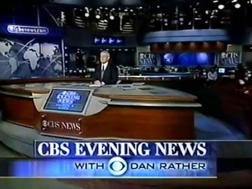
Random nerd fact...The "Rather theme" (1991-2006) lasted as long as Katie Curtis's tenure on Today. It was Couric's evening news that replaced the theme. IIRC, according to her book, staffers thought her getting a composer for a new theme was too much. and even without the music that intro was still cool. I wouldn't mind that as a cold open before they get to the headline montage, like what Today does now.
-
Yeah, that was a bizarre story choice for an inaugural broadcast. Hoping they eventually play the climactic portion of the Rather theme.
-
Positives: Loving the Dan Rather era score, headlines theme and logo font's returns. They've constantly recycled the *1987-1991 theme so I'm glad that this lives again. I hope CBS News Special Reports get this music again. When Tony is eventually replaced, I hope they keep it. Love using the newsroom as the broadcast set, an updated version of the Dan Rather era. Tony's desk looks like Rather's. I'd say Tony's set looks even better than the sets used by Nora and Maurice/John. CONS: L3 graphics are boxy and ugly. The format is a copy of the competition. Everything is breaking news in the intro, but at least everything in the A block wasn't "Breaking". The camera seemed to bounce whenever it came back to Tony's main shot on set. Overall, I'd say Maurice and John's broadcast was superior, but I do prefer the set and news theme on Tony's show. I wonder what the CBS evening news with Nate Burleson will look like in 2027 Even ET is leading with Tony's debut.
-
on a positive note, the warm colored background behind Tony looks pretty nice, the warm lighting and smooth HD are pretty complementary as well. The best set the broadcast had in recent memory was Nora's DC
-
I wouldn't mind that. I don't find them outdated.
-
Good ole Nexstar/WTEN. Always cost cutting.

-
Ahh. I suspected that it could be a video wall/green screen mimicking studio 1A. I didn't catch the beginning of the broadcast, so I waited until the end of the show to see if he would say "from Miami". I didn't hear it so I thought it was New York. I presume this is the NBC 6 building in Miramar?
-
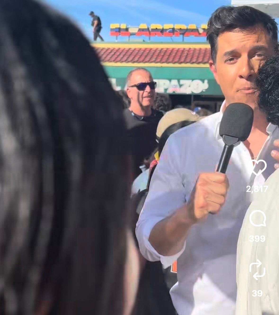
Looks like Tom Llamas had a busy day. He reported from the celebrations against Maduro in Doral, FL and apparently he's in Studio 1A for Nightly News. ***EDIT: Tom is in Miami

-
I was confused by the New York City radio station launching an Atlanta television channel. Do Atlanta residents know what Hot 97 is, or does it hold cultural significance to them? Geovany Dias has returned to WPIX as a reporter. He was previously at WFTV in Orlando.
-
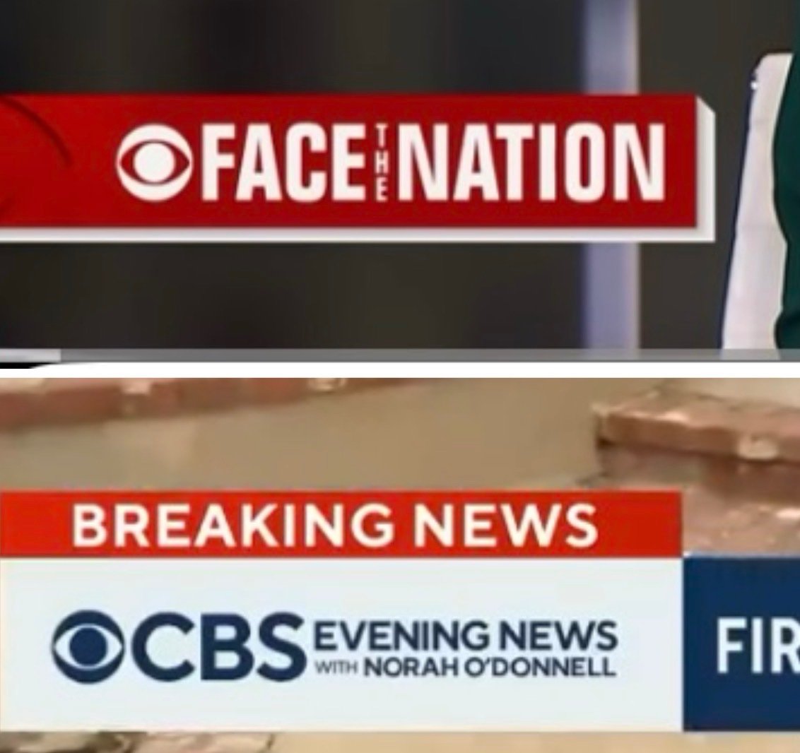
First it looks like that power point looking blue beveled Face the Nation style box will be part of the L3 for the revamped show. Similar to the L3 logo box when Nora was there. Second, Tony makes an impassioned plea for viewers to trust him because he understands their concerns about bias and the media being out of touch with average Americans. While what Tony says sounds nice, knowing who now runs CBS News, it has an under tone. "We want to be more appealing to conservatives and cautious that holding the president accountable doesn't feel like liberal bias." The corporate interests line was ironic.

-
I remember a similar set up occurring about last year with Dave Carlin and another male anchor (name escapes me). Loosely related, also caught a dual male anchor sub in Miami/Ft Lauderdale today. Per usual, the holidays break the mold of who we typically see together. Anywhoo back to CBS 2...
-
it looks like all of the big three networks have followed ABC's lead in shifting their local 11 PM newscast at 10 PM on New Year's Eve.
-
since we're bringing back the typeface, can we bring back the Dan Rather theme too. The 1991 theme has been recycled a lot, it would be nice if they could use one of the best themes.
-
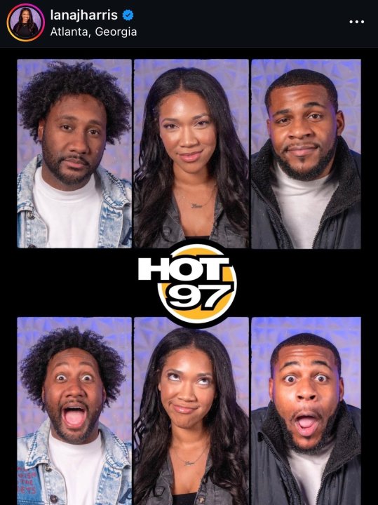
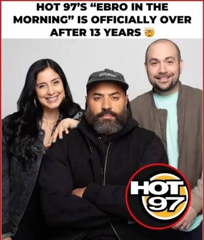
Former WANF morning anchor Lana J Harris will now be a radio host at New York City's Hot 97 (WQHT-FM) per her IG. The station is not specifying what role Lana and some other new cohosts will take. It's widely presumed they will helm a replacement for the canceled Ebro in the Morning. Legendary long time DJ Funk flex is hosting a temporary replacement for the show. He also confusingly announced that he will eventually take over the morning slot in 2029. There is still no public explanation as to why Ebro was canceled. This leaves (WWPR-FM) Power 105.1's The Breakfast Club with no major competition in the hip-hop morning drive radio market. Ebro Darden was very critical of the TBC. His show's cancellation comes as Netflix announced it will stream video content from TBC, and Charlemagne tha God reportedly signing a $250 million content creation deal with iHeartMedia.
-
Former WANF morning anchor Lana J Harris will now be a radio host at New York City's Hot 97 (WQHT-FM) per her IG. The station is not specifying what role Lana and some other new cohosts will take. It's widely presumed they will hrlm a replacement for the canceled Ebro in the Morning. Legendary long time DJ Funk flex is hosting a temporary replacement for the show. He also confusingly announced that he will eventually take over the morning slot in 2029.

-
Weijia Jiang anchored tonight. Is there a particular reason John and Maurice's last broadcast was on a Thursday and they didn't just have them finish the whole week. My only presumption is the contract ending date?