
Leaderboard


Popular Content
Showing content with the highest reputation on 04/12/23 in all areas
-
Wow, that Eagles green looks great; way better than it has any right to be. Certainly blows Black-and-Gold out of the water for personalized GFXs colors in my eyes.9 points
-
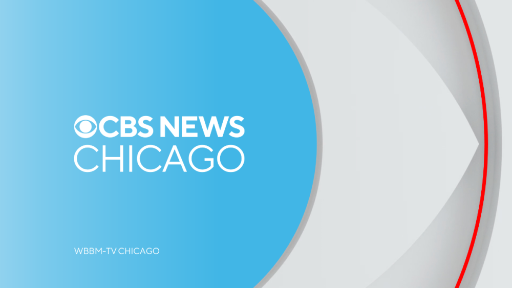
@24994Jdid a mock in the Discord for WBBM with the Bears colors, and it actually looks good! (I won't share unless he'd want to lol) The aforementioned B+C article did have this quote from Adrienne which is making me think "open source" more and more... Basically, this feels like it's a "sum of all parts" among the stations, and KYW might have served as an ice-breaker. Ironically this has the feeling of something @Samanthasuggested to me once: the idea of a station group (she was thinking about Gray) creating a graphics package or branding conventions with different colors for different regions.6 points
-
KYW-TV is CBS's pet project in more ways than one, it's fully repudiating and excoriating the past Dunn/Friend regime. Making Ukee Washington the literal face and voice of the station (in more ways that one) speaks volumes. If you didn't see Ukee deliver KYW's new mission statement during the 5pm newscast, you really should seek out the airchecks. What if the varied color palettes are intentional? What's to say they want the O&Os to try various color schemes and this is being worked out open-source between the stations? Of course I'm a Browns fan, so Eagles green >>>>> Steelers black-n-yellow, sorry yinz all lmao5 points
-
5 points
-
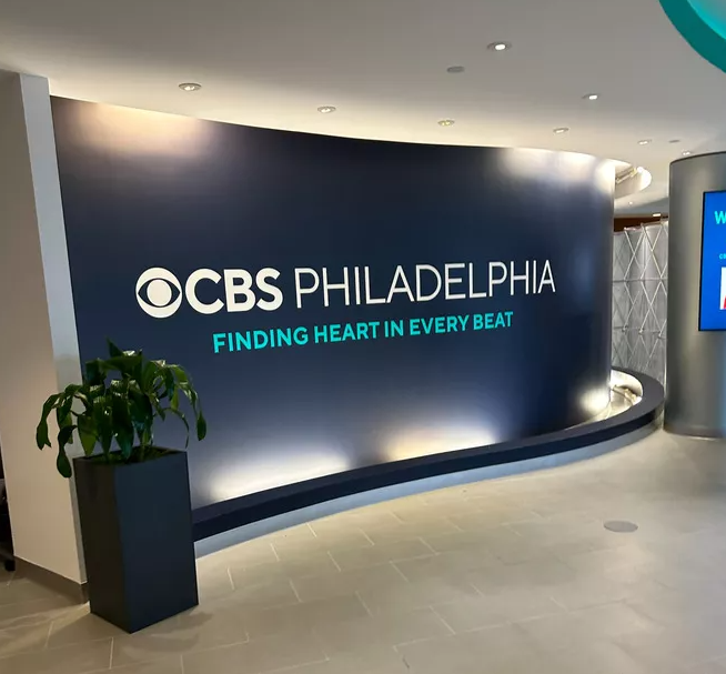
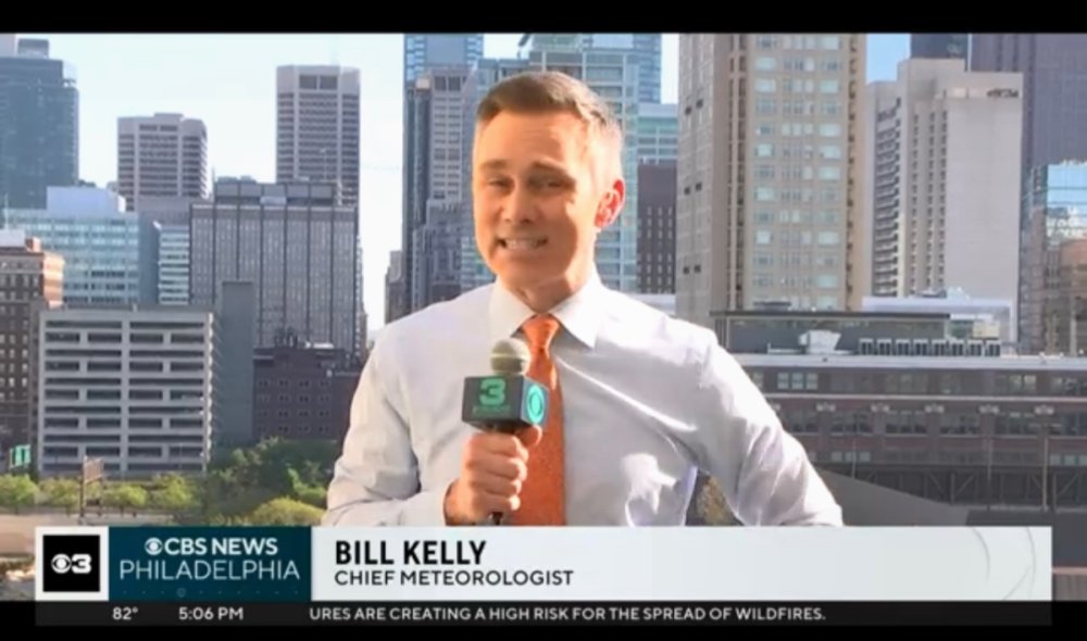
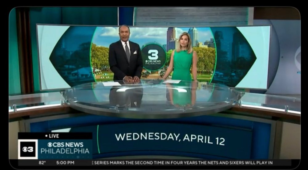
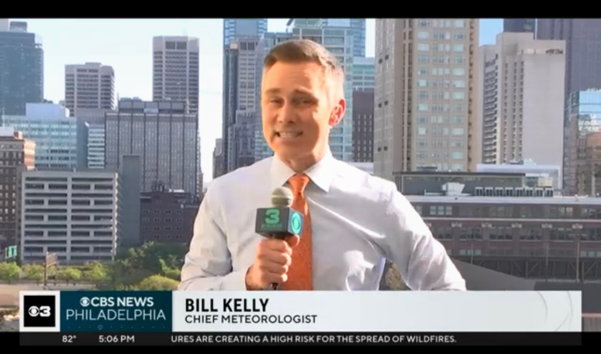
It's a wrap on the Eyewitness News era today as the full "CBS News Philadelphia" brand and (green!) graphics have launched today5 points
-
Broadcasting & Cable has more on the changes at KYW. Their new branding is "Finding Heart in Every Beat" which is certainly unique. https://www.nexttv.com/news/kyw-philadelphia-scraps-eyewitness-news-for-new-branding
 5 points
 -
The more I see it, if they had to insist on the box, I would have preferred the 3 by itself sans Eye. Also on their choice of color scheme, I think they picked Midnight Green 1; cause Eagles and 2; mainly to differentiate themselves from the other stations in town. Everyone else uses some combination of blue and white as the primary colors of their graphics. KYW would at least be separating themselves in that regard by going with Eagles colors.5 points
-
And in Chicago flag colors... Was NBC ahead of its time? I kind of hope so, honestly.
.thumb.png.c9fb3f4600cca8f84c6594b8575a68ec.png)
 4 points
 -
KYW is doing everything they can to make Ukee Their Franchise(tm). He’s living proof that good guys DO finish first.4 points
-
Having seen the demo, I actually give it a 9.5 out of 10, if it was JUST the 3 with no eye in that box, it’d be a runaway 10/10 and the best execution of the package yet. In fact, it already is better than KCAL3 points
-
New 3, for sure, with no CBS eye attached during the news. The flair of the new numeral is lost when at such a small scale, in the box, with the eye.3 points
-
Thing is, I can’t think of a commercial station in the market that has used a color scheme like this. Maybe WCAU in 1995 when they were a lame-duck CBS O&O? I know WIP-FM has that color scheme and blatantly so, being the Eagles radio flagship and all. To wit, WPSG has a logo that reads “CW Philly 57” but is identified verbally as “The CW Philly”. This is actually on-brand for them.3 points
-
They'll never admit to the trades, "we went with a logo that hadn't seen the light of day since NBC was thrown back to Cleveland in 1965" because it would be insane to say. BUT it's pretty clear they looked long and hard at the station's history, saw that "3" and felt it would be better than the Westinghouse font or that Helvetica "3"... they went with the throwback on purpose.2 points
-
Couple of more (including new mic flag)…
 2 points
 -
That's awesome. He has a really good narration voice.2 points
-
WPSG did have graphics that leaned neon green for their "Wake Up News" show after the switch from UPN to the CW2 points
-
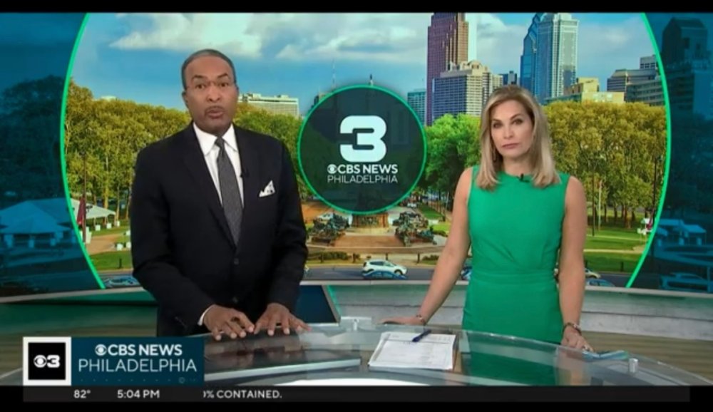
The final product is green, but unfortunately, the 3 is co-branded with the CBS eye in the box, like New York and others. Paired with the black ticker, it's a very handsome look.2 points
-
How about bringing back that classic Group W 3 logo?2 points
-
It's the new silent 3 of CBS Philadelphia and CBS News Philadelphia. Screenshots and video are in the O&O graphics thread1 point
-
And here you go1 point
-
KCNC already has the CBS graphics. The WBBM one posted is only a mock.1 point
-
I also think the Westinghouse font is lost media. It hasn't seen any regular use as a typeface since Westinghouse became CBS. There have been (bad) redrawings of previous logos (looking at you WJZ and KYW 1060) and KPIX never retiring their 5 til just this year but no actual evidence that it survives at all.1 point
-
I say this as someone with no ties to DFW, but my heart doesn't exactly flutter over the prospect of KXAS's star 5 being canned.1 point
-
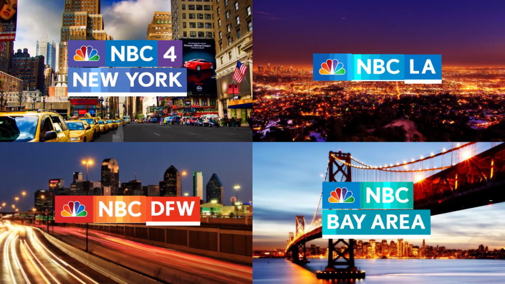
Exactly what I was referring to earlier. I was actually a big fan of this look and the direction it was going. It tied in nicely with the network's "More Colorful" promo campaign. Also the stations DID have the option to retain their channel number branding. As you can see WNBC was to stay NBC 4 New York, WCAU was to rebrand to NBC 10 Philadelphia, KNSD eventually became NBC 7 San Diego after being just NBC San Diego when they launched the look. But yes NBC was WAY ahead of its time given the blow back they got from most of the O&Os when this was coming down the pike.1 point
-
Dropping that Helvetica "3" was totally intentional. It had too much negative baggage connected to Dunn/Friend and it was absolutely boring to boot. If WCBS were to swap out their current "2" for the Eurostyle-ish font with no eye and put THAT in their box...1 point
-
They are clearly coping KDKA with the local football team colors. Told you they were eyeing WCBS and KDKA. The eye 3 box is clearly WCBS and the local team colors is KDKA.1 point
-
I was wondering the same thing. If this opens the door for say WJZ to go purple (wouldn't be the first time they went with a crazy color scheme) for the Ravens, or WBBM go dark blue and orange for the Bears or blue and red for the Cubs? It seems like everything is in play. This does remind me of when NBC tried to implement this strategy back in 2011. The stations all had a choice of color schemes to go with.1 point
-
It's an easy fix for anyone in the gfx dept to take care of. I'm sure it'll be straightened out in the coming days.1 point
-
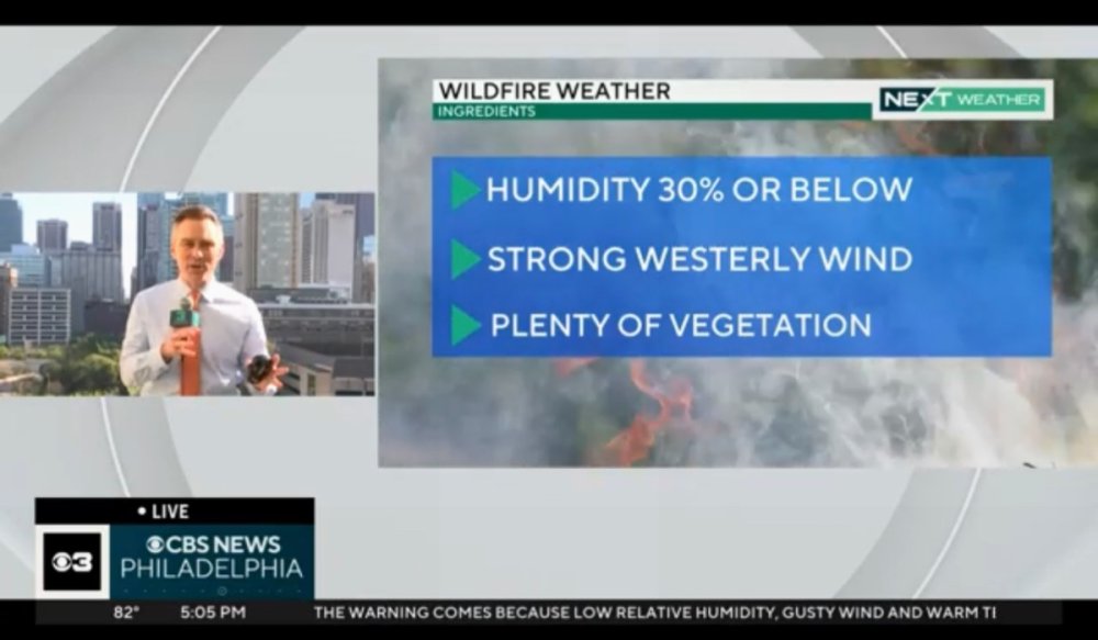
Something they need to tweak with the Next Weather graphics, the logo and banner are green like the rest of the graphics but the forecast boxes and other elements like that are still the default blue and it clashes badly.1 point
-
The Philly Inquirer also has a nice write up on the rebrand: https://www.inquirer.com/entertainment/tv/eyewitness-news-cbs-philadelphia-rebrand-20230412.html?outputType=amp The statements from the GM in both articles does have me doubting what others have claimed is the end of local identities at CBS Local. Just going by what all the GMs and the head of the division have all said, their goal is basically to merge the CBS News brand with the local fabric of each station with each station going about it the way it fits their market. Flame away if you disagree. I don't care. Lol Everything looks great but fail on that dated skyline image. Also they're using the new Next Weather gfx.1 point
-
Really like the green…
 1 point
 -
the CBS eye and the 3 together seem awful small in the box...1 point
-
A breaking news stinger ran at 4pm with the new look (didn’t mean to post within seconds of you @Georgie56)
 1 point
 -
I like Comet when they are showing something old and schlocky, but they show too much of the new stuff and newer vintage sci-fi does nothing for me. Kind of the same with Charge. The older stuff is cool, but there is a lot of marginal stuff on that channel.1 point
-
Here's an Arizona Republic article from 1981 about Cecil Tuck and his decision to pair Allen and Scoutten, while demoting Dave Nichols and getting rid Ray Thompson: https://www.newspapers.com/clip/55737168/changes-at-channel-3/1 point
-
I was thinking the green (IF the gfx actually end up being green) could have at least two meanings- one being the obvious Eagles connotation, harboring the city's affinity for the team, the other being the positive connotation of the term "green" in modern parlance. Also given the sheer size of the 3 in some of the new promos (even though I much prefer it's smaller usage in place of the "box" in the new logo), as has been said- it's definitely a testament to the "channel 3, channel 6, channel 10" mentality of the market. Aside from potential usage in the graphics and maybe on screens in the studio, I doubt the word "three" will be mentioned much, if at all, but for hardcore old-school Philadelphia viewers, just SEEING a three will perhaps help bridge that gap between the outgoing and the incoming.1 point
-
@HulkieDand I were spitballing last night over a possibility this usage of Eagles green might be tied to a forthcoming broadcast rights deal of some sort with the team. I can’t think of a single TV station in the entire market that’s ever used the color scheme, nor could she. And to be honest, the O&O graphics will look a lot better with Eagles green and teal as opposed to black-and-gold. That typeface needed to be retired in 2003 and would be even more obsolete in 2023. Using this weird “3” for what it clearly is — a simple marketing tool for CBS News Philadelphia — is actually not that bad an idea. (“Tune in to CBS News Philadelphia on Channel 3!”) Plus it’s more visually appealing than that ungainly Helvetica “3” KYW-TV has been saddled with for far too long.1 point
-
I've gone ahead and started a Speculatron thread for HLN. As Daleks would say, SPEC-U-LATE!!1 point
-
Holy mooing cake, it's Ernie Anderson voicing a KTVK news open. I never thought I'd hear that. I figured Tony Evans did it.1 point
-
Word from the Discord is that Jim Donovan confirmed in his daily Facebook live this morning that the new look will be debuting on KYW tomorrow at noon1 point
-
The CBS Philly Vimeo has posted a few new imaging spots featuring a green theme and the new logo, that along with the fact that tv listings haven't reverted back to using the "Eyewitness News" name this week may point to something imminent (unless the user has actual inside info).
 1 point
 -
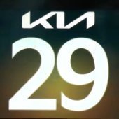
KYW has the colors of Philadelphia Eagles KDKA has the colors of the Steelers WBBM with the Bears colors Looks like the CBS is having its O&Os try NFL team color schemes. Got a feeling that KCNC will be on the list, and they'll be using Broncos-colored CBS graphics for KCNC0 points
-
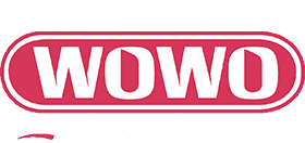
WOWO radio in Fort Wayne still uses it nearly 40 years after Westinghouse sold off that station. And once WJZ drops it, WOWO will be the only one left.
 0 points
 -
WCCO has to be flipping today... Facebook page has been rebranded from "WCCO-TV | CBS Minnesota" to "WCCO News & CBS Minnesota". No logos changed on the socials yet... Addendum: No way this played into any launch date whatsoever... But WCCO is on virtual channel 4, and the satellite they kept, KCCW (Walker, MN) is on virtual channel 12... Today is 4/12...0 points
-
I still don't understand the green choice so long ago, it was such an awful color choice both for branding and accents.0 points
-
Maybe each station is advocating for certain things (whether it's bringing back old branding, web sites, logo, #s, etc...) and CBS brass is, in some sense, placating them. Which is why I don't think the co- (or secondary) branding outside of the primary CBS News [....] is temporary or transitional as I don't see the point of taking that approach. But I agree that if you're going to use a co- (secondary) branding like a channel #; it would make sense to use it verbally in some way not just visually.0 points
-
It's not surprising given that some of the other stations that are using the box logo aren't verbally using the old brand (see KTVT and WFOR). But yeah it goes to your point; why keep the old logos or in KYW's case keep the 3 at all. KYW is especially a strange case since they abandoned the old brand even before launching the new look and music.0 points
-
Honestly, that makes it even more puzzling. Why even ponder including the 3 if you’re not even mentioning it? Of course, this is assuming they even use that 3 as a visual brand for the station and its newscasts, and not just for promos or something.0 points


.thumb.png.3d66a1eeb7ecf5404151f8a77ea7cbfd.png)
.png.703b5a3cd2424ff9af937cff9fccaac2.png)


.thumb.png.20cbae3777de7f140153442a1bb805e7.png)


This leaderboard is set to Chicago/GMT-05:00