
Leaderboard
.thumb.png.3d66a1eeb7ecf5404151f8a77ea7cbfd.png)


Popular Content
Showing content with the highest reputation on 06/14/23 in all areas
-
No taking notes by WABC. They're getting it. All 8 stations are getting it. Period. WABC changing their wordmark is not clear, either way. 'Similar' is the point. The lower thirds (and likely yellow as an accent color) will be universal. It's the opens, segment brands, etc. where the stations have the freedom. WLS chose this cut for WLS. Everyone is doing their own thing. They're continuing with all the cuts they adopted in 2013, for closes, bumpers, etc. Sorry for the multi-quote. Just easier to break it down, point by point.5 points
-
Obviously it has real time data - I meant “fake” in a more general sense, just questioning the design rationale behind it. It’s a lot of effort for such a little throwaway design element. I saw this on the NS write up and felt the same - would have made for a much cleaner open. There’s just too much to look at now.3 points
-
Found this on another site. I would honestly prefer this as the open. Its less busy and cleaner. This is just a still and I have no clue where this came from but it looks better than the current open.
 3 points
 -
2 points
-
There's not many things I dislike about this package. I'll agree the opens are a little busy, it will be interesting to see how they evolve over time. The music though... The music is bad. I am sure some people are going to love that previously unheard cuts of the "classic" music are being used, but hoo boy, they are 22 years old, and you can tell why they were tossed in a drawer in 2001 and forgotten about. My understanding is these might not have been their first choice, but for various reasons this is what they ended up with. It would be nice if they find the money in the coming years to commission something new. It's past time for some of these Gari packs on the O&Os to be put out to pasture, or at least updated to not sound like a bunch of 90's synth work.2 points
-
My bet? There's no one left at WCPM who could compose a half decent update to the package.2 points
-
I think I prefer something simpler. I’d rather have the Scripps package than this. There are too many elements moving all over the place, the mashup music is jarring and strange. The live bug is weird looking and reminds me of something CNN might use. For spending years making it the whole thing looks like a ridiculous rush job. Color me disappointed. WLS downgraded big time. I’ll second whoever said it looks like WABC’s package.2 points
-
Those are fair points, but the package is still a massive upgrade for pretty much all of those stations (esp. WABC). Imo, it’s still on par w/ the other major network O&Os, and it looks far better than the packages the major station groups have put on their stations.2 points
-
Open definitely seems busy! Not at all what I was expecting when I saw the lower-thirds.2 points
-
The fancy arrows DO have a purpose… they “move” the little line below the headline in the previews… you know… like you do in an app! Kinda like tabs that look like text boxes… it’s what all the kids are into right? I swear these ideas are from somebody about to retire who is about as hip as a heart attack.1 point
-
The pointless gloss that doesn’t emphasize anything, lens flares on top banners, and everything flying in/up/around This game can be played with any decorative element, and for the same reason your neighbor covers their house with Christmas lights, it’s there to draw attention. imo the graphics should complement the story, not distract from it, but the consultants often don’t seem to think so1 point
-
I managed to fire up the online newscast on my Apple TV so I can see what this looks like on a TV vs. my phone… the lower thirds owe royalties to somebody in Fargo, ND. There is no separation to the names of someone being interviewed and where they are from. A thin line between top and bottom would be awfully nice. The transitions where the graphic swings in and swings out again (weather for example) looks familiar… like 2012 familiar. Making your audience dizzy trying to read your graphic still isn’t in style. The best part of the package is probably the weather graphics. I never thought I would have a use for this but… *Cough* Why do TV news people have to have the same hard headed product philosophies as car executives? Keep it simple and don’t try to overflash or make it harder to read a graphic or see an image in an open. A large chunk of the viewers are older and may be turned off by it.1 point
-
Well I'll give them this - the open is very distinctive and has depth to it that takes full advantage of the big screen. That angled depth look carries over to the topical graphics. Not a fan of the generic wordmark - the prior one had more sophistication and was more unique. Overal - the prior package was great and better, this could have been worse, and points for effort on the open. For the music... I expected to hear KTRK anchor names after those first few notes, and interesting they went back to the 1992-2013 notes for the signature, after 10 years of going back to the 1983-1992 signature. Again I think the prior version was more sophisticated. Although like that they went pretty much unadulterated with the signature notes vs the original 1992-2013 version. Im going to guess the market research said people associate the teletype sound and the NS2K plus signature with WLS growing up so they mashed them together.1 point
-
The insert graphics are decent. The opens have a lot going on in them, I'm not sure I need a fake ticker and time/temp, but hey - props for trying something new. It's not the best O&O package out there but certainly not the worst and I think definitely an improvement over what most of the ABC O&Os have on the air now. Odd choice though going back to a very dated-sounding (well, it is dated, it's from the 90s) music bed... clearly they didn't want to spend the $20-30k for a few new opens/bumps?1 point
-
I think its a brilliant dynamic package. it might be a big much for older viewers to wrap their heads around. But I think its brilliant. Dont like the chopped together opening. I hate there is no music bed after the opening. It feel abrupt. Not sure about the cobble together opening theme.1 point
-
After seeing an entire newscast, I have to say there is just too much motion going on. It seems like most graphics swipe the screen the way the open does and move pretty fast. The lower-thirds look fine as a screenshot, but there's a lot of strange movements their too. At first, the Eyewitness News reporter's name shows up in a larger white banner, it shrinks and moves up a little (like a tab), then the blue banner pops up, and the white tab disappears after a few seconds. It's just too much, and it's not what I expected at all after seeing the screenshots. Many of graphics kind of look like WABC's package, which I've never liked. Other than that, it's pretty strange for the Weather and Coming Up graphics to look almost exactly the same.1 point
-
Take notes WABC! It's amazing how all of the New York stations are flagships yet none of them are the best looking presentation wise in any of their station groups. * not counting graphics on 2, 4, & 5 who have the exact same graphics as their sister stations*. Not feeling the new ABC bug. It's the same things CBS did: put a streaming sized bug on TV.1 point
-
Brigit co-hosted Fox Weather Now from Dallas today while Ian hosted from the studio. Maybe this means they'll be on this show together regularly...we'll see. Despite Brigit being back, Fox Weather Live still aired only from 6pm-8pm ET. The untitled overnight loop, hosted tonight by Steve Bender, again started at 8pm ET.1 point
-
I was really hoping to see the talent opens return to WLS. I love the graphical elements however the opens seem a little busy. Also not a fan of the new open mash-up music.1 point
-
Looks pretty good to me.1 point
-
I’m not sure about that; the intro cut of music has the NS2000 signature tacked on at the end. It sounds as if it’s an old cut that’s never been used by anyone before. EDIT: Here’s the video1 point
-
Jim Rosenfield being considered is something I did not expect but he would be a great hire. I'm used to seeing him as an afternoon/evening anchor so it would be interesting to see him doing mornings. However, as this station just let a newly hired reporter go before he could even appear on air due to apparent budget issues, I'm not sure that they have the money available to hire someone with Jim's experience. (Unless they feel that this would be more of a necessary "power move" to fill in their anchor slots compared to a new reporter.) Rosenfield first came to New York joining CBS 2 as noon and 6:00 co-anchor. I remember the promos hyping his arrival and being disappointed that he seemed very stiff. Then he left for NBC 4, and eventually came back to CBS 2 and seemed much more comfortable. While we're thinking of former CBS 2 anchors, my mind also considered Don Dahler, who was an ABC News correspondent before essentially filling Jim's role at 2. I wonder if he is also under consideration at all. (Not to turn into too much speculation here.)1 point
-
I’d love for Jim Rosenfield to join NYC airwaves again.1 point
-
Jim Rosenfield, formerly of WCBS and WNBC - most recently of WCAU was in the building today. Not that it necessarily means anything - but he did a test with Shirleen.1 point
-
The Belmont Stakes has its own bespoke graphics package, which is surprising because I thought they'd be dragging out the old black rectangles for it. And shockingly it's not huge and in your face. It's very green and gold with shades of the World Cup, and the old US Open theme music strikes again.1 point
-
A 1983 edition of CNN's Prime News during the invasion of Grenada (but the newscast opens with an item about the shutdown of CNN competitor SNC): A 1988 edition of CNN's Sports Latenight with Dan Patrick and Gary Miller. The two anchors would leave for ESPN in 1989 and 1990 respectively:1 point
-
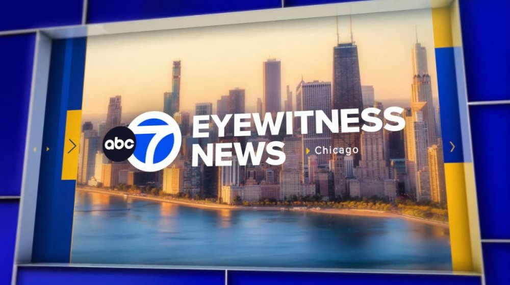
I agree. There's just too much movement. If you're going for the 3D look, use 3D graphics! This is a 2D package with too much motion, trying to get the "3D look". The way the Channel 7 pops up in the open looks very cartoonish, and the tiny arrow pointing to a tiny Chicago also pretty cheap looking. The Eyewitness News typeface is too generic. Some of the graphics are also extremely plain (like weather forecast), while others, like the open/breaking news deal, have way too much going on with still images moving around that's it's kind of dizzying. But most have the same swiping motion that seems to be overused for almost every single graphic/transition. This isn't what I expected at all and I have to agree it is a downgrade. I'm sorry, but I feel like someone got paid a lot of money to steal elements for every other station he/she has ever watched, and much like the open's mashed-up music, just threw it together.0 points
-
Overall I’m excited for this package but the opener and music are very busy.0 points


b.thumb.png.b658c90e4e56cb08f2e8ba3195bb9da9.png)


This leaderboard is set to Chicago/GMT-05:00