
Leaderboard


Popular Content
Showing content with the highest reputation on 12/20/22 in all areas
-
Also, I don't get all the disappointment. All the signs of what this package was going to be have been laying around since the start of this thread, and should have become clearer when CBSN was launched and the overhaul of the network package. If you thought it was going to be anything else, you weren't paying attention.15 points
-
This forum is very nostalgia heavy, and most here have an extreme attachment to graphics and their local stations (see the argument about Pittsburgh needing everything to be black and yellow) Nothing new will ever be ok unless it keeps the same colors, names, numbers, style, anchors, sets, bumpers, idents, while also being new, fresh, exciting, up to date, and representing their area with little call backs and touches that bring a tear to your eye and you can say "That's my station". It's pretty funny when you look at it objectively. Times are changing, get over it. Apparently the point is to show headlines, which is what it does.10 points
-
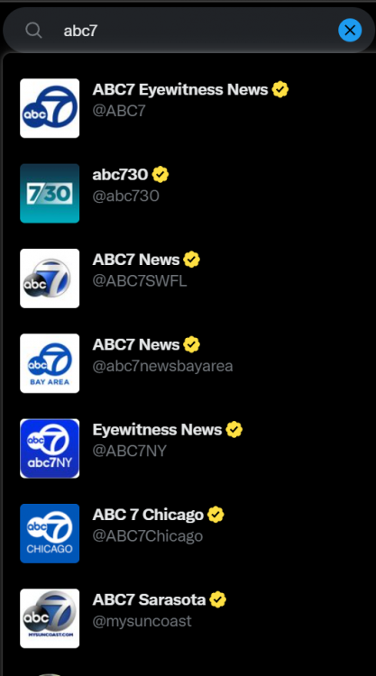
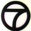
This is what a forward-looking news organization looks, sounds, and feels like. I'm sure there will be people upset that the "Westinghouse channel numbers" and "iconic" other cruft disappears, but these stations existed before that stuff came around, and will exist after. Most of these stations never had a firm "logo" for their first 20 years of existence and they did just fine, without "confusing" anyone. Most of these logos have outlived several generations of logos at major brands. I'm still not sure why it's seen as important for a local television station in Baltimore or Pittsburgh or wherever to keep the same logo forever, while major companies like United Airlines or Hyatt Hotels get to update theirs just about every decade. TV has this bad history of treating viewers like they are absolute idiots. "Oh, we can't change anything because someone out there might get 'confused'." If someone told me RJ Fletcher's speech in UHF about the "pea-brained yokels" watching TV in his market was based on real worlds said by a real TV station GM, I would not be that surprised. There's nothing wrong with a little nostalgia, but it can't get in the way of progress. When a station branded as "TV 7" in 1954, that's because that's where it was. On TV. On Channel 7. That was it. The first signs this branding didn't work in the modern era came in the late 90's when every "ABC 7" and "NBC 4" was fighting for a relevant web domains. Then came Social Media. If I go on Twitter right now and search for "ABC 7" this is what comes up: Talk about "Confusing viewers" when the first one offers no way of identifying which station it is, and looks identical to the rest of the ABC7s there. No, most viewers do not know offhand how to differentiate between the different Circle 7s out there. There is no confusing where these CBS stations are located. I don't buy into these stations "losing" any "local flavor" with this branding, because locality is baked into the heart of it. You can be any one of a bunch of "CBS 2s" out there, but there's "only one" CBS News Chicago.
 8 points
 -
If I went to a focus group and played them the Enforcer theme, I bet only one person at most would recognize that as "the theme for my local newscast" or know that it (in most of the country) has anything to do with CBS. I said in Discord on March 8, 2021, "honestly? I bet Average Joe Viewer couldn't make the connection between Enforcer, CBS Local and...CBS." I later called it "some ditty that most people don't even realize is associated with CBS local news for reasons far from them in time and space". And I stand by those words. Shelly Palmer and later Frank Gari sold that theme mostly to CBS affiliates because of the use of the theme at the CBS O&Os. (Of course, non-CBS affiliates have used the mnemonic—including WVIT and KRIV, O&Os of other networks—and even in some cases had their own versions made, like WHTM's Sheldon Elias-done remix.) The whole point of a brand mnemonic is to provide that familiarity across platforms and expressions. It's really fitting for the News and Stations structure of CBS. This is the same network where the background of the CBS Evening News lists bureaus in Rome, Johannesburg, London...Sacramento and Baltimore. By doing this overhaul in the way they have, CBS has Built on one of its few strengths in the area of local news, the streaming channels. Recognized (at least here with San Francisco) that the newscasts have been titled to be replayable in a loop on CBS News. Executed a brand hierarchy that is forward-thinking and geared to the content-flowing-like-water mantra of Adrienne Roark etc. At the same time, the call letters are being used to reassure viewers in certain markets with especially entrenched or viewed CBS local news brands that this is the same newscast they're used to watching. Brought the local stations news in line with the network news and the network as a whole. If the goal is to improve the reputation of the local product based on CBS News, this will help. Provided a much-needed visual rejuvenation to the local news product. Created an up-to-date look that should help the stations to at least some extent in ratings combined with other improvements to the news product. Broken with the look and feel that stagnated around the CBS stations chain in the Dunn–Friend era.8 points
-
To me this rebrand looks great and is extremely forward-looking to the way people get their news and info today. Call letters and channel numbers don't hold the cache they did 50 years ago in TV's golden age. If the network brand has a stronger affinity than the local stations (especially most CBS locals which have always placed in 3rd or 4th) why not lean into it?5 points
-
The way I see it, Briella isn't wrong, but neither is nycnewsjunkie, and neither are you. It's the old adage of "perception is reality"... or more accurately, perception can become a person's reality.4 points
-
Nicely said. Things change, just gotta get with the times. These news organizations are struggling (most don't even look for sweeps periods anymore) - who really watches the news anymore? We get our information from social media. I would side eye an organization if they weren't making changes right now...4 points
-
What's so cool about this is that for the first time ever in America (please correct me if I'm wrong), we have a local and national media outlet sharing a design language with the graphic packages. From the CBS Evening News, Streaming, and the locals, they match together. Great identity system.4 points
-
I think they are going for her walking in from the street after getting the story, since in the opening she walking around. I think it's creative, and a much needed breathe of fresh air. I honestly like the approach KPIX is taking with this rebrand. The nod to the past with the naming of all the evening broadcasts to include the anchor's name and blending it with different presentation styles that aren't just having someone glued to the desk. Stations spend all this money to add all this technology and promise that it's going to revolutionize how they tell stories, only to continue with the same approach. I'd like to see more stations step a bit further outside of box, like this, and use all those AI tools, use the set to it's full potential and not hang around the desk so much. Yes, it's a bit rough around the edges right now, but this could really be good once refined.4 points
-
I wouldn't be so sure. It seems like CBS is all in on this new branding standard. If anything, I'd say the box with the call letters on some stations like KPIX is just a transitional brand until people get more familiar with CBS News Bay Area and then the box will go away. I mean it doesn't look like every station is getting box with call sign, only the select few with legacy brands that may be hard to just cut off right away. I.e. KDKA, WBZ, WJZ, KPIX, etc.4 points
-
If they get rid of the music, they won't live to see the Standard General takeover4 points
-
The obsession with numbers and call signs is going to be your undoing. It’s weak branding and a relic of the old age. This is the future, I think you will be disappointed when rather than numbers coming back, call signs go away altogether.4 points
-
Considering that you’ve got 10 people liking your post, and that a sizable number of people in this particular thread have offered nothing but uncritical praise for what CBS is doing, your perception is mistaken. Yes, there are people who don’t like it, and prefer stations to have individual characteristics, but that’s their prerogative. They’re allowed to have an opinion too. As far as my personal feelings are, I really like this rebrand. The graphics are miles beyond what they replaced, and IMO, they’re the second best looking local news package out of the US that I’ve seen (the best being NBC’s). although I’m not a fan of the way they use the call letters in what is very likely a temporary branding. The call letters in a box don’t look good next to the “CBS News X” really look sloppy IMHO. (EDIT: I probably should’ve noticed that already, but I really notice it now having seen it on air). I get that they’re trying to transition things over, but they’ve already been doing that for more than a year. In KPIX’s case, I don’t think the anchors/reporters even mention KPIX once. If you’re going all in on CBS News, go all in now.3 points
-
Just adding in that it's a really nice rebrand. The overall downturn in local TV news has hit KPIX especially hard over the last few years, and the product has really fallen into the cellar of the Bay Area market. Yeah we'll miss the old Group W-style 5 (however it was starting to look really old), but I can't tell you the last time I used the channel number buttons on my remote now that almost all of my linear TV viewing is via streaming services. All in all a nice step up for PIX.3 points
-
Its almost like everything that happened between 1985 and 1995–Chris Crane dissonant chord music, sets with corrugated metal panels and video walls, flashy flying graphics, crime-crime-crime-all-the-time—needs to be ensconced in amber and abided by for all eternity, and any deviation from this by a station or owner is Somehow Very Bad. cough cough Tegna cough cough To be honest, WSVN (the station that is seemingly subject to the most nostalgia) is still its old flashy self because Miami is an outlier of a market. An aberration. WFOR under this CBS revamp would be taking a position unlike any other station in town, which I’d prefer over having them be Another WSVN Knockoff or Another Generic Newscast (as took place with Dunn-Friend) and languishing in obscurity.3 points
-
She said “KSBY News Bay Area”3 points
-
The other issue being that I don't suppose Nexstar can actually buy anymore without selling off properties because they are at the cap.3 points
-
As long as the content isn’t being affected, what’s the problem?3 points
-
In the interest of not pushing this thread on more of a tangent, numbers were used in branding because of 1) multiple national networks in the us, 2) non standardized numbering by area, 3) the need to let people know where to find their station due to 1 and 2. 4) It just became easy in a world with just 12 channels to reference the number. now with how global things are, having to compete with entities that don’t have a “number” or call sign, the numbers and call signs are very limiting.3 points
-
Thank for saying this in a much more polite, eloquent way than I wanted to. The "NEW GOOD, OLD BAD" attitude of said poster in this and another thread has rubbed me the wrong way, for some reason, but painting this community with such a belittlingly broad brush struck a nerve.2 points
-
Same stock buy.2 points
-
The thing about nostalgia-driven posters is that they’re usually the loudest people in the room. It’s easy to see how the perception takes root. Said posters can have their opinions on CBS going for unified branding and music not Enforcer being A Bad Thing but CBS is doing this because they see it in the best interests of the network and their station group. The execs in charge have determined that The Old Way Of Doing Things is no longer going to work.2 points
-
I love this format.2 points
-
Morning open2 points
-
Full 3pm newscast Most of the O&Os were struggling, even with the channel numbers. What do they have to lose with this?2 points
-
I think the new package is really good at this moment. There are some things about it that could be better (like the usage of the call signs where/when applied), but it's very nice imo. Can't wait for when the other stations implement it.2 points
-
From the Discord. I don't have the user's name handy, at the moment. KPIX_2022_3PM_Trim.mp42 points
-
Well, looks like the gun may have been jumped a smidge. The set is getting a "refresh" , not a full replacement, with a new duratrans, new colored lighting beneath the desk & some other areas, and the video wall getting replaced. Morning anchor Mindi Ramsey posted pictures of in-progress shots, and a video on her Facebook. It's a very confusing choice instead of a full set refresh, but then again this is NEPA. And any changes are met with vitriol, pitchforks, and a very busy Talkback 16 line. Video w/ Lighting Test: https://fb.watch/hwjYovxx_d/
 2 points
 -
I get where you're coming from, but some station logos should never be changed. Ever. On the other hand, there are other station logos that need a complete overhaul (see WKYC and WRTV, for example).2 points
-
They still mention “KPIX 5’s *reporters name* has the latest” the website is still referred to KPIX.com I’ve yet to see new mic flags1 point
-
There was never a “CBS Mandate”. In every aspect, the station group was a total mess design-wise, with inconsistent branding, inconsistent logos, a music package (Enforcer) that kept getting worse with each passing generation, an okay-ish graphics pack by WCBS forced on everyone because past leadership was too miserly and didn’t care. And that’s not counting WJZ and the garish mess they deteriorated into. What is happening now is a TRUE CBS Mandate. Every station is on board… even KCNC, and they’re one of the few bright spots in the entire chain. This is not only here to stay, I expect that ramifications for branding conventions to occur at the affiliate level before too long. (PS: be sure to click the link )1 point
-
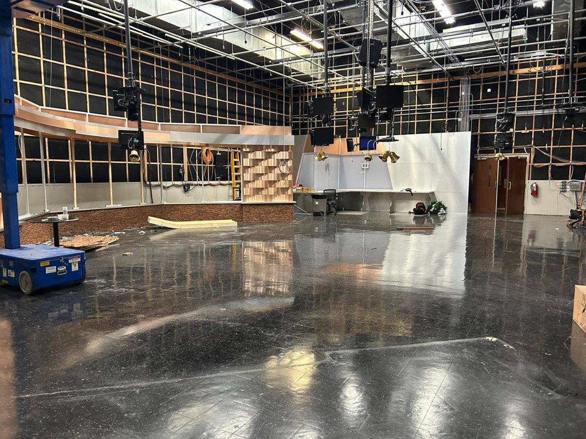
Small update: Studio is being dismantled for the new set in Feb
 1 point
 -
Figured. F***ing figured.1 point
-
It's not bad... but those L3's... eek1 point
-
Considering that Nexstar owns the CBS (WKBN) and Fox (WYFX-LD) affiliates and operates the ABC affiliate (WYTV), they're going to want to find a different buyer.1 point
-
I second that. But I give it a year and then they'll reverse it back to CBS Mandate.1 point
-
interesting that they dropped enforcer for a new package based on the cbs 4 note branding they rolled out in the last few years.1 point
-
From what I've seen so far, especially with the music, I'm getting Time Warner Cable News / Spectrum News vibes. Definitely looks inspired.1 point
-
The Maag family is just trying to stay afloat in a market that's had its' population halved over 50 years. There's far too many radio stations in Youngstown and 1-2 too many TV stations. Even the Maags gave up on the city's lone daily newspaper. WFMJ's biggest weakness is the fact it remains locally owned; thanks to the M&A mania, WKBN-WYTV have the bigger advantage of economy of scale. WFMJ doesn't have the resources to compete with those two long-term, and even launching a 5pm news felt like their resources were being strained. The better question to ask is when do the Maags throw in the towel with WFMJ and sell the NBC affiliation and station IP to Nexstar.1 point
-
https://www.nexttv.com/features/cbs-news-detroit-set-to-launch January launch date for WWJ is official!!!1 point
-
That was my first thought. I thought that woman looked older than she probably is. I wonder if they get rid of the music. Also interesting that they would be investing in a new set before their Korean bankster overlord takes over.1 point
-
I only suggested this as they do something completely different with the NBC peacock... But I will comply and not mention anything further... sheesh1 point
-
We're not doing this with every affiliate.1 point
-
Sources say that not even the leagues are not willing to save Bally Sports in it's current form. Bankruptcy and liquidation of the rights could be imminent....the takers? Tech companies. https://nypost.com/2022/12/18/mlb-nba-and-nhl-unlikely-to-save-tv-regional-sports-networks-sources/1 point
-
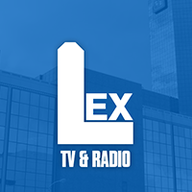
That is easier said that than done. Some stations can't afford to change their logo right away. WLEX changed their logo to be all blue in 2021. New signage on cars, building, new mic flags so they won't be itching to change their logo again anytime soon, but I would like to see a new logo one day to incorporate the new NBC logo.1 point
-
I'm not surprised that NBC will program 10PM On Chi, L&O do well in the 3 hour block. West Michigan has 3 10PM newscast 2 are just half hour newscast Fox17 goes from 10PM to 11:30PM. I remember when CW7 launched a 10PM newscast their slogan was news in half the time a dig at Fox17 they got rid of the slogan years ago. I agree too much local news West Michigan doesn't have much news in a day to fill why I think 4PM news in this market isn't good in my opinion.1 point
-
A post on that other site mentioned that the inserts from these graphics will be the standard Telemundo Deportes graphics going forward. Given it is a branch of NBC Sports, I can definitely see how this could replace the 2015 graphics on the English side (the 2018 inserts were pretty much the NBC Sports default but with the shapes from that year's World Cup branding).1 point
-
Not surprisingly, Comcast and Nexstar have reached a deal.1 point
-
New clip from WXFL (WFLA) circa April 3, 1983 less than 3 months after the call letter change with either a different theme or different cuts of Gari’s The Spirit of Tampa Bay. I don’t think these cuts lasted very long and the station changed graphics 4 or 5 times over the course of over 3 years between The Look….Alive and Power News to stay ahead of WTSP for #2. News update at 21:12 and tease at 35:35. Again no open.1 point


.thumb.png.20cbae3777de7f140153442a1bb805e7.png)


.png.9a2c0a1ac7c25f017a8926d945b51afb.png)
.png.20518c91557979c9bcbd4b1b3fa9b2e5.png)
.png.0d6c6a26963cab509eb073d3bfd4a90b.png)
.png.e50c881caa56a263e53893f1ed6f9d48.png)
.png.c333295bfd9da80598b55d7c759b7aac.png)
.png.30faffe704fb86d95bcc934739a31bf1.png)
.png.57e2e59a6ba7e9715fcc1cea37734378.png)
.png.6e564e113144f0a6e1952125ed11923e.png)
.png.01bf2fa4fc6f099f6b3ed7c474599525.png)
.png.7da3d5b076d4c9544d36bfee0e9f4ab1.png)


This leaderboard is set to Chicago/GMT-05:00