
Leaderboard


b.thumb.png.b658c90e4e56cb08f2e8ba3195bb9da9.png)
Popular Content
Showing content with the highest reputation on 02/06/24 in all areas
-
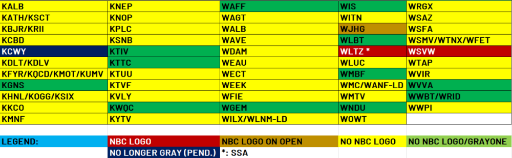
Okay so we can stop this whole "XXXX" removed the NBC/CBS logo and make this thread longer than it already is, I spent the last 90 minutes going to every Gray owned and/or operated NBC website. I went to the livestream tab and watched the latest newscast to get the most accurate info. As you can see by the table I made, 99.5% of the staions have removed the NBC peacock from the station logo and branding. I can also verify that a good chunk of the CBS stations have also removed the CBS eye from the station logos (no I won't do a table). Wikipedia and Logopedia are NOT the best source for this info, as I found most of the station pages have NOT been updated to reflect the removals. I propose from here on out, let's stop posting that station XXXX has removed the peacock or eye from the logo. Unless the station completely revamps the logo, let's just know that this is now verified that Gray is removing NBC/CBS logos (ABC/FOX are unknown at this time)...
 6 points
 -
Not even a week in with the new look and they changed the X handle. However, it’s wrong it was correct when they launched.
 2 points
 -
I do see your point. However I would argue that CNN has failed in the mornings for 20 years and so maybe the lighter flair of Robin would have led to something more successful than what CNN has been doing. I’m sure robin could be serious if the situation called for it.2 points
-
They could have saved so much headache if they just moved Robin Meade to CNN instead of letting her go.2 points
-
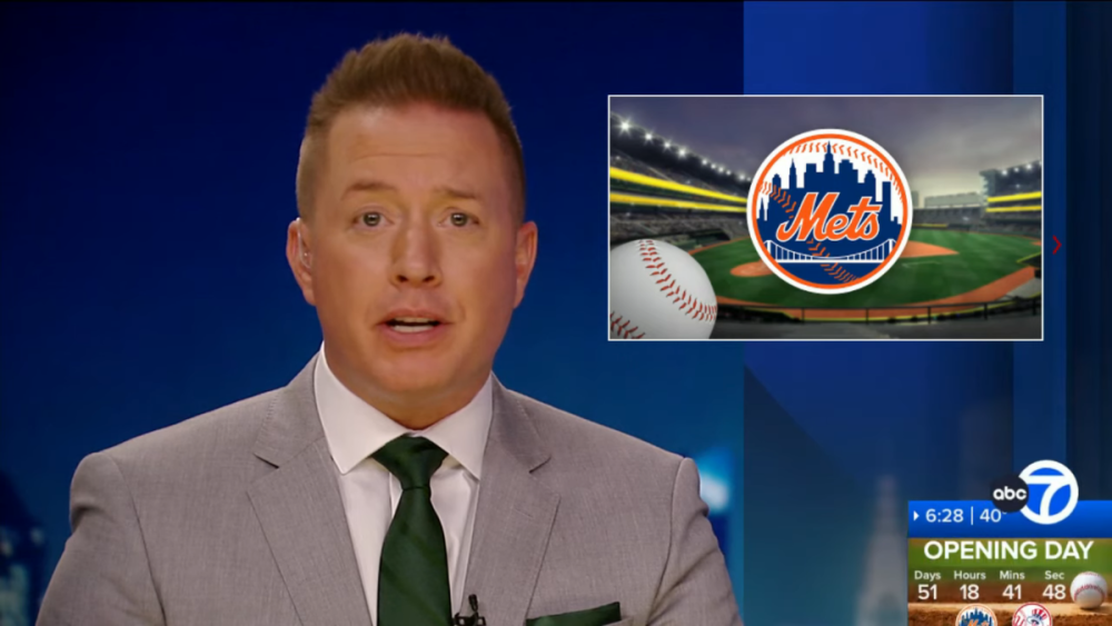
The bug transforms into a (busy) countdown for Opening Day when talking about Spring Training.
 1 point
 -
They were still using live staff announcers, at this point, and until around '91. It was likely just a spot fill-in.1 point
-
I think these look pretty good, actually. I like the different colors highlighting certain stories, a nice addition if you're just glancing at the screen and decide you want to focus more on a campaign or money story.1 point
-
This means nothing... There are several Gray stations that have had the NBC peacock and the CBS eye removed for weeks now...1 point
-
Wow, lots of changes again. Very unstable. I feel bad for Poppy and especially Phil, who gave up his (chief?) White House correspondent role and moved his family to New York only to be screwed over a few months later. I hope they are both taken care of as they are both excellent talents and have done everything asked of them. John Berman and Kate Bolduan both separately served as co-anchors of the previous New Day, so this is a return to the timeslot for both of them. Surprised they're keeping the CNN This Morning name at all. Also interesting that the new morning show, News Central, will be 7-10. They briefly had their morning show (I think during the Soledad O'Brien days?) run at these times but eventually moved it back to 6-9. They're replacing one Chris Licht creation with another. And now CNN Newsroom makes its return to weekdays. Am I correct that only three hours of morning/daytime programming will be anchored from NY now, with the rest from DC, until 7pm? Overall, this seems like a massive cut rather than an investment in mornings.1 point
-
Also notable, that's sports anchor Jim Rose with the opening voiceover, that night.1 point
-
Agreed. The concept is not horrible. The L3's just look too cartoonish, flat, fat, and white. The graphics looked better in the CBS News Mornings shot, maybe because it doesn't have the ticker and the upper subject bar weighing it down. Broadstroke: As time advances television graphics are not.1 point
-
New graphics premiered. The open basically looks the same, but has been made shorter. The lower-thirds look cartoonish and they went with a bold condensed font for the main text. Is the text an afterthought? The logo, now stacked in two lines, stays on the left side of the screen like the other CBS newscasts and local news. (Previously it would move above the lower-third.) Edit: I should add that this is an upgrade over the previous look, which didn't let the text breathe and had too many sections that were just black. This is mostly white and feels lighter. WCBS seems to be having problems with the ticker. It's been blank most of the time, occasionally running a single headline from the website before being blank again. It also remained on screen during most of the first commercial break.1 point
-
WSB is now using the new graphics in full, as they have debuted the standard open.1 point
-
Oh I know why they do it. And I completely agree with you. This isn't the 1950s anymore. The race should be shown live in the Indianapolis market. There's absolutely no reason why it shouldn't be aired live. None whatsoever.1 point
-
I hope the L3s get updated with the new ticker, the two just don't match.1 point
-
The only message that likely sends is "We don't want local fans to be interested in our [race/game]."1 point
-
Using a one-size-fits-all metric doesn't work here. In Top 50 markets, the proposal is certainly worthwhile. However, once you get below 100 and especially below 150, you have a hard time maintaining more than 2 independent operations and that would lead to missing affiliations. In the smallest markets, a monopoly seems to be acceptable and hasn't hurt either its product or the consumer. Look at KGNS in Laredo for example - it has no competition, yet they have greatly upgraded their product under Gray.1 point
-
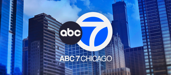
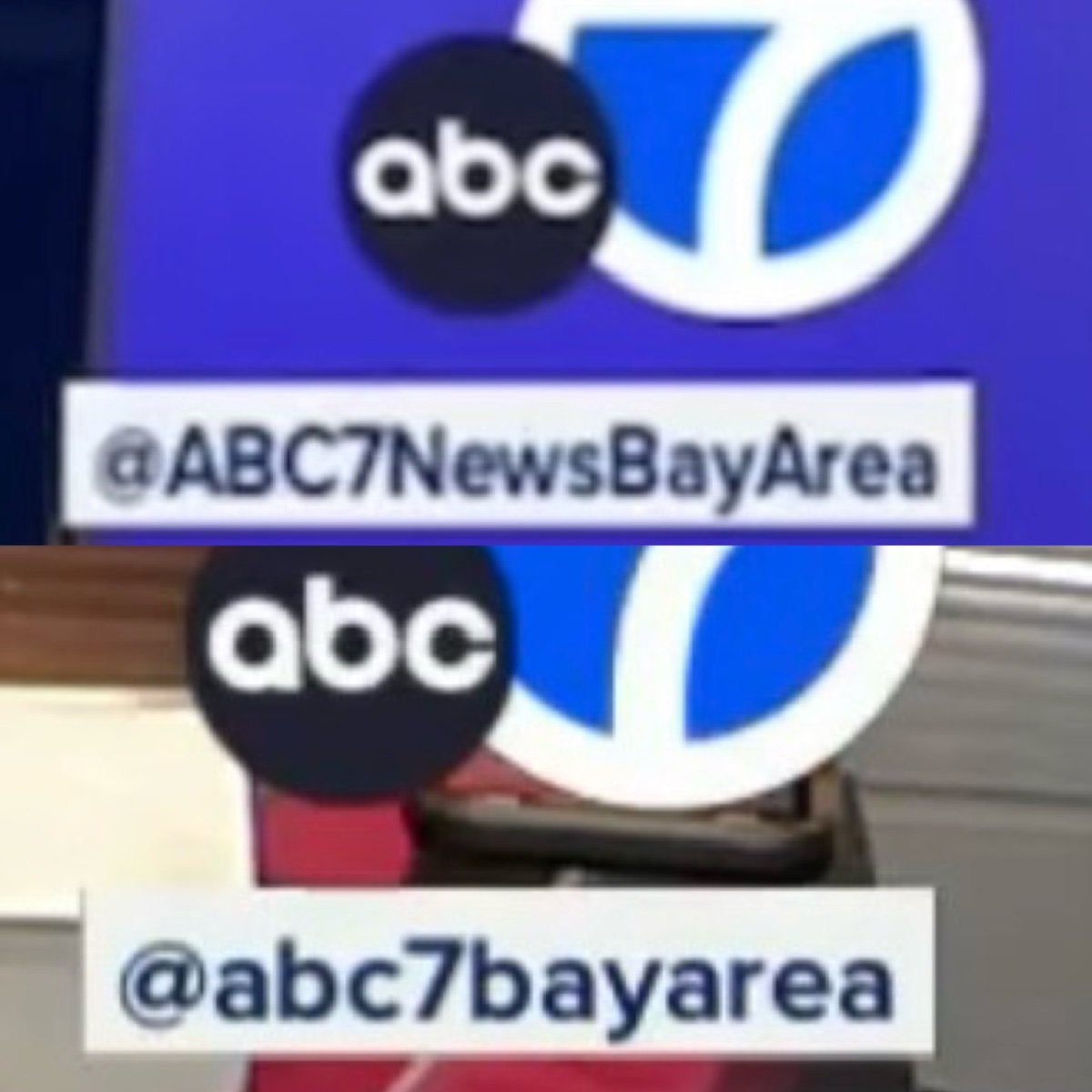
They're identical, though the two .png files you attached aren't accurate. Those feature a different circle 7 than the 2021 versions. KABC and KGO are now identical, too, and all 4 stations use the same numeral.1 point
-
WLS-TV's New ABC Circle 7 (Above) WABC's New ABC 7 Circle 7 (Above) Is there a visual difference between the two now at this point? They look so incredibly identical, before the WLS ABC Ball was slightly off-centered and higher in the earlier days and now it closely resembles if not identical to WABC. What do you guys think?

 1 point
 -
Thank goodness. Those grey toned shots with the 'better' Bay Area in the open were so grim looking.1 point
-
My guess is, since it's labeled as KTLA 5 News on iHeart, it's just an audio simulcast of this, which is mainly newscasts and news replays :https://ktla.com/on-air/live-streaming/1 point
-
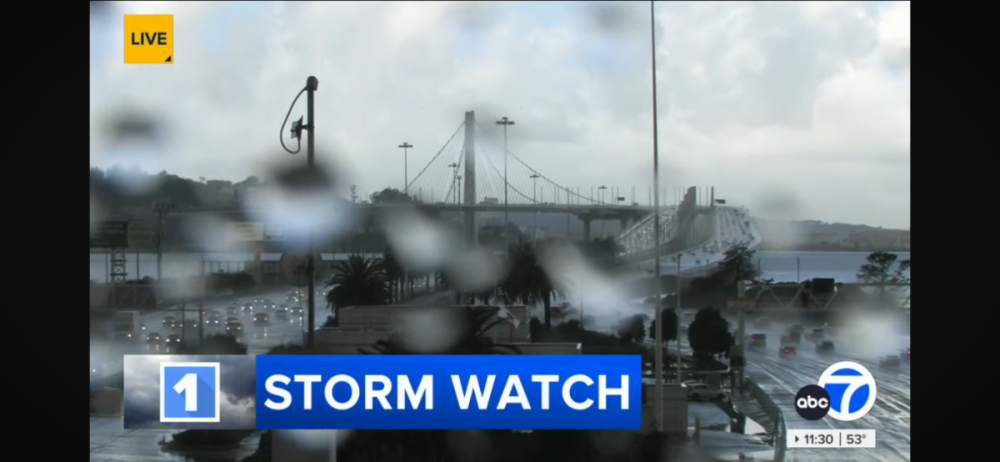
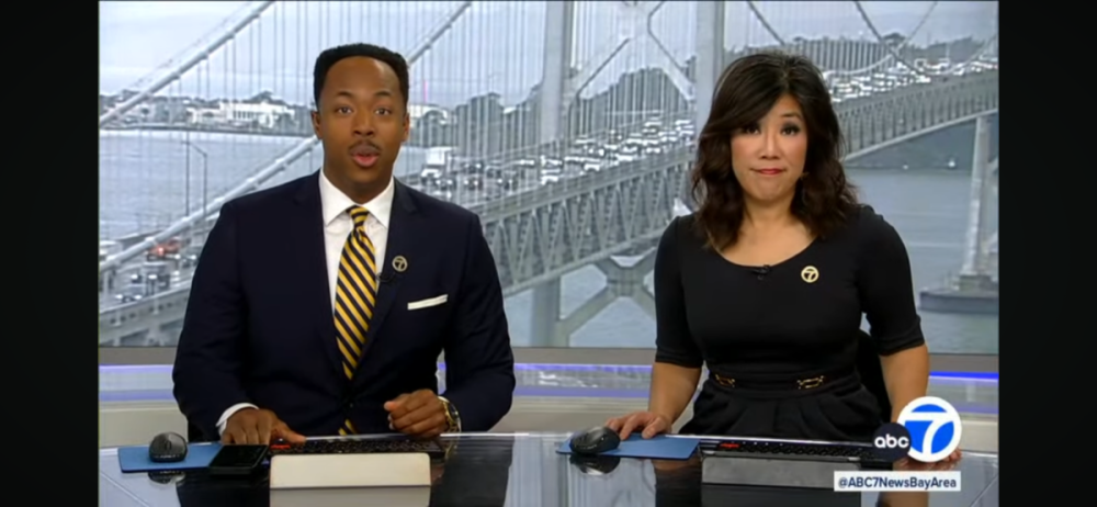
KGO ABC7 News has made the switch! Looking nice and liking the old pre COVID pandemic theme too! RPReplay_Final1706815857.mov

 1 point
 -
To be fair he didn’t say that. I guess he just assumed that all of them were carrying it without checking listings.1 point
-
Cool set. But the talent changes are god awful. These new anchors are unattractive dweebs!0 points


This leaderboard is set to Chicago/GMT-05:00