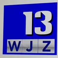
news89 468 Posted September 26, 2016 Posted September 26, 2016 Ahh TV5, wait WEWS. Is about ready to rebrand maybe today. Facebook and Twitter logos have been updated. Management went all out for a new logo.
Rusty Muck 4688 Posted September 26, 2016 Posted September 26, 2016 news89 isn't joking. THIS... ...is the new "News 5 Cleveland" logo. Excuse me for a minute...
ns8401 999 Posted September 26, 2016 Posted September 26, 2016 Kind of bad 70's or 80's pancake flat look there...
Action Newsroom 1379 Posted September 26, 2016 Posted September 26, 2016 All I can say is...thank God Channel 5 UK changed it's logo already, or else a lawsuit would've went to Cleveland immediately. Despite this, it still looks like trash. The old logo is timeless and shouldn't have been replaced in the first place.
Rusty Muck 4688 Posted September 26, 2016 Posted September 26, 2016 All I can say is...thank God Channel 5 UK changed it's logo already, or else a lawsuit would've went to Cleveland immediately. Despite this, it still looks like trash. The old logo is timeless and shouldn't have been replaced in the first place. It looks like a knockoff of the Citadel-era WOI/5 logo. I couldn't help but laugh when I first saw this. Dorothy Fuldheim ought to be crawling out of her grave and head to the station to kick senior management in the butt.
news89 468 Posted September 26, 2016 Author Posted September 26, 2016 It's official at TV5 Eyewitness News. Wait News5 is alive. This logo was updated in the past hour compared to the first one I posted.
Action Newsroom 1379 Posted September 26, 2016 Posted September 26, 2016 It looks like a knockoff of the Citadel-era WOI/5 logo. I couldn't help but laugh when I first saw this. Dorothy Fuldheim ought to be crawling out of her grave and head to the station to kick senior management in the butt. Oh yeah, true that. And you (and Jim) reminded me... if they were both owned by ABC, we wouldn't be having a problem right now. (Although the Alphabet logo in the TV5 logo is a bit too big for serviceable use.)
CircleSeven 1968 Posted September 26, 2016 Posted September 26, 2016 It's official at TV5 Eyewitness News. Wait News5 is alive. This logo was updated in the past hour compared to the first one I posted. That is fucked up. They could've kept the 2007 logo. You catch these kinds of logos in smaller markets. Whoever thought about bringing this logo to life should be fired.
NewsMaster 227 Posted September 26, 2016 Posted September 26, 2016 Still not as bad as this... Disagree completely. That logo (and the one that came after that one) is SO much better than this crap. Even I can make a better logo.
Rusty Muck 4688 Posted September 26, 2016 Posted September 26, 2016 Disagree completely. That logo (and the one that came after that one) is SO much better than this crap. Even I can make a better logo. Use the WPTV logo (with the NBC peacock swapped out) already. It wouldn't take them two minutes to do so. I really want to know what design firm was hired to create this, and for how much.
nathannah 2796 Posted September 26, 2016 Posted September 26, 2016 At least go with ABC Modern to line up with the logo or add some gloss. This is just all kinds of blah, like a Wyoming NBC affiliate circa 1978 switched to ABC and needed to cover up the 'trapezoid N' CTV simsub-style. Hopefully the on-air use is much better, but as-is it's very dull.
channel2 1044 Posted September 26, 2016 Posted September 26, 2016 Kind of bad 70's or 80's pancake flat look there... "Pancake flat" is the prevailing aesthetic of the moment, and this is keeping with that. There is no creativity in this logo. No interesting flair like the old Circle 5 had or anything. The introduction of computers into the design world seems to have really done a number on local TV design, because broadcasters only want cheap, fast design, nothing memorable. (The 1998 "NewsChannel 5" logo demonstrates that too!)
news89 468 Posted September 26, 2016 Author Posted September 26, 2016 Use the WPTV logo (with the NBC peacock swapped out) already. It wouldn't take them two minutes to do so. I really want to know what design firm was hired to create this, and for how much.
TexasTVNews 1380 Posted September 26, 2016 Posted September 26, 2016 Ahh TV5, wait WEWS. Is about ready to rebrand maybe today. Facebook and Twitter logos have been updated. Management went all out for a new logo.[ATTACH=full]3350[/ATTACH] Tell me this isn't WEWS new logo they got from Des Moines WOI-TV?
news89 468 Posted September 26, 2016 Author Posted September 26, 2016 Tell me this isn't WEWS new logo they got from Des Moines WOI-TV? Yes, this logo you see is live and on air. Complete with new durtans on parts of the set.
MichiganNewsGraphicsJunkie 1160 Posted September 26, 2016 Posted September 26, 2016 Another case of a kindergartner being asked to make a logo in Microsoft Paint... Absolute garbage.
news89 468 Posted September 26, 2016 Author Posted September 26, 2016 Another case of a kindergartner being asked to make a logo in Microsoft Paint... Absolute garbage. It's looks out of place on air. They still have a mix of promos airing the circle5.
Rusty Muck 4688 Posted September 26, 2016 Posted September 26, 2016 Another case of a kindergartner being asked to make a logo in Microsoft Paint... Absolute garbage. They probably asked the same kindergartener who redid WFXT's logo.
TexasTVNews 1380 Posted September 26, 2016 Posted September 26, 2016 RIP WEWS NewsChannel 5 (1990-2016)
IndyNewsOpens 83 Posted September 26, 2016 Posted September 26, 2016 https://pbs.twimg.com/profile_images/780516565229801472/WWeyUyrJ_400x400.jpg Worse than RTV's logo, which I (now used to) maintain as Scripps' worst.
NEOMatrix 1319 Posted September 26, 2016 Posted September 26, 2016 Ahh TV5, wait WEWS. Is about ready to rebrand maybe today. Facebook and Twitter logos have been updated. Management went all out for a new logo.[ATTACH=full]3350[/ATTACH] OK! WHO THE HELL APPROVED THIS?!? I literally could've did this in 5 minutes! This makes the "Cleveland 19" logo look like the old "Circle 5". Someone at Euclid is getting a b*tch slapping for this.
channel2 1044 Posted September 26, 2016 Posted September 26, 2016 To me this is better than the RTV6 logo. As low-effort as this is, at least it's not actively offensive.
NEOMatrix 1319 Posted September 26, 2016 Posted September 26, 2016 Hey Scripps, Mickey got a message for you about plastering ABC on that "Hurl 5" logo:

Recommended Posts
Archived
This topic is now archived and is closed to further replies.