
Leaderboard

.thumb.png.3d66a1eeb7ecf5404151f8a77ea7cbfd.png)


Popular Content
Showing content with the highest reputation on 06/29/22 in all areas
-
Mandate as in "everybody will be getting this," but the toolkit idea makes it clear that execution might vary. Of course, that could be concerning when it comes to the WABC's of the world, in how they might screw this up, but that also means you might see a variety of open styles, and even different color schemes or in-news brands. This will/should not be a 100% same-for-all product.5 points
-
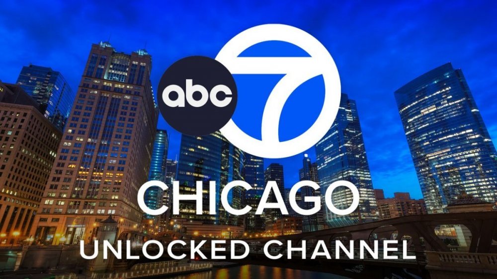
We have confirmation on new O&O graphics from NewscastStudio.
 5 points
 -
I would think with a new ABC Broadcast Center being built, they would not invest in a new studio until the move in a year or two.2 points
-
These look really nice, clean and professional. The in-house team that designed the current graphics being used at WABC should be arrested. It's like all the weather graphics at every station are growing up. Long gone are the days where we see the 5 day forecast with the sun wearing sunglasses.1 point
-
I'm sure these graphics will be a big improvement from the current look once they roll out! Also I wonder if they will be in the works for a new studio- it is starting to look dated compared to many other stations ; I wonder if the new "remote studio" Bill was in a while back is part of a plan to upgrade the main studio...1 point
-
A TEGNA-inspired logo with cruddy Gray graphics…. Marvelous.1 point
-
For those wondering when WABC might get new graphics. ABC is switching to a shared graphics package for all their O&O stations. ABC Chicago’s WX graphics first piece of new group design mandate https://www.newscaststudio.com/2022/06/29/abc-7-chicago-new-weather-graphics-preview/?utm_medium=social&utm_campaign=socialpost1 point
-
And since there's been uncertainty about what the final logo designs are, for the O&O's, as the "creative" types online keep throwing out Frankenstein-like creations, here they are, once and for all.

 1 point
 -
It's so bad the video was pulled offline LOL1 point
-
Oh wow... that's really bad.1 point
-
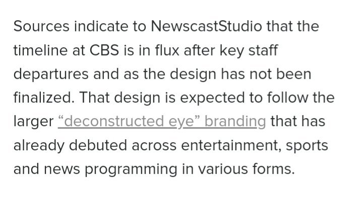
NewscastStudio confirmed that the new graphics are mandated.1 point
-
WLS, Chicago; 10 p.m., 1999:1 point
-
Kirstin Cole posted a farewell and said that she was moving closer to her family.1 point
-
Dario Melendez moved from Bally Sports Wisconsin to the vacated WISN-TV sports directorship a couple months ago; it's now a de facto 'trade' as WISN's Stephen Watson is taking Melendez's exact former hosting position at BSW. No word on compensation, draft picks, or a player to be named later .1 point
-
WFLD, Chicago; 9 p.m., 1996:1 point
-
The better question is will those "new" graphics include Move Closer To Your World?1 point
-
I hate spunk! (Sorry, I just had to)1 point
-
Indeed quite a massive upgrade, though if I had a thing to nitpick on, I wish those gradients would be smaller then they are here. Otherwise, it's looking great, and hoping for NS2K+'s return!1 point
-
Note to TEGNA: This is how you do flat graphics well1 point
-
Remember when Gray tried to recreate WABC’s old look? Looking at this and seeing the Beehive graphics, it’s clear that Gray really needs a new graphics department.1 point
-
I figured the ex-Quincy stations would be next. As far as the ex-Meredith stations, they are similar enough that I suspect they will be retained until another Gray package comes along later.1 point
-
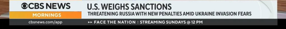
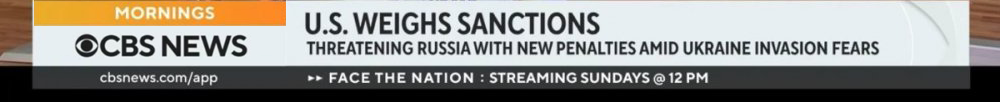
I'd argue the look of CBS News (streaming) is a better implementation than what's on network, outside of some minor nitpicks - IMO, the logo bug is too big, the little programming indicator is too small. I think if they adjusted it so that the programming indicator was within the box, it would help, and they could go back to what they have now when the programming isn't live. Example:
 1 point
 -
Speaking of KKTV in Colorado Springs.... Looks like they just went through a logo revamp.
 0 points


This leaderboard is set to Chicago/GMT-05:00