
Leaderboard


Popular Content
Showing content with the highest reputation on 01/16/24 in all areas
-
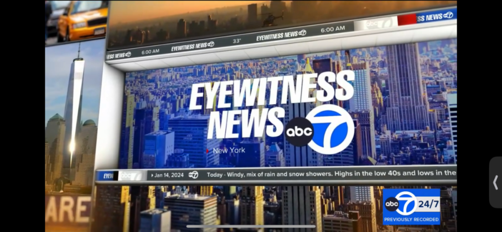
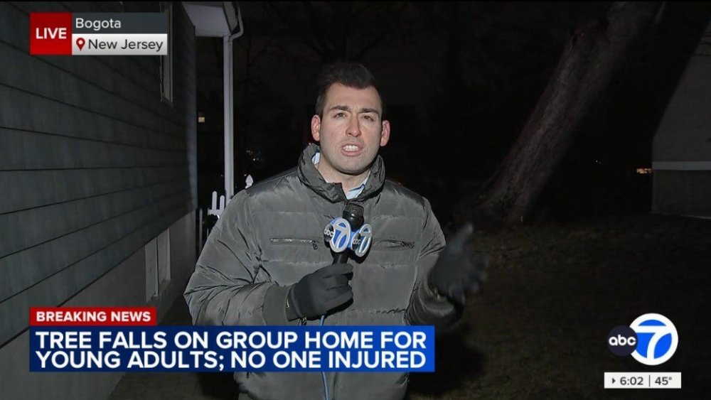
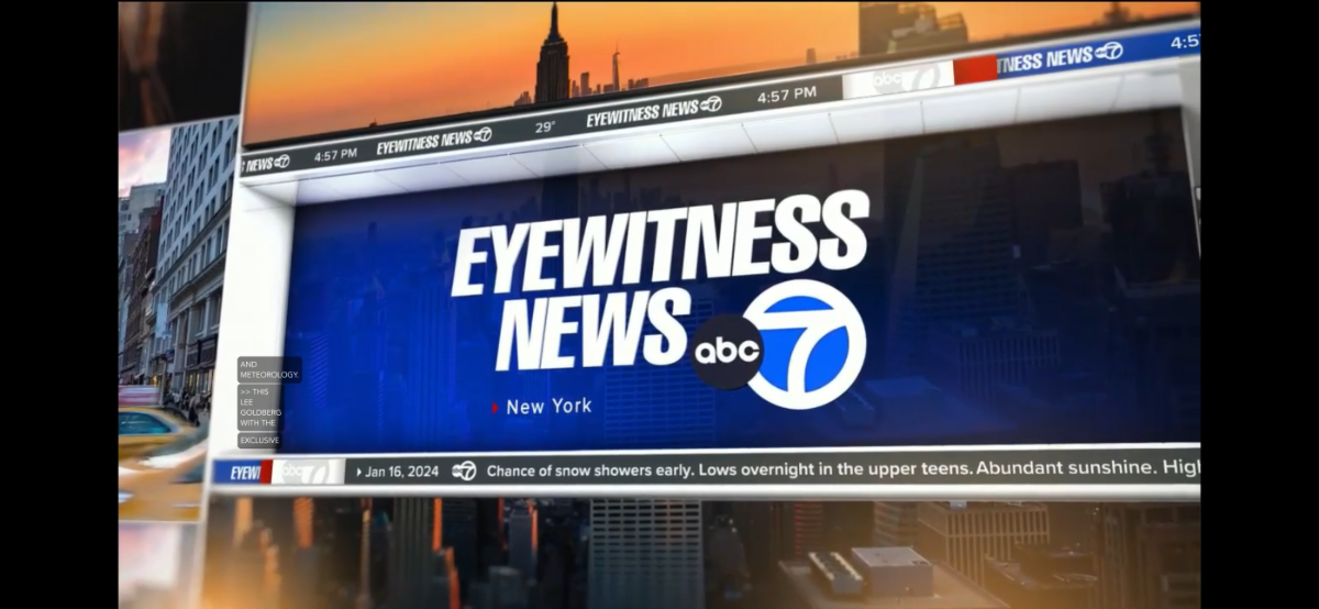
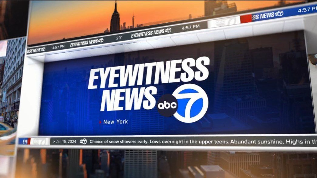
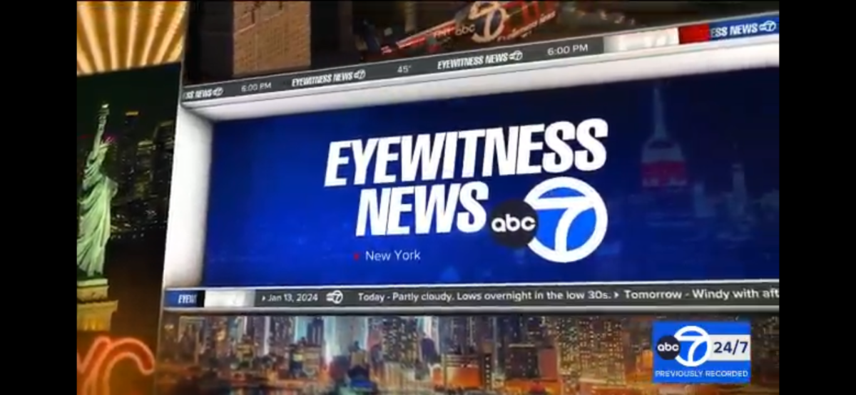
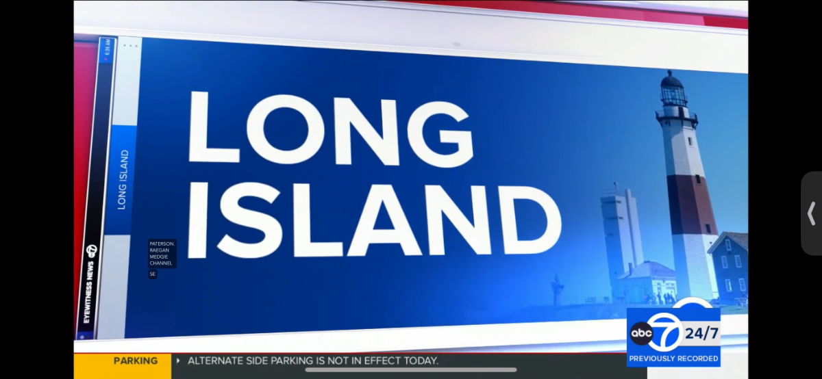
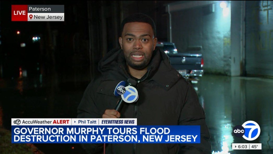
Surprise! Talent opens for ABC7 New York have debuted tonight with the 5p show! my screen grabs to prove it and hopefully someone will get those videos real soon! Looking sleek and fancy nevertheless!


 4 points
 -
It seems like I spoke too soon hehehe The 5pm edition using a talent open


 4 points
 -
A sad day in Baltimore, since the Sun was a vocal critic of David Smith and his escalation of Sinclair into a national powerhouse of propaganda. Given their current state under Alden, it sadly may actually be an improvement, since the paper is once again under "local" ownership.4 points
-
It'll be interesting once WPVI (Philly) gets the new graphics, especially how they'll do the long opens will "Move Closer to your World". How long have they used their current package for?3 points
-
The Sun is certainly running with that “local ownership” line, and I suppose “local ownership” is a tangible improvement compared to being owned by a hedge fund. But I’d bet any money that the editorial leanings and journalistic standards of the paper will be drastically different than they are now. Hasn’t David Smith thrown enough money away already? Nobody was rooting for him to become dollar store Rupert Murdoch.2 points
-
Yeah, I've mentally visualized it just that way. The usual "sights and sounds" shots and then the "graphic wall" flies in right after MCTYW hits that long note.2 points
-
Never in a million years could I see them doing that. What’s likely going to happen is the full theme with the typical scenes of people in the city and the “Action News, Delaware Valley’s leading news program, with…”. The only thing that will change will be the graphic at the end, which will be the new intro that all the stations are adopting.2 points
-
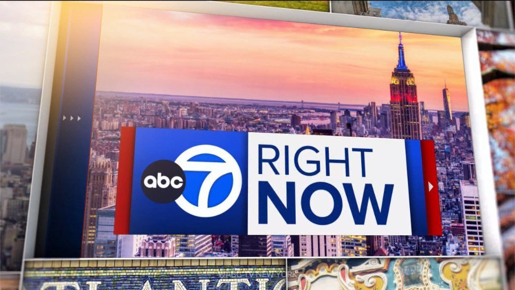
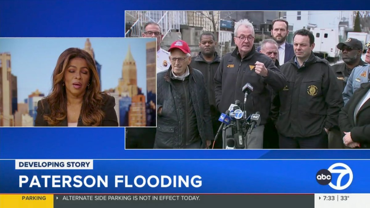
Yeah overall its crazy how it took WABC this long to finally look like the top station in the nation. These graphics are finally on par with their identity as the #1 Station in the nation. The look of WABC is elevated by far, and they quite frankly are the best-looking station now. So I echo the same sentiment with everyone on here since I started writing on these forums nearly 20 years ago the chief complaint has always been how lackluster WABC's graphics always were compared to the rest of the local stations, but now finally we can say they are up on top now. The news theme is old but it still works and sounds modern enough, way better than what their sister, WLS in Chicago did for their new opening which sounds like a mess. WLS should've kept their old News Series 2000+ themes that were iconic for them, hopefully, they'll revise it in the future, but I highly doubt it haha. Seems like news stations are holding on to their themes longer now and changing themes isn't as a big thing anymore as it was back in the day. The Eyewitness News intro sounds a bit different, with the removal of the "news ticker" sound as someone mentioned, also the opening tease cut is a bit different too more of a beat to it now and less melody you hear the drums and bass more I guess haha for lack of better words. Here's an Evolution of WABC's Graphics from the early 2010s to Today for comparison. Giant Octopus Graphics Package (2012 - 2016) Previous Package "Downgraded Look" (September 2016 - January 2024) Current Package "Best Overall" (January 2024 - Present)2 points
-
Finally the #1 station can start looking like a number one station. Though I prefer the KGO/KABC look, this is far better than anything WABC has had in the last 15 years.
 2 points
 -
Oh my God this is soooooooooooooooooooooooooooooooooooo much better than that crap they had2 points
-
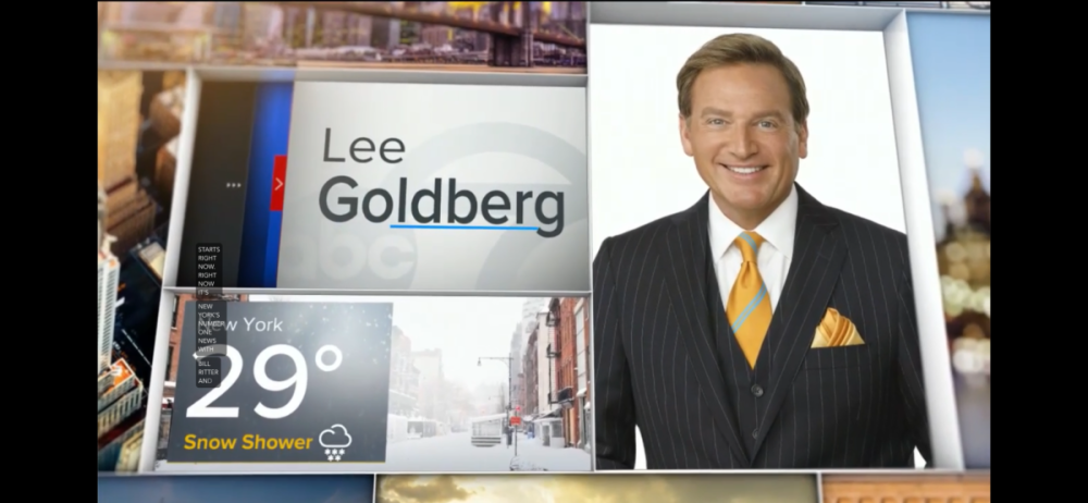
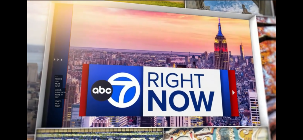
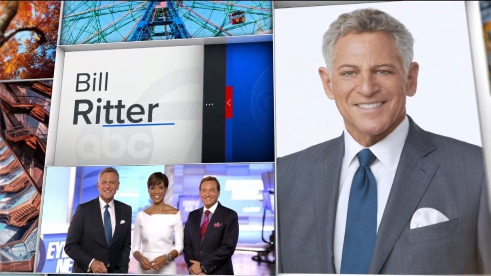
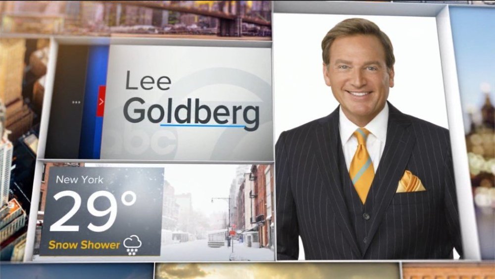
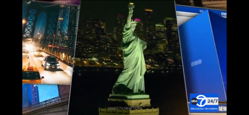
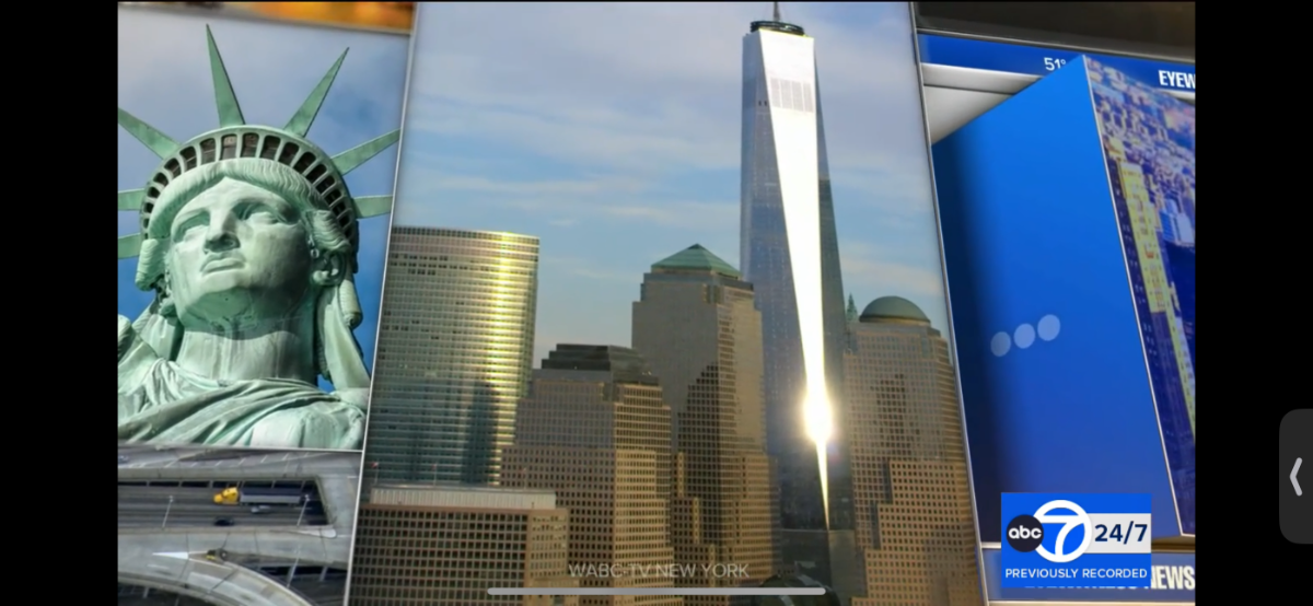
Loving ABC7 New York’s new graphics….AT LAST! Feeling sad about CVD’s voice though, I know he’s up there in age and all but I know it’s not the same and they may replace him with someone else, what a long run since at least the 90s! Here’s my own captures!


 2 points
 -
Especially since the Baltimore stations thoroughly cover this part of Maryland in the local news… Whatever happened to “significantly viewed” status?2 points
-
Here's the thing: David Smith's inability to understand how a newspaper works will make this a disaster from the start. A newspaper is not insulated by retransmission revenue like his Sinclair stations and cannot withstand any loss of subscribers or advertising. The Sun also has competition from the Banner, which has clearly found footing as a digital enterprise and would benefit if there was an actual "cancel the Sun" campaign. If David Smith wants to literally blow hundreds of millions of dollars with a good chance of no return on investment, that's bad for him, bad for his other commercial enterprises, and ultimately good for the rest of us.1 point
-
David Smith wasting over nine figures to buy a newspaper easily, easily trumps the Diamond Sports disaster he committed in 2019. The three words that will make this vanity project a personal hell for him: "Cancel my subscription".1 point
-
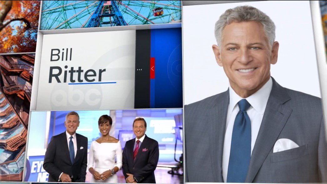
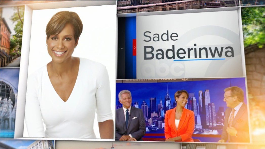
Diffrent strokes for different folks. I will say, though their current set might be an improvement over the last, and the skyline update is a big help, it remains arguably worst in market. The area where they do 3D weather graphics looks especially cheap. 7 was neck in neck with WNBC for worst set but News 4's recent updates gave them a little advantage. I'd say WCBS still has best the best looking studio. On a positive note, it feels surreal to say, but ABC 7 definitely has the best graphics in NYC now! Love the talent intros instead of the three second openers that have become industry norm.1 point
-
2 WFXT FOX 25 News At 10 clips KPDX FOX 49 News at 10 1994 WNDU Newscenter 16 1987 WNDU Newscenter 16 19881 point
-
Look, I thought the complaining about the old package was a bit much over a lot of nothing. I don't think it was ever as terrible as claimed. This is a very slick package. We'll probably see it replaced in 6-7 years as is general timeline. (Even this package lasted longer than most of them have.)1 point
-
Along with the logo and graphics change, the longtime "Louisiana's News Channel" slogan also appears to have been deprioritized (it appears in fine print in the open, suggesting it may still be used in some capacity, but less prominently) in favor of "Your #1 Local News Station".1 point
-
Ok I thought it was just me! I'm glad I'm not the only one. I think they added texturized elements. Diamonds, lines, and the stars are all 3D. It's noticeable in their set in the background and on the desk also in the L3. But they're still keeping with the same red, white, and blue theme. Its a subtle change. They also used a drone over the river in Des Moines which showed augmented reality graphics. Similar to what NBC/MSNBC does with Rockefeller Center during election coverage. It is more noticeable in the NY studio that Anderson uses. Seen here on this video on cnn.com.1 point
-
Is it just me or did CNN debut new or updated graphics and backgrounds for election coverage last night?1 point
-
Regarding WBOC being dropped: Breezeline says it’s about not wanting to pay two affiliates. https://policyband.com/blog/spokesman--breezeline-dropped-cbs-affiliate-wboc-to-manage-costs Significantly Viewed does still exist but this is the reason most providers are dropping duplicate affiliates.1 point
-
Here lies the problem/challenge however- One "good" show does not stop the trend that has driven viewers away en masse. The Swifties are still probably sour about the Golden Globes joke last week (I'm sick of it showing up in my newsfeed), half of America can't stand Hollywood's political opinions in their speeches (see Ricky Gervais' call out of that), oh, and ABC was showing a blowout football game at the same time. It's going to take a lot of time, effort, and consistency to make Americans care about awards shows again.1 point
-
Not really broadcasting related, but certainly big news in Baltimore, even with the Sun's decline and influence. The sale and operation is independent of SBG, but the lack of regulatory muscle makes that a comically short hurdle to overcome.1 point
-
The only reservation I have with the new look is, sadly, Charlie van Dyke. He’s one of my favorite voiceovers, but he really doesn’t sound good in the intro. I’d hate to see him go, but it wouldn’t surprise me if someone else started voicing the station’s newscasts in the near future. I know there are other VO actors that voice promos and such already.1 point
-
So they got rid of: the Twitter/X handle for each anchor/reporter. web and social media info at the close of the newscast.1 point
-
Yes, the skyline backdrops have been updated.1 point
-
Overall, this is a great package and super refreshing for WABC. What a fantastic improvement from the downgraded package they launched in 2016 and it's finally put to bed today after nearly 8 years. So it's really exciting to see this new look for them! They still kept the Eyewitness News Signature music package though (It dates back to September 1999) Kept it simple with the music. Same cuts they've been using since 1999. The intro's bumper has a bit of an altered sound for the opening teases. The open music sequence is much better than WLS. Let's see how the West Coast will follow suit. Overall I think WABC is a contender and I think they take the crown for the best overall O&O Graphics. The set looks gorgeous as well. The change in the backdrop is refreshing. Makes the set look new again! Anyway, this upgrade will be sufficient till they move to their new locations in Hudson Square Downtown in 2025.1 point
-
Yep the cityscape backdrops on set have been updated too.1 point
-
It’s all good. WWJ seems to be making some changes behind the scenes and are hiring more people. One of the anchors who just left (Jeff Skversky) said the station’s numbers were lot better than what was expected. The info I got definitely backs that up. They are definitely looking for a new sports anchor.1 point
-
Yeah on this id rather see GMA update their gfx away from the heavy blue and yellow look.1 point
-
Agreed! The ABC7 LA and Bay Area’s current looks aren’t too bad either and happy that my flagship station here in NY can look and feel like the #1 station at last! I got some dayside captures of the new graphics! RPReplay_Final1705237193.mov


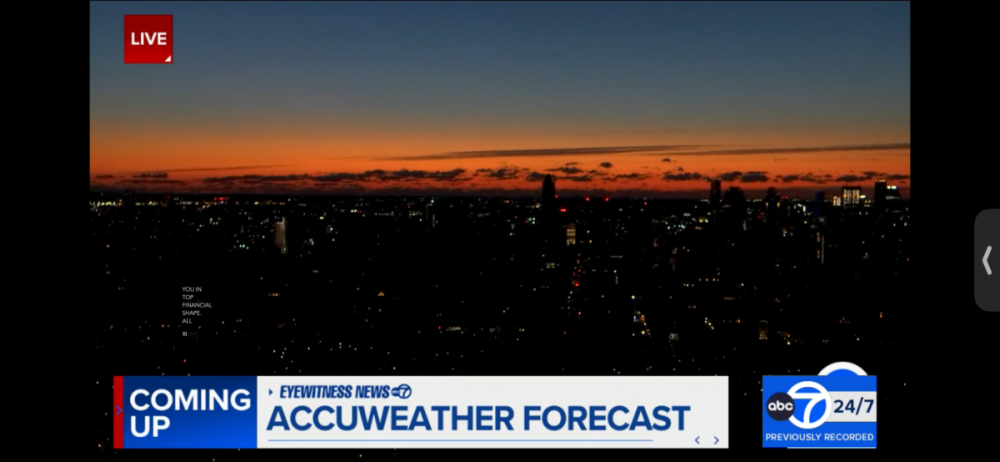 1 point
 -
It's WABC's turn


 1 point
 -
We haven't seen a new petition in a while, but we have one. This time its a joint petition. Remember a couple of years back Gray's KCBD in Lubbock wanted to get off VHF 11 for UHF 36? Now, Gray wants to try a different approach. A three-station frequency swap. KCBD (11 > 35) KJTV (35 > 23) KLCW (23 > 11) In the petition, it states that KJTV's current tube transmitter is failing. And replacement parts are not available. Gray has already bought new equipment for KCBD and will use that for RF 35, instead of RF 36. KJTV would use the transmitter currently used by KLCW on RF 23. And KLCW would move to KCBD's current VHF transmitter on RF 11. Gray evaluated moving KLCW to RF 36, but it stated that buying equipment for both stations would be "financially infeasible in this smaller market".1 point
-
The Tegna-DirecTV dispute is over. https://www.nexttv.com/news/tegna-and-directv-end-blackout-with-new-multiyear-distribution-deal Just in time for the NFL playoffs (including WKYC airing the Browns' playoff game today).1 point
-
Your commitment to the program and the kids is wonderful.1 point
-
Hello everyone, Posting on this thread not because of another newscast but because I'm looking for possible help, with our "set". We of course are always wanting to improve our product, that's why we've changed graphics, cameras, etc, One of the ways which we feel that we really haven't improved on when we should, is the set, just four white walls, a monitor, and windows, but that's kind of hard with a non-existent budget. Could anyone perhaps be of assistance to see if any stations or networks (so I guess I mean the cable ones by that, has CNN completely vacated the CNN center, wonder what happened to studio 7) in our area (outside of Atlanta but of course it seems like the ATL stations won't be getting a new set anytime soon), so roughly most of Georgia, are on a temporary set or have some spare set species they would be willing to give up? Thanks for any and all advice and feedback as always!1 point
-
I didn't realize that Blake Burman took over as moderator of The Hill on Sept. 5th last year. At first I was thinking this move was going to have an impact on Leland's ability to host the show, but here it turns out he's been gone from the show for a while. As for weekday Morning in America, man that show just keeps going through so many changes. I guess ending at 9am ET brings them in line with a typical cable news morning show schedule. Weird seeing them shift back to a solo-host format. I figured that they were going to keep two anchors as multiple anchors are pretty standard for mornings.1 point
-
Overall the new COX look isn't horrendus it's just inconsistent. Most of the graphics are 3-D, but a lot of the lower thirds are flat.1 point
-
This was a huge upgrade for WPXI and WSOC1 point
-
EDIT 1/16/24: WAFB has moved to GrayONE as of Noon on 1/16/24. Put WAFB/Baton Rouge on the clock for GreyONE - this new logo just popped up on their website: Previous logo, in place for decades with the CBS eye logo added along the way:

 1 point
 -
Except for possibly the First Alert logo, this is a 1:1 preview of WOIO’s take on GrayONE.1 point
-
The more I watch it, the more I like it. The entire CBS Package is incredible...simple and incredibly well thought-out.1 point
-
Oh great. Now where am I going to find out the latest in vinyl flooring or mortgage rates?1 point
-
Feels more like an election year cash grab.1 point
-
Better them than airing TND IMO. At least WPXI is local.1 point
-
I"m curious...how many NBC affiliates (or station owners) opted not to show the pre-game special for the Miami/Kansas City game that's exclusively streaming on Peacock?0 points
-
I hate this package. The way the theme music has been chopped up and abrubtly cut off on some or quickly turned off. It doesnt even feel like COX anymore. They were always still the best at news opens and the correct timings and flow of the opens with the music and graphics. There were never rushed and they always had proper opens. Not these rushed anchor introduced 2 second opens most stations use today. These are just awful. IMO complete downgrade.0 points


This leaderboard is set to Chicago/GMT-05:00