Jay Russell 25 Posted May 15, 2017 Posted May 15, 2017 WGNs video wall is obviously in the center look at the angle of the first tease
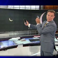
alex979 119 Posted May 15, 2017 Author Posted May 15, 2017 This popped up during Paul Konrad's weather this morning. Looks like we're getting new graphics.... [MEDIA=imgur]a/l2hOM[/MEDIA]
ED2 144 Posted May 15, 2017 Posted May 15, 2017 I'll have to judge the rest of the graphics package surrounding this logo, but on its own it looks bad.
24994J 5888 Posted May 15, 2017 Posted May 15, 2017 It matches the original post in this thread, so I'd say it's set to launch. It's going to take some time to get used to it, for sure. Not sure why they didn't maintain the coloring contrast of the current logo, because the white on white of the N up against the box does look a little weird.
Georgie56 3661 Posted May 15, 2017 Posted May 15, 2017 That banner reminds me of TEGNA's graphics. Looks like Akzidenz Grotesk is in its final days at WGN.
C Block 1611 Posted May 15, 2017 Posted May 15, 2017 That logo is a huge improvement. Maybe it's not the full-on retro throwback some were hoping for, but the still-current logo is not good and isn't anything worth holding onto. We'l see how the graphics turn out, but I sense some KTLA inspiration here.
EHTVnews 21 Posted May 15, 2017 Posted May 15, 2017 It matches the original post in this thread, so I'd say it's set to launch. It's going to take some time to get used to it, for sure. Not sure why they didn't maintain the coloring contrast of the current logo, because the white on white of the N up against the box does look a little weird. The "9" on the new logo kinda resembles the one they used until early 90s or so. And I hope they keep the box colored the same way as the current logo.
ChiCubsFan 34 Posted May 15, 2017 Posted May 15, 2017 This popped up during Paul Konrad's weather this morning. Looks like we're getting new graphics.... [MEDIA=imgur]a/l2hOM[/MEDIA] The most important question: Will Tom keep the text inside the graphics?
24994J 5888 Posted May 15, 2017 Posted May 15, 2017 The most important question: Will Tom keep the text inside the graphics? Never.
Georgie56 3661 Posted May 15, 2017 Posted May 15, 2017 The most important question: Will Tom keep the text inside the graphics? Nope. He'll make his mark on them as always.
TennTV1983 870 Posted May 15, 2017 Posted May 15, 2017 That logo is a huge improvement. Maybe it's not the full-on retro throwback some were hoping for, but the still-current logo is not good and isn't anything worth holding onto. We'l see how the graphics turn out, but I sense some KTLA inspiration here. Let's not forget that KCPQ has something similar to what WGN is rolling out.
ED2 144 Posted May 15, 2017 Posted May 15, 2017 Is that the new set in this station announcement? http://wgntv.com/2017/05/15/morgan-kolkmeyer-joins-wgn-morning-news-as-4-6-a-m-meteorologist/ EDIT: Never mind, it's the set from WREX.
rkolsen 1699 Posted May 15, 2017 Posted May 15, 2017 I can't tell but does the WGN match the WGN America logotype?
NEOMatrix 1319 Posted May 15, 2017 Posted May 15, 2017 Well, WGN badly needed a new logo. All I can say about it is that it's ok. It's not as bland as WEWS or cheap-looking like WFXT. However, it's not distinctive, which is typical of modern TV logos.
Action Newsroom 1376 Posted May 15, 2017 Posted May 15, 2017 My two cents on the logo: It's alright, but not distinctive enough. And the 9 is duller than the current 9.
brianpr3 199 Posted May 15, 2017 Posted May 15, 2017 i like how this new set was kept a secret till recently
24994J 5888 Posted May 15, 2017 Posted May 15, 2017 Am I the only one who likes the current 9? I'm conflicted. I don't think they ever used it particularly well. I think they should have opted for a stacked version like KTLA, with the call letter atop the number, so the 9 wouldn't have gotten lost like it did in small uses like the current bug. That does make me wonder, though, if that's something they're consider now with the new logo, like their west coast sibling.
Spring Rubber 733 Posted May 16, 2017 Posted May 16, 2017 I think the "9" was intentionally "lost" in their previous two logos to represent the fact that the station is verbally called "WGN" on-air rather than "WGN9". I wonder if they might consider audibly saying the "9" on the air now.
24994J 5888 Posted May 16, 2017 Posted May 16, 2017 Stranger things have happened. With no superstation and no affiliation, I do like the idea that they're completely starting fresh. It's only a shame that some of these things might be temporary.
Chicago's Very Own 104 Posted May 16, 2017 Posted May 16, 2017 I can't tell but does the WGN match the WGN America logotype? Nope, but it's similar looking. While I don't dislike the new logo, I do think it would have looked better with the WGN America logo. I think it would have helped make it more distinctive, especially since that seems to be the main complaint about it. Personally, I'm just glad that the "9" is bigger. It was huge on the previous logo And then it became way too small compared to the rest of the text, and poorly utilized with other variations of the logo. So now they've got the sizing right at least! The 9 is bigger and it's in-line with the 'WGN' I'm conflicted. I don't think they ever used it particularly well. I think they should have opted for a stacked version like KTLA, with the call letter atop the number, so the 9 wouldn't have gotten lost like it did in small uses like the current bug. That does make me wonder, though, if that's something they're consider now with the new logo, like their west coast sibling. I agree. Like I said above and as you said, the current "9" wasn't used well, and I think the biggest issue is that it was too small. On Twitter, I've actually seen a KTLA-like WGN logo used when people link to some of their web videos. I think it looks cool, and with their new logo, it'd probably look even better! Although I hope they don't start calling it "WGN 9" verbally like Spring Rubber said, I think just saying "WGN" rolls off the tongue better and I doubt they'd change that.
Georgie56 3661 Posted May 16, 2017 Posted May 16, 2017 They have the boxed "9" spinning in the newscast bug and on the bug seen on syndicated programming.
slim4155 5 Posted May 16, 2017 Posted May 16, 2017 So far not a fan of what we've seen. I would much rather they use the logo with the red box 9 than this new variation.
ABC 7 Denver 1889 Posted May 16, 2017 Posted May 16, 2017 This popped up during Paul Konrad's weather this morning. Looks like we're getting new graphics.... [MEDIA=imgur]a/l2hOM[/MEDIA] It's almost like they're ripping off WTOV.

Recommended Posts
Archived
This topic is now archived and is closed to further replies.