slim4155 5 Posted May 18, 2017 Posted May 18, 2017 On the 4 Ben Bradley pointed out some of the design concepts being in Chicago style, like the look of the brick and limestone. I just wish the main video wall was larger. It also seems to be 4:3 which I don't like but overall really nice. Now to see what WBBM does.
Spring Rubber 733 Posted May 18, 2017 Posted May 18, 2017 It's as if WGN conspired with the atmosphere on their first night on the new set so that they could have some severe weather coverage tonight.
Weeters 2183 Posted May 18, 2017 Posted May 18, 2017 On the 4 Ben Bradley pointed out some of the design concepts being in Chicago style, like the look of the brick and limestone. I just wish the main video wall was larger. It also seems to be 4:3 which I don't like but overall really nice. Now to see what WBBM does. The main wall is 16x9. Any wall with an equal number of 16x9 monitors horizontally and vertically is 16x9. That's why 3x3 and 4x4 walls are so popular, because you don't technically need special controllers for them. I am not a huge fan of this set. It looks like someone refreshed a set from the 90's. I'm going to make a wild guess that Chicago Scenic fabricated it since everything they do comes out looking so dull (good for stage, not good for TV.)
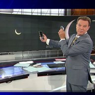
ED2 144 Posted May 18, 2017 Posted May 18, 2017 I missed the earlier newscasts... did Demetrius or Tom present the weather in front of a green screen or the large video wall?
24994J 5904 Posted May 18, 2017 Posted May 18, 2017 I missed the earlier newscasts... did Demetrius or Tom present the weather in front of a green screen or the large video wall? Demetrius did a report or two at the video wall, but Tom's stuck to the green screen and the weather center.
tyrannical bastard 4683 Posted May 18, 2017 Posted May 18, 2017 Not really a fan of the filled logo with the blue "9", but the transparent one looks halfway decent, especially on the IDs. I wish the "9" was more distinctive and filled the box better. The set definitely has a throwback feel to it mixed with the technology of the day. With the upcoming merger with Sinclair, it almost looks like the next evolution of their look. I'm sure there will be an upgrade once Tribune is digested and worked into the "system".
Jase 1165 Posted May 18, 2017 Posted May 18, 2017 I am not a huge fan of this set. It looks like someone refreshed a set from the 90's. I'm going to make a wild guess that Chicago Scenic fabricated it since everything they do comes out looking so dull (good for stage, not good for TV.) I see it as a mixed bag. There are some things that work (the desk and city grid/map backdrop) and things that don't (the brick, overall lighting and use of space). Some people may have expected more/better, but WGN doesn't have a history of going big and bold. They tend to lean towards function than design. That said, I'm not at all surprise that this is what came up with (they can't please everybody). Without question, there are some missed opportunities here (do they really need a traffic desk?), but I'm willing to lessen my criticism to some degree.
C Block 1611 Posted May 18, 2017 Posted May 18, 2017 I agree that this set is nothing special. I suppose it's an improvement over something from 2005, but it's by no means groundbreaking. I wasn't really much of a fan of KTLA's set (the basis for this one) either just because it feels like everything is stuck to one wall. The faux Chicago loft pieces only cheapen the set. The logo looks nice, though I agree that more space between the letters and the number would help. Overall not horrible by any means, but not great either. I suppose at least Tribune is a nice enough station group that they do seem to care somewhat about individual station brands. It's also still worth celebrating that WGN would at least evolve. They strike me as the kind of station that doesn't want to change anything. Also interesting for me to think about the one and only time I was in that building. That place is definitely old school. I was in the stage just next to it with the muticolored bulbs hanging from the ceiling. I'm somewhat surprised they still have that studio set up as is today. When I was there a decade ago, I asked to a ~300 lb stage manager where to get lunch around there. He told us to go to Portillos. I guess he wasn't wrong about that.
rkolsen 1699 Posted May 18, 2017 Posted May 18, 2017 I'm not a fan of the set. The home base shot with the white brickwork looks strange to me. I honestly like the soft area of the set the best. I hope the traffic graphic above the little desk is an LED tile. I'd find it funny if made a workstation for traffic and none for weather. I assume the computer in the desk could function as a weather center or is off to the side with workstations next to green screen. I'm disappointed they went cheap on the cameras. Robotic, but stationary pedestals. Thinking about it stationary cameras don't matter as you can move them into position. I'm surprised they don't have a height drive. I think that in conjunction with the PTZ could emulate a head on trucking shot. They look like they could easily be moved in place but I'm not sure how it would look on a trucking shot. But hey if you want a moving shot they got a jib. One thing I noticed with these static installations is that there seem to be a greater number of cameras as the cost of a pedestal is $90+K times however many cameras you want and need and then all the required control software. It appears they have eight cameras in the studio 6 PTZ, a jib, and a steadicam. Eight is a lot for any studio let alone local news. Demetrius did a report or two at the video wall, but Tom's stuck to the green screen and the weather center. Was the weather center a part of the old set or somewhere else in the building? I am not a huge fan of this set. It looks like someone refreshed a set from the 90's. I'm going to make a wild guess that Chicago Scenic fabricated it since everything they do comes out looking so dull (good for stage, not good for TV.) Is the union shop construction rule required for all theatric / TV installations in the city? Or with union negotiations with the station?
Spring Rubber 733 Posted May 18, 2017 Posted May 18, 2017 The "Traffic" graphic above the desk is a large display. It changes to say "News" during the late night and early morning shows when there's no separate traffic segments. The weather center is a separate room in the building; not associated with any particular studio.
Chicago's Very Own 104 Posted May 18, 2017 Posted May 18, 2017 What does the morning ticker look like? It reminds me of the CLTV ticker.
alex979 119 Posted May 18, 2017 Author Posted May 18, 2017 I'm somewhat surprised they didn't make those blue skyline backdrops behind the anchors a lighter color for the morning news.
24994J 5904 Posted May 18, 2017 Posted May 18, 2017 Mike's announcer booth made the move, but it's in front of the green screen, so it'll be moved in and out each day.
ED2 144 Posted May 18, 2017 Posted May 18, 2017 Mike's announcer booth made the move, but it's in front of the green screen, so it'll be moved in and out each day. I guess that's why Paul is doing the weather in front of the video wall. I'm warming up to the new lower thirds and full screen graphics. There's definitely a connection between WGN's graphics and the graphics KTLA uses. I think the new logo on the time/temp needs to be shrunk down a little. It seems like the logo is cramped on screen when you have the live bug and lower third on the screen at the same time. I kind of miss how the old WGN[9]NEWS logo used to spin on the animations to say "Chicago's Very Own" and back, with the skyline effects added in. Worked a lot better with the sliding panels behind it. https://www.youtube.com/watch?v=id=QH6dbQ7yt0I;t=27
Spring Rubber 733 Posted May 18, 2017 Posted May 18, 2017 Agreed, the opener logo looks awkward now because of how long it sits there without animation. Also agreed on the panels to the sides of the anchor desk needing to be lightened. Dare I suggest that they be changed to yellow to match the yellow lights at the top of the set that they use for the morning news.
alex979 119 Posted May 18, 2017 Author Posted May 18, 2017 I think they might still be figuring out how to use the video panels... the ones by the interview set were displaying a nighttime skyline scene during the 9a hour. Hopefully they make some tweaks for tomorrow or next week.
Georgie56 3662 Posted May 18, 2017 Posted May 18, 2017 I guess that's why Paul is doing the weather in front of the video wall. I'm warming up to the new lower thirds and full screen graphics. There's definitely a connection between WGN's graphics and the graphics KTLA uses. I think the new logo on the time/temp needs to be shrunk down a little. It seems like the logo is cramped on screen when you have the live bug and lower third on the screen at the same time. Example: both stations now have a box on the L3s indicating what newscast it is (e.g., MORNING NEWS, NEWS AT TEN, etc.) and are horizontally formatted.
ED2 144 Posted May 18, 2017 Posted May 18, 2017 Example: both stations now have a box on the L3s indicating what newscast it is (e.g., MORNING NEWS, NEWS AT TEN, etc.) and are horizontally formatted. Also the lower thirds are a single line, with the subject name in bold face, and the description line is on the same line in smaller text.
10Viewer 362 Posted May 18, 2017 Posted May 18, 2017 I really like it. The problem with most sets is that they are too sterile and cold. How do you balance the tech with warmth? Some get it right and some don't. It does kind of harken back to the set that WGN used from 1987-1994.
alex979 119 Posted May 18, 2017 Author Posted May 18, 2017 The circular piece of the desk (with the 9 on it) actually detaches and can be moved away. They used it for a special segment on the midday news today. I bet they'll use it for instant replay and sports shows. [MEDIA=twitter]865247295864012800[/MEDIA]
24994J 5904 Posted May 18, 2017 Posted May 18, 2017 The large OTS is apparently only used for sports, seeing as they don't have a monitor behind them, anymore. They could at least add some kind of border to it, but at least they don't use it for the news anchors. I spoke too soon...
Chicago's Very Own 104 Posted May 18, 2017 Posted May 18, 2017 It's so weird how inconsistent they are with the OTS. I saw earlier that they used the style that they've been using since 2014 (and it looked fine), and then I saw that. It's like they're still coming up with a new graphic for it and can't settle on a placeholder to use in the meantime.

Recommended Posts
Archived
This topic is now archived and is closed to further replies.